Menu
Pinwrk Mobile App
Minimum Viable Product (MVP) of an AI-driven mobile platform that helps gig laborers optimize billable time by helping them find jobs that are clustered closer together. The more people book a worker, the bigger the savings!
| My Roles | UX Reseacher + UX/UI Designer |
|---|---|
| Collaborators | Product Owner, Developers, Data Scientist, UI Designer, DePaul iD Lab Executive-in-Residence |
| Categories | Lifestyle + Business; Social Interaction; Algorithm |
| Duration | 8 months (bi-weekly Agile Sprints) |
| Tools | Qualtrics, Google Docs, Mural, Microsoft Word; Pen and Paper, Figma, Adobe Illustrator + Animate; Zoom, Asana |
1. Understand
Opportunity
The total market potential for the U.S. gig-market is $401.1 Billion. This includes $1.1 Billion for Dog Walking and $900 Million for Housekeeping services. The market is projected to grow to $455.2 Billion by 2023.
Challenge
Gig-laborers experience frustration because they can spend as much as 40% of the workday commuting between customers. They are seeking ways to create more availability to work, but don’t have access to platforms that make this easy.
Consumers do not have an easy way to pool jobs together with their friends, family, and neighbors in order to save on services. They also seek referrals and suggestions from people they trust, and not random sites or bots.
How might we...
How might we match service seekers with providers in their area in order to foster mutual savings and convenience?
Competitive Review
To better understand common interaction patterns and features for the dog walking service domain, I performed a competitve review of Wags! and Rover.
Results of my contributions
Using the "Design Thinking" process (developed by Stanford d.school), I performed a range of UX research and design activities that helped transform a business idea into a Minimum Viable Product (MVP) driven by user insights.
2. Empathize
Survey of Service Seekers and Providers
To understand the goals, motivations, and pain points of service seekers and providers, I co-authored a survey questionnaire that was administered both remotely and in-person. The data was input into Qualtrics. The team then analyzed the results to better understand the unmet needs of both user groups.
User Insights: What we learned about Service Seekers:
- Respondents are willing to hire gig laborers if the need arose.
- Most respondents have used referrals to find providers.
- Respondents ranked Quality of Work and ability to choose a specific Time for scheduling as the most important factors when hiring.
- Respondents valued price, but not at the expense of quality.
- Respondents indicated that some services require greater selectivity in the hiring process than others.
Service Seeker Survey Questions
User Insights: What we learned about Service Providers:
- Respondents indicated that gas and tranportation costs are major expenses.
- Respondents prefer to find jobs that are in close proximity to each other.
- Respondents indicated they might be willing to offer group discounts for services that can be performed concurrently (e.g. childcare).
- Respondents indicated that referrals are their primary method for gaining clients.
- Some respondents indicated they would like a more reliable way to get paid, as sometimes clients forget.
Service Provider Survey Questions
Personas
Based on our research, we identified two personas: The Service Seeker and Service Provider.
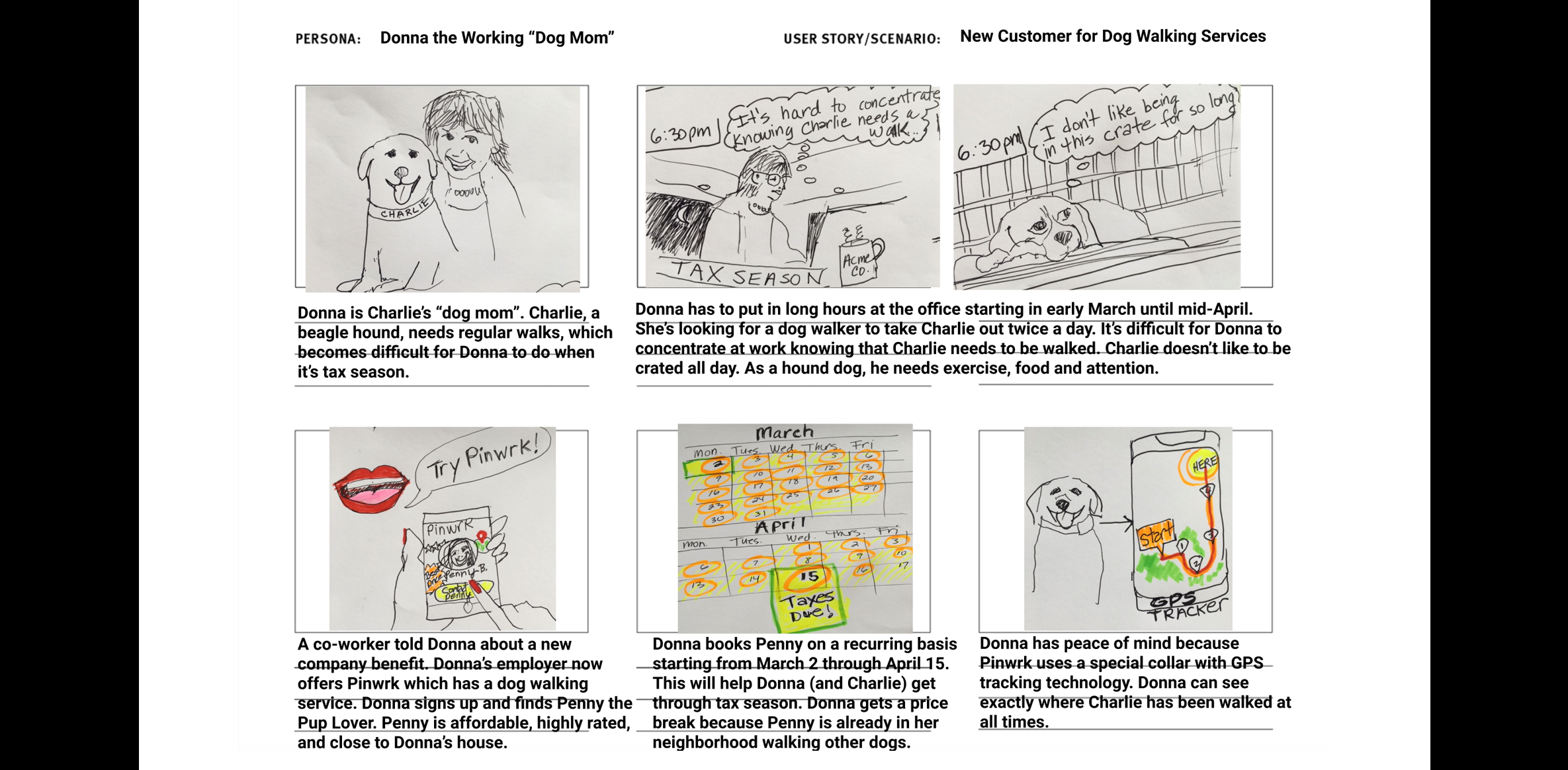
As a busy accountant, I need a dog walker to take care of my four-legged child, Charlie, during tax season when I'm working long hours. I'm looking for someone who loves animals, lives nearby, and can walk Charlie twice per day. I'd love Charlie to have some dog company, and so I'm open to having Charlie go on group walks with other dogs in the neighborhood.

Donna the Dog Mom
Service Seeker
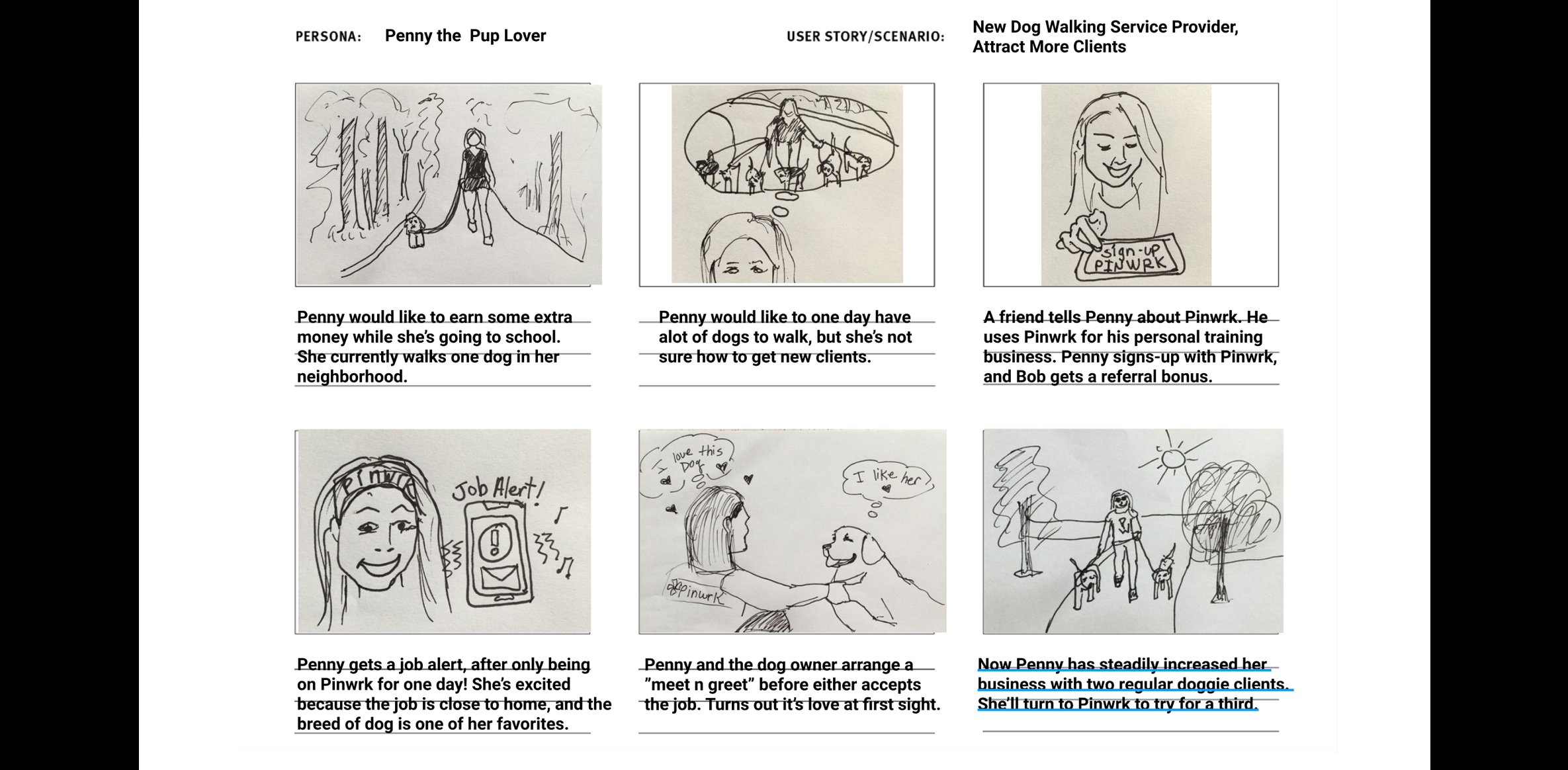
As a new dog walker and pet sitter, I'm looking to build my business without the hassle of going on multiple platforms. Since I don't own a vehicle, I'd like to find jobs in my neighborhood where I won't have to commute. I'd like a platform that handles the scheduling, payment, and promotion for my services.

Penny the Pup Lover
Service ProviderStoryboards
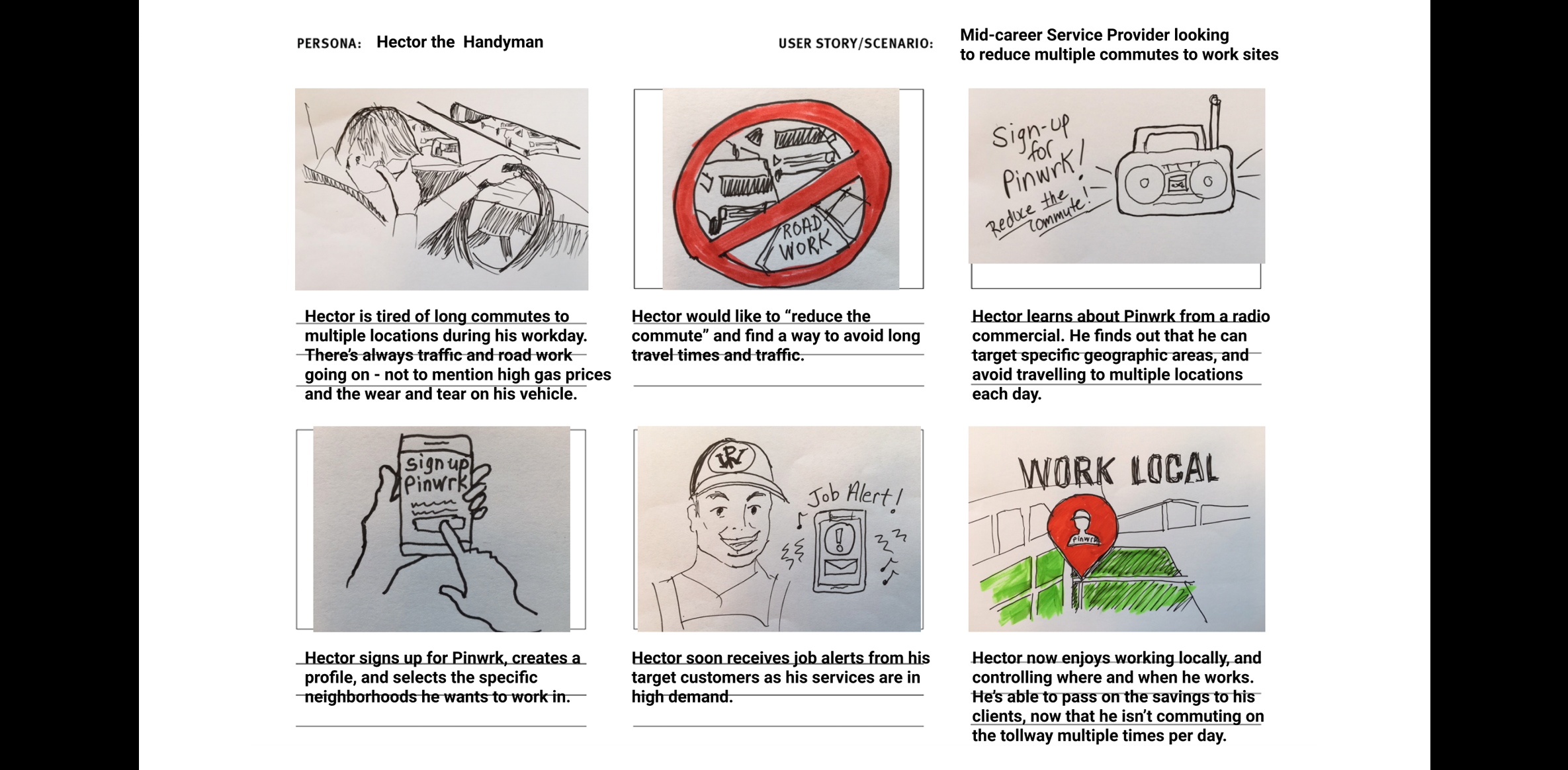
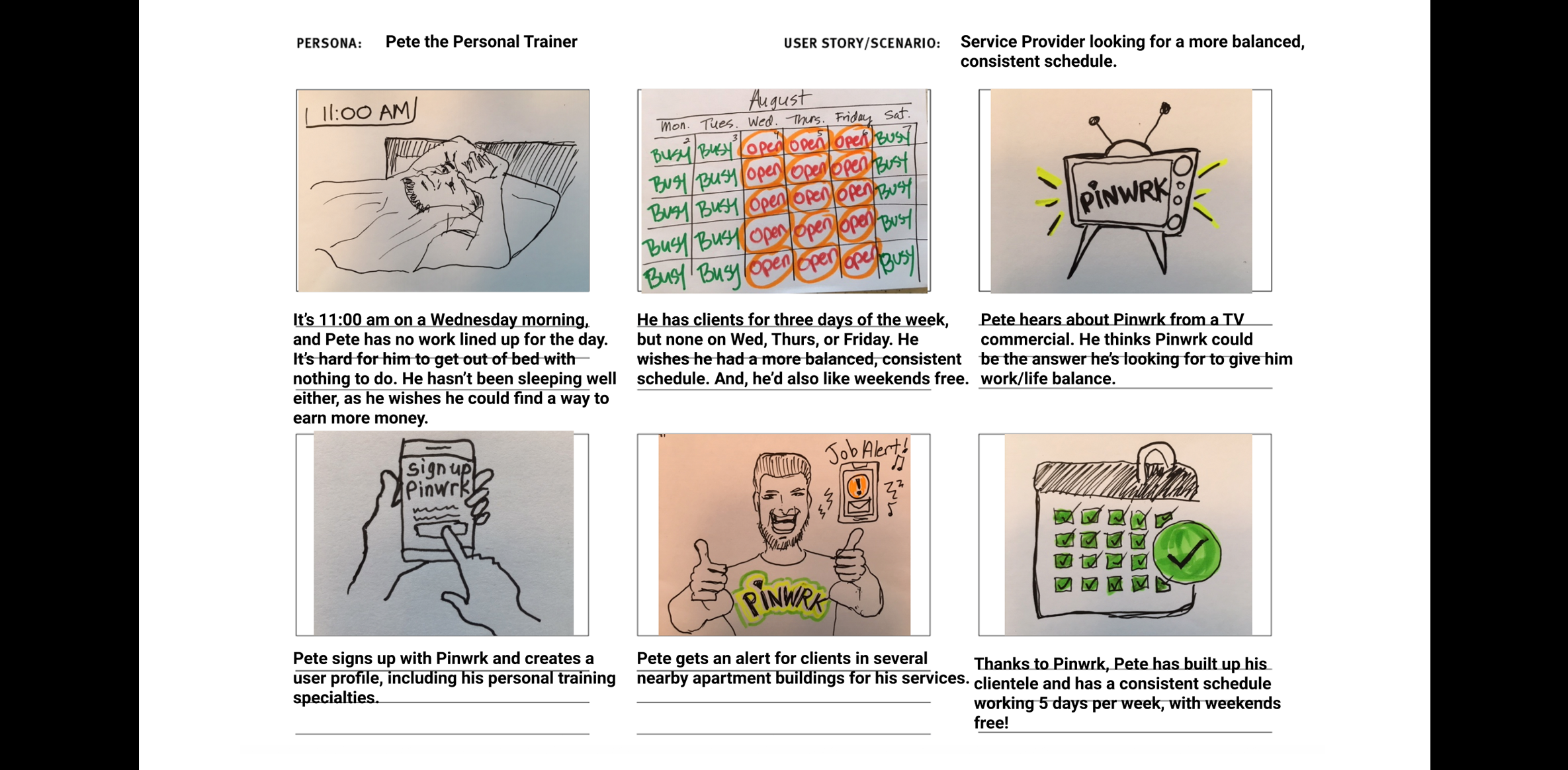
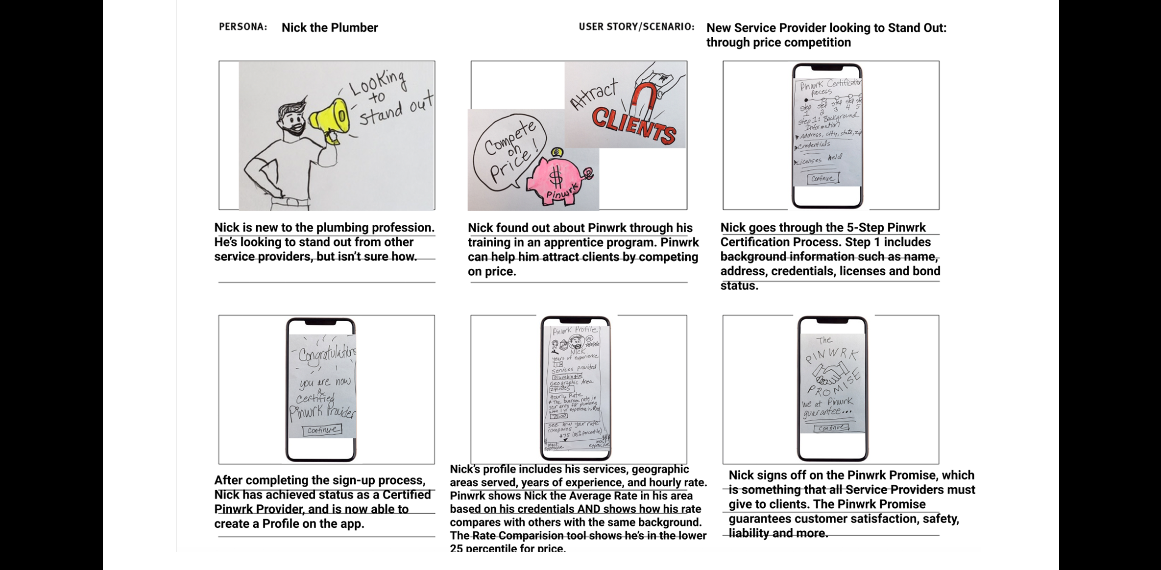
I created several storyboards depicting scenarios for the main personas.
3. Define
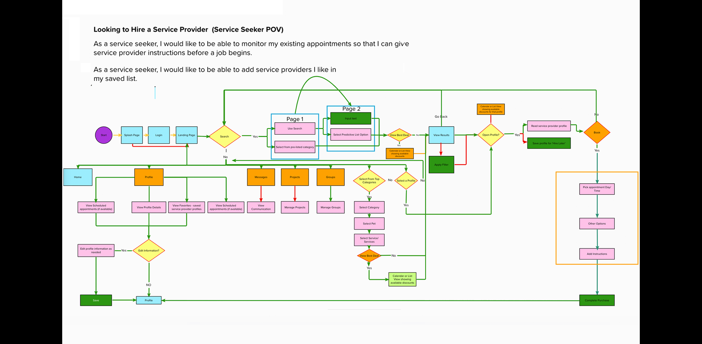
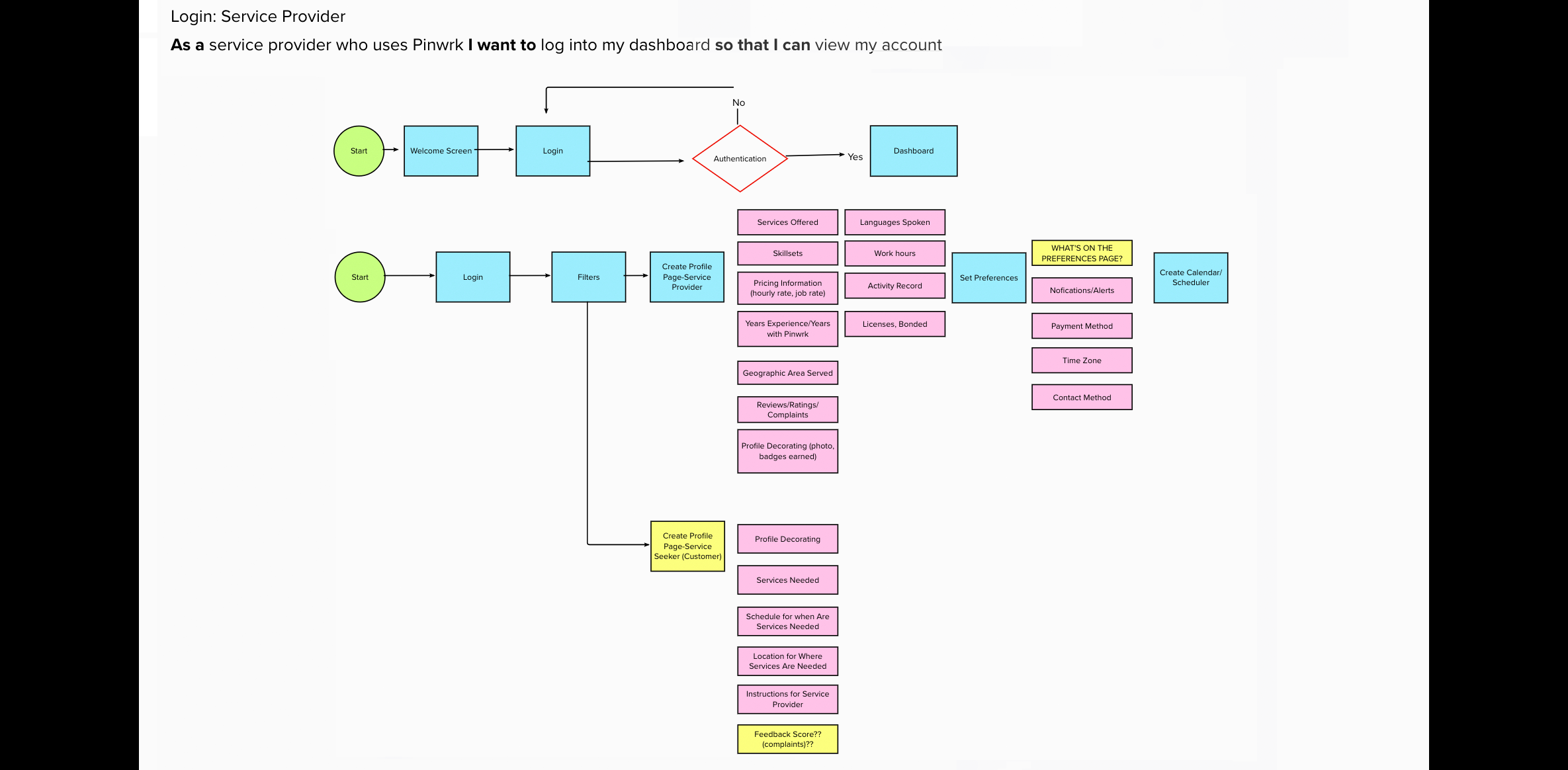
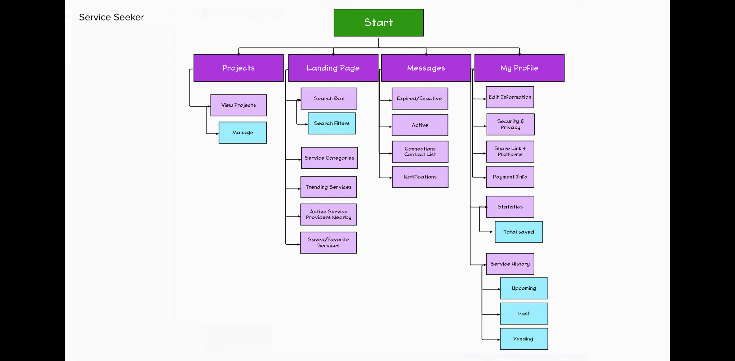
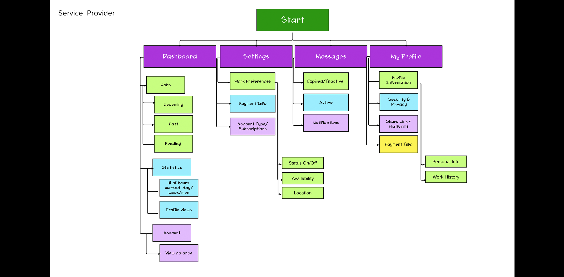
User Flows & Information Architecture
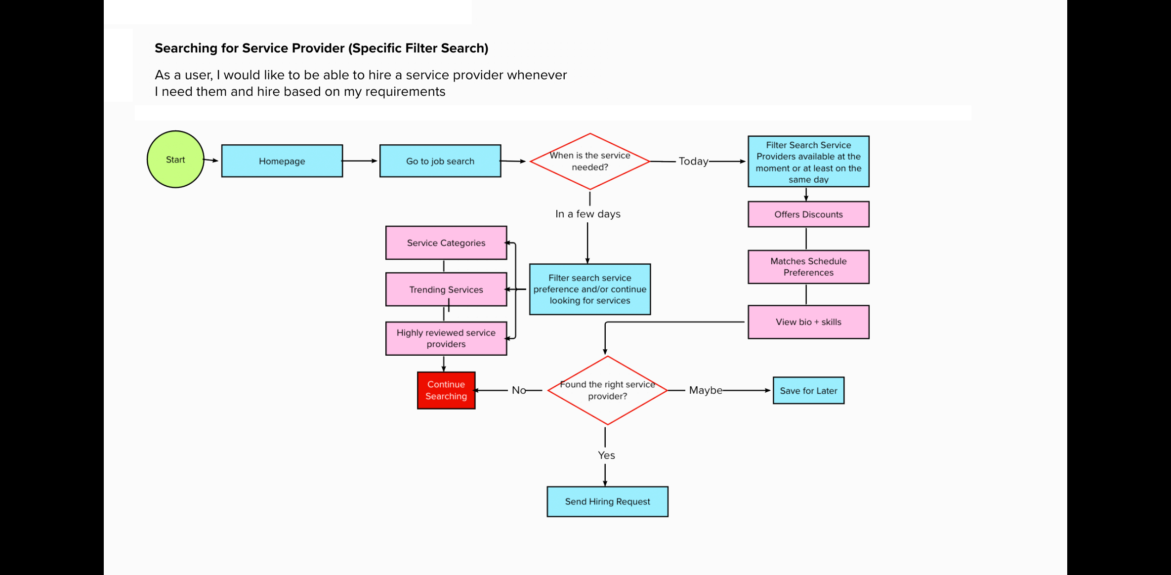
Working with the product owner, I identified user flows and assisted in establishing the information architecture.
4. Ideate
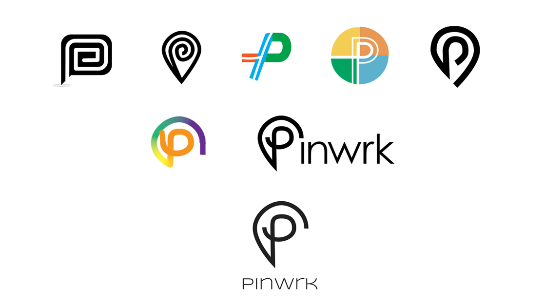
Branding and Logo Creation
I created and refined several logo ideas which evolved into the final brand identity which symbolizes a geographic "pin" and the letter "p."
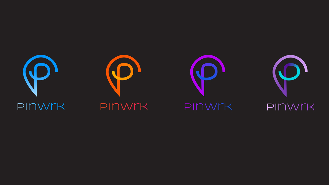
Color Studies
I performed several color studies and treatments for the selected logo.
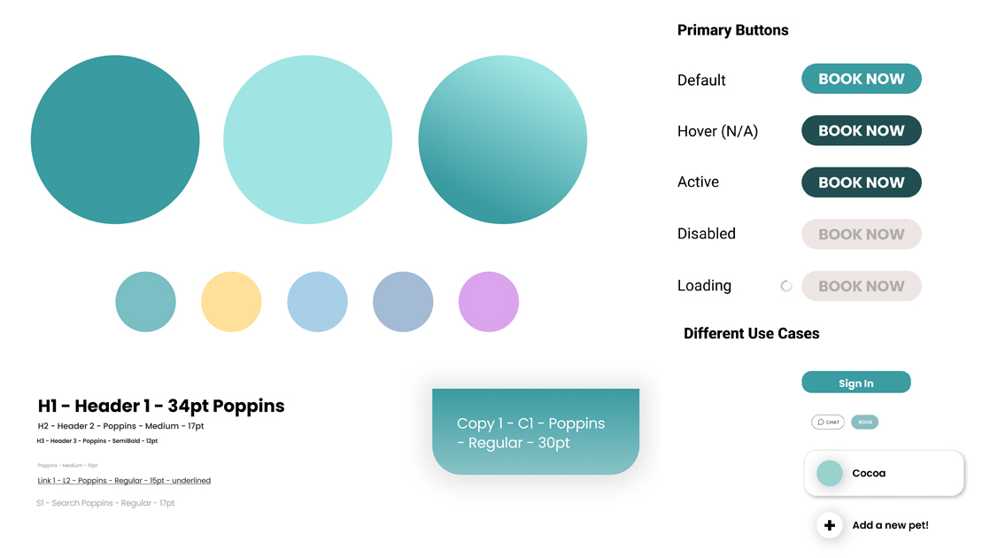
Initial Style Guides
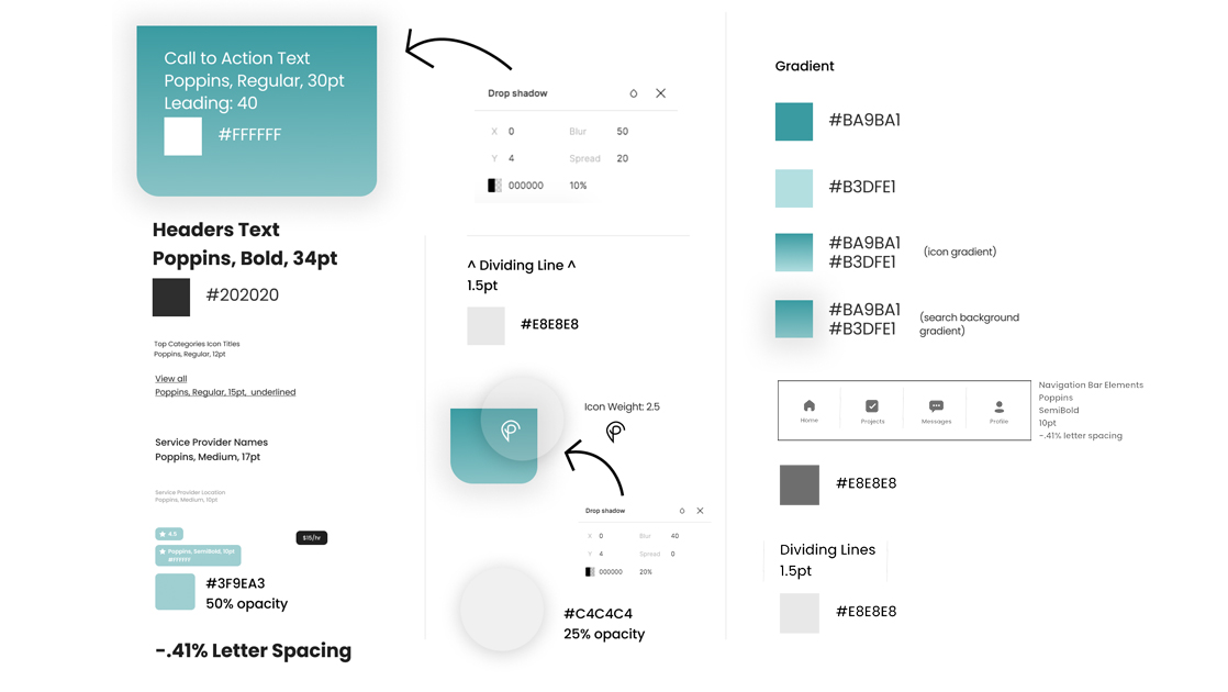
To facilitate the next phase of creating high fidelity screens, I collaborated with the team to finalize the color palette and establish an initial style guide.
We further refined the style guide to include specifications for navigation, drop shadows, typography, and gradients.
5. Prototype
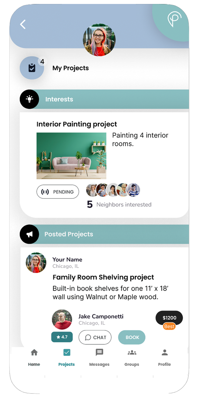
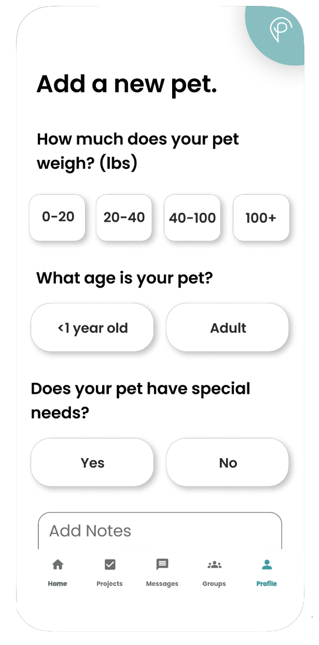
High Fidelity Screens for Service Seeker "Customer" Version
Collaborating with the UX Team and Developers, I designed several of the High Fidelity Prototype Screens.

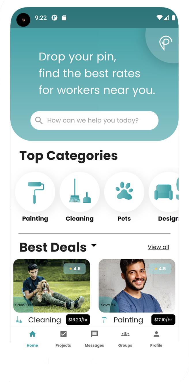
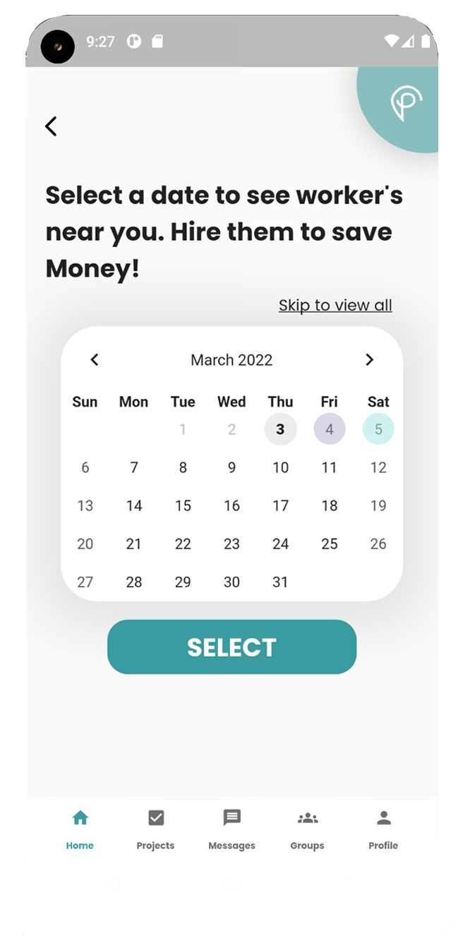
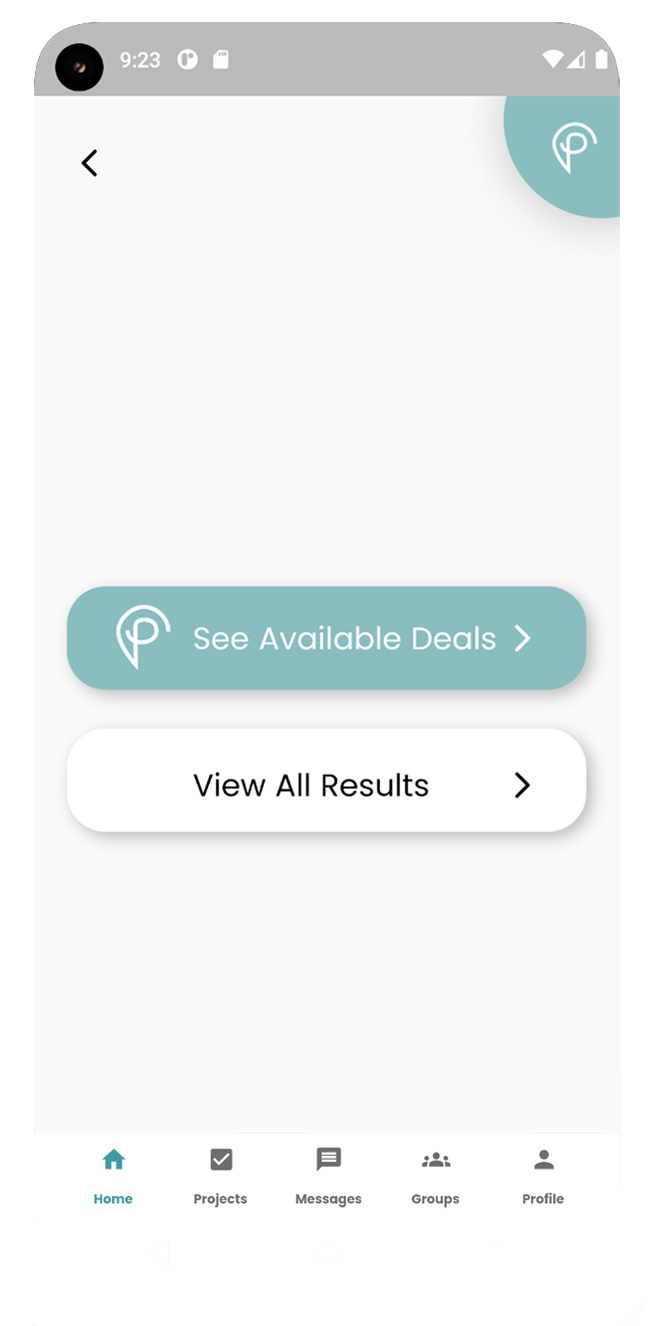
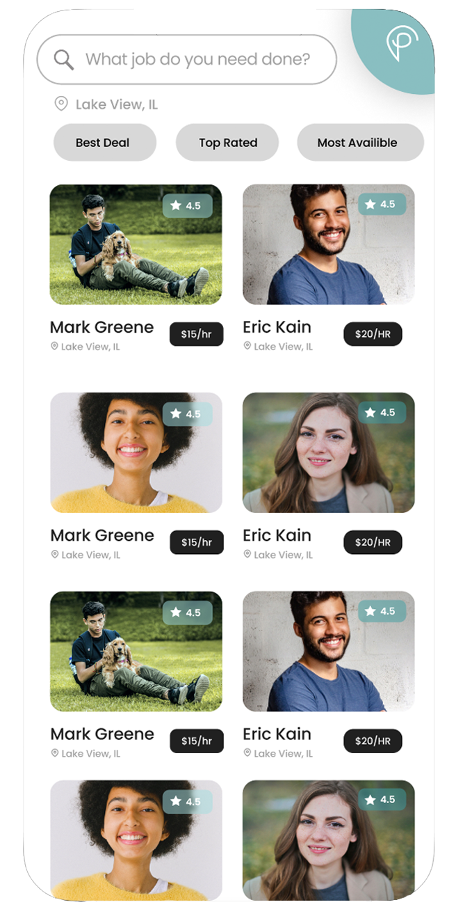
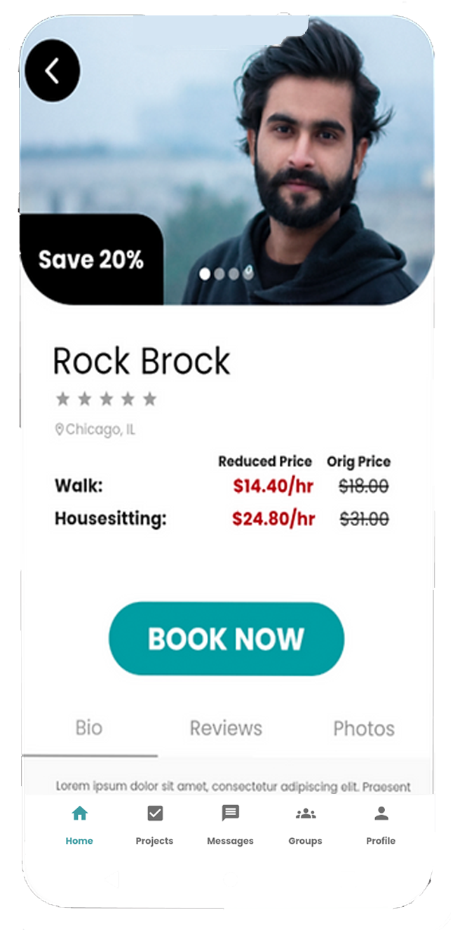
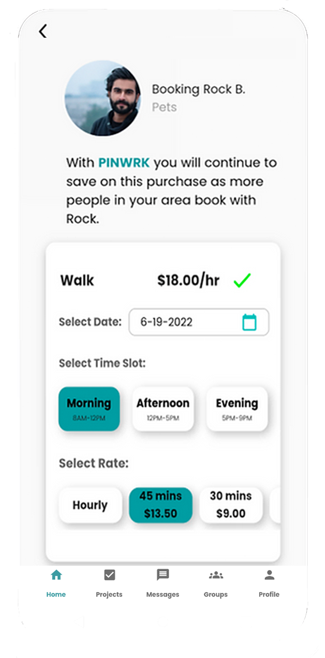
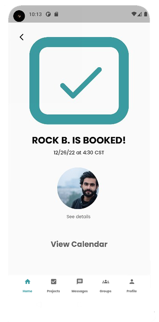
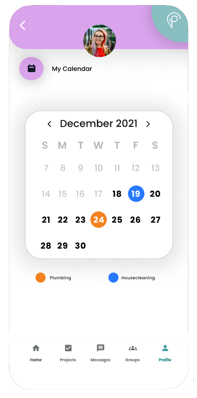
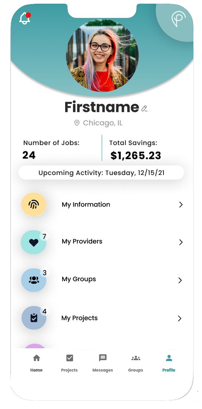
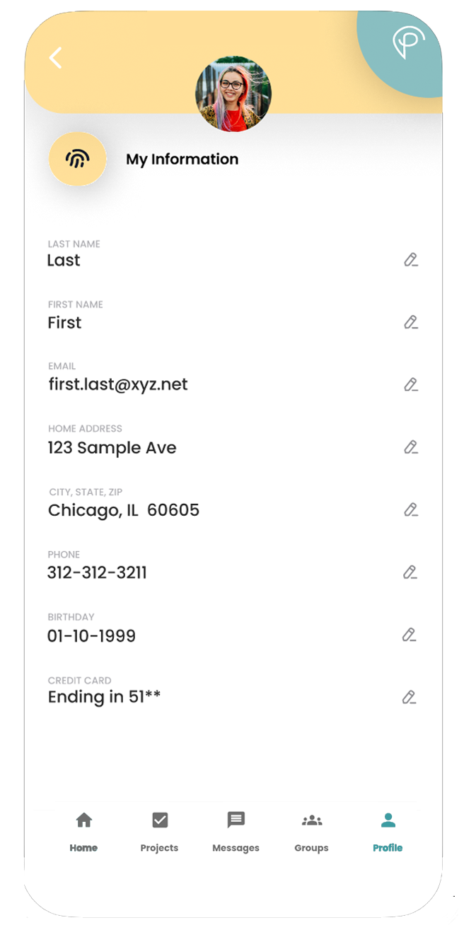
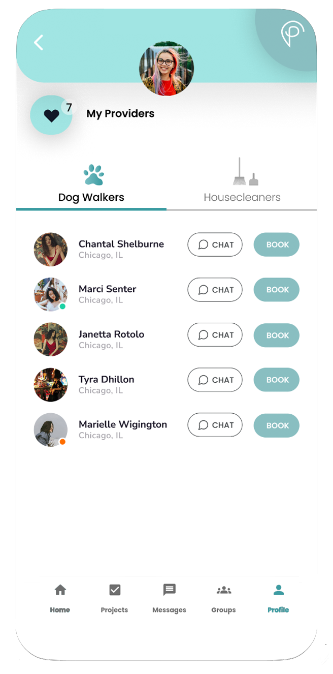
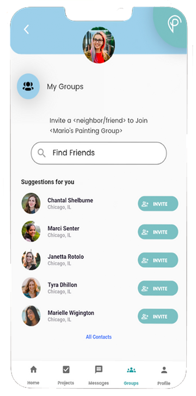
1. Splash Screen
First page after downloading the app.
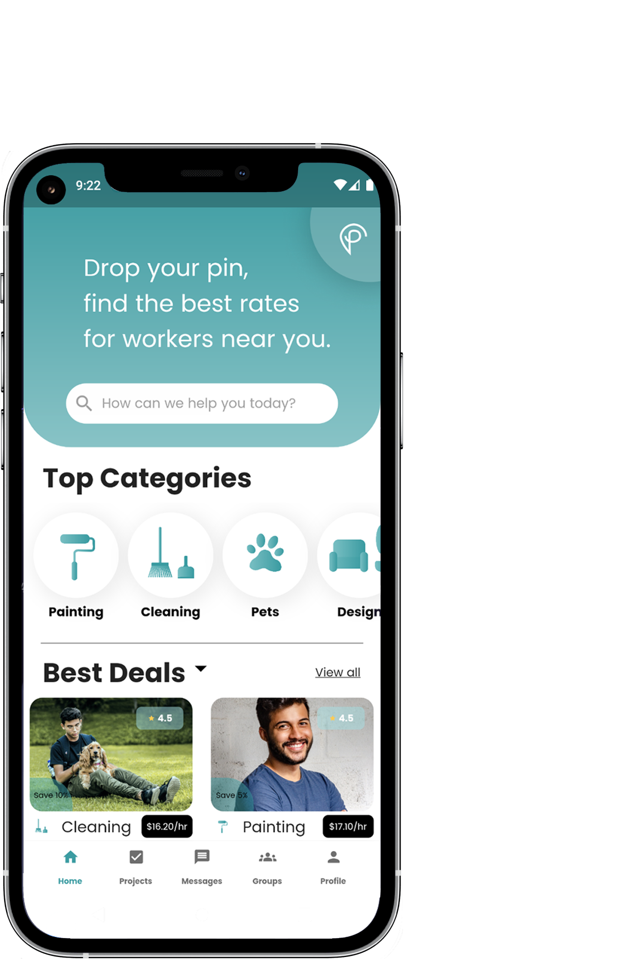
2. Home
Find providers for the services you want.
3. Select a Date
Choose a date or date range for when you want services rendered.
4. See Available Deals or All Results
Choose from best available deals or view all provider results.
5. Provider Results
Choose from providers matching your search criteria.
6. Service Provider Profile
View and Book Service Provider.
7. Book Service Provider
Pick date, time, and type of service.
8. Booking Confirmation
Confirmation that Booking has been Successfully Completed.
9. My Calendar
Customer Calendar of Booked Jobs.
10. Service Seeker Profile Page
Customizable Profile Page for the Service Seeker (Customer).
11. My Information
Profile Information for the Service Seeker.
12. My Providers
List of Service Seeker's Saved Providers.
13. My Groups
List of Service Seeker's Groups.
14. My Projects
List of Service Seeker's Projects.
15. Add a New Pet
Add a New Pet for Service Seeker.
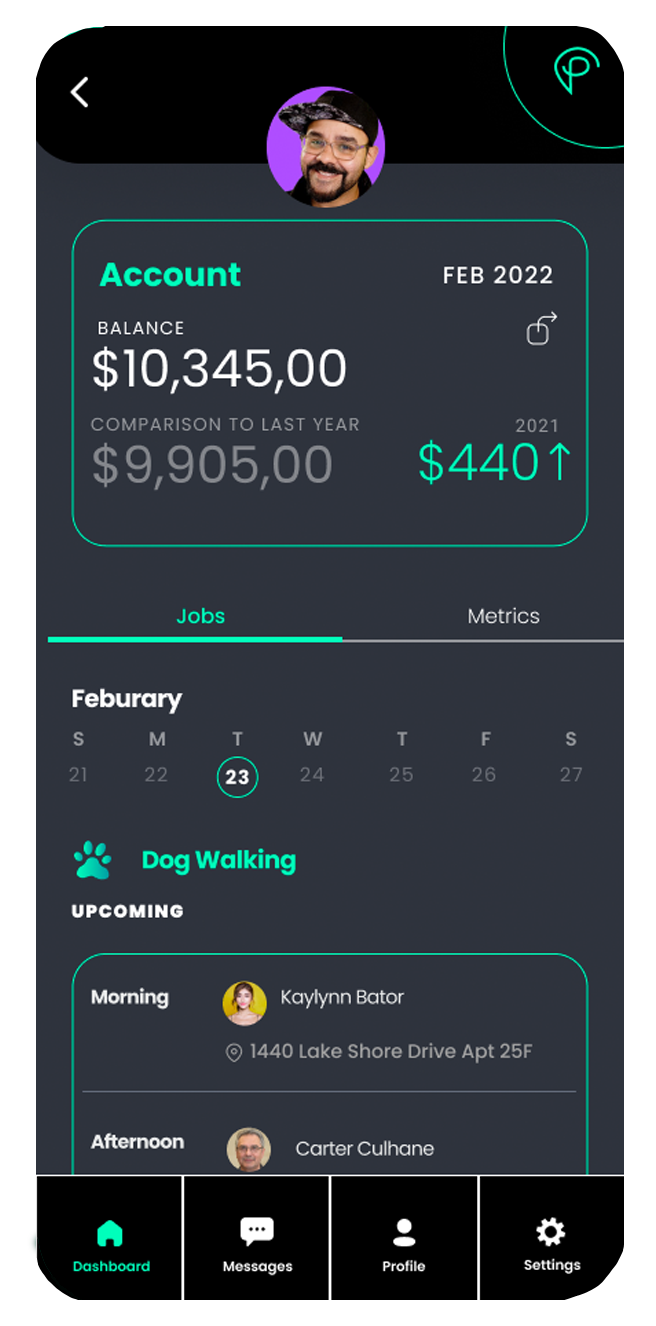
High Fidelity Screens for Service Provider "Pro" Version
After completing the Customer version of the app, I designed several of the High Fidelity Prototype Screens for the "Pro" version.
1. "Pro" Splash Screen
First page after downloading the app.
2. Dashboard - Jobs
Dashboard displaying upcoming jobs and account information.
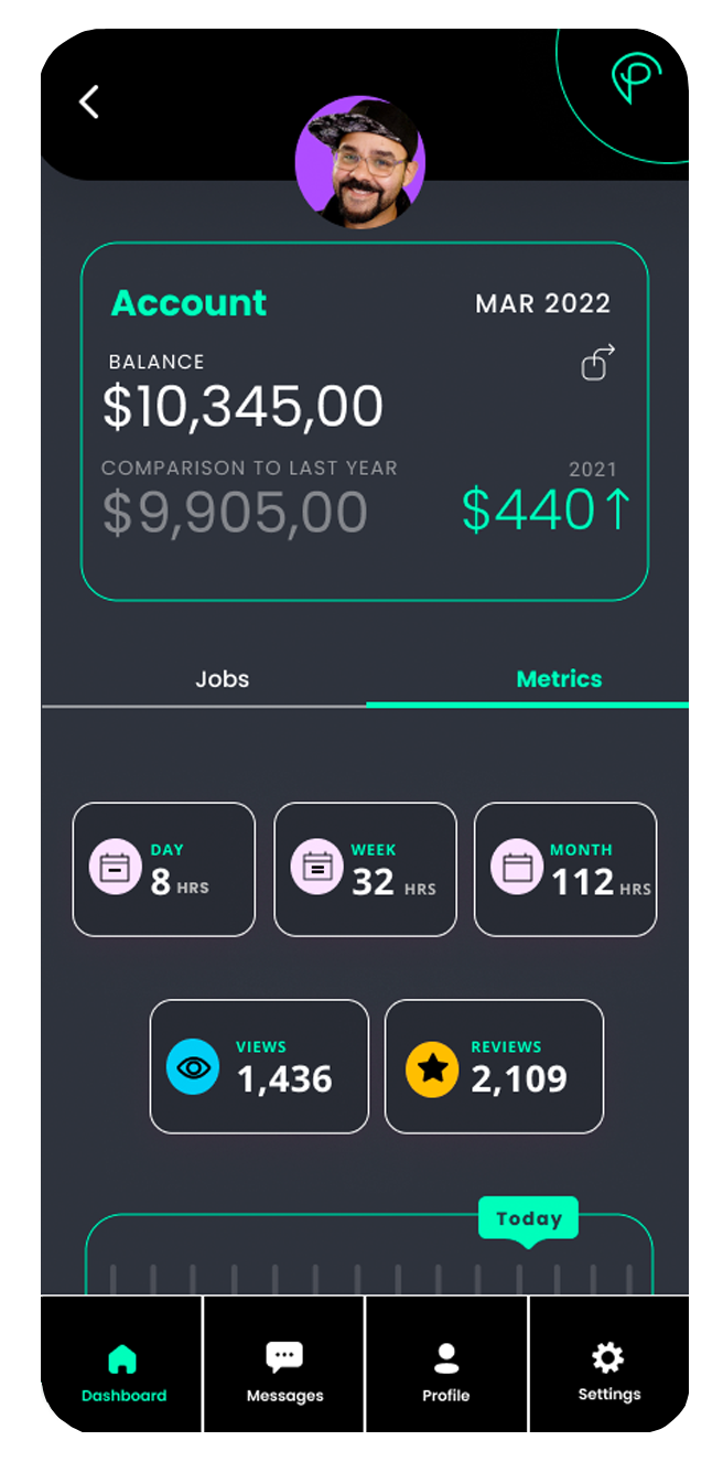
3. Dashboard - Metrics
Dashboard displaying metrics of views, reviews and job frequency.
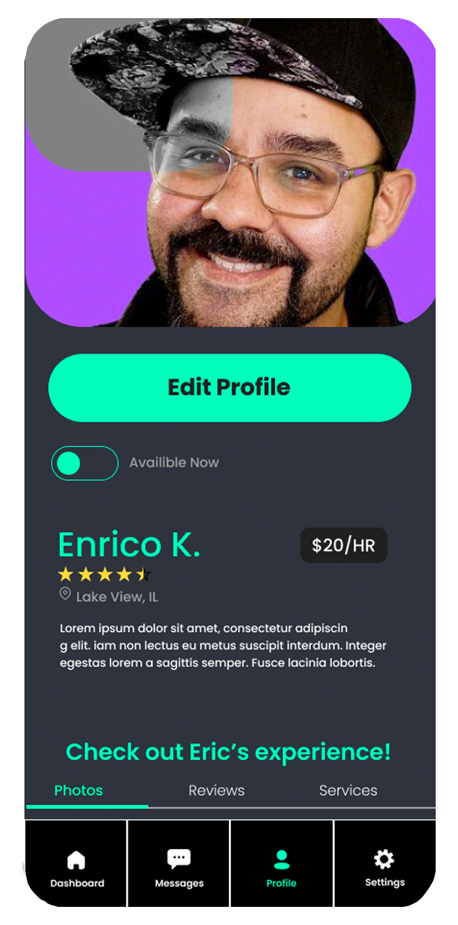
4. Service Provider Profile
Customizable profile page of ratings, photos, and services.
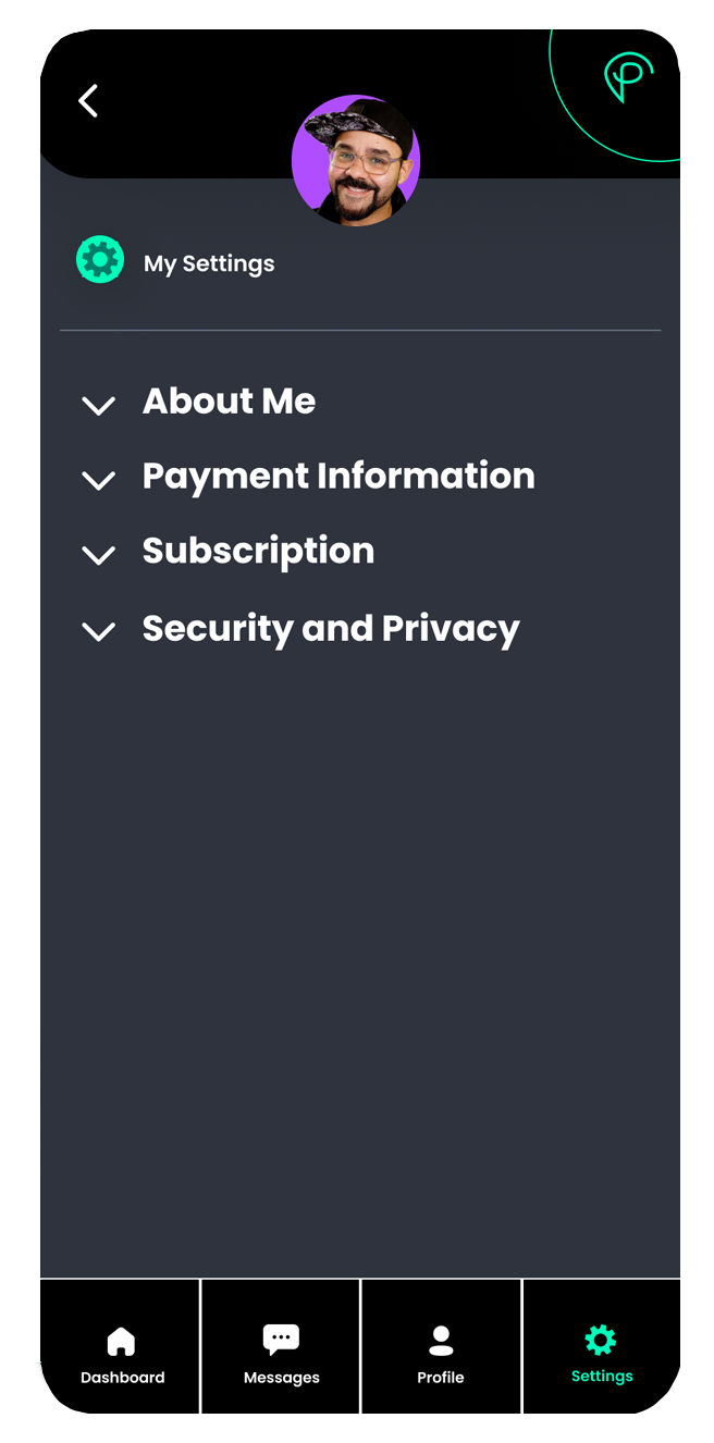
5. My Settings
Update preferred settings for payment and more.
6. Test
Usability Evaluation and Concept Testing
In this study I created several test objectives that I felt could evaluate the usability, usefulness, and desirability of a select number of Pinwrk high-fidelity prototype screens for a core piece of Service Seeker functionality.
I recruited three participants through convenience sampling and performed the in-person usability walkthrough using Zoom to record each session. The usability evaluation included one test moderator. I interviewed how each participant would complete the task of hiring a dog walker. Next, I identified the following major findings: (for further details, please see the Findings section).
Major Findings
| # | Test Objectives | Summary Insights | Recommendations |
|---|---|---|---|
| 1 | How easily can users find a service provider? | The large icon buttons were preferred over using the Search field for finding a dog walker. When presented with two additional filtering options in the search process, participants did not understand the difference between "See Available Deals" and "View all Results" without additional text to explain. | Take the user to a menu page where they can filter based on Pet Type, Services, Experience level, Location, Availability, Price/Rates, and Deals after selecting the Pets icon. If using a results choice page, add text below each button to clearly define the difference between a best deal and all results. |
| 2 | What is the user’s desired path and process when hiring? | WHAT COMES FIRST: PROVIDER OR THE DATE? Participants prefer choosing a provider first then selecting a date second, citing the need to find the “right person” and the belief that dates are negotiable. CALENDAR Participants did not know when to Select a date versus Book a provider, how to find additonal providers, and how to schedule recurring dog walks over a date range. SERVICE PROVIDER PROFILE Participants were unclear why the prices were discounted. Two said they would want to message the provider prior to booking. One wanted to know the proximity of where the provider lives and their mode of transportation. CONFIDENCE IN THE BOOKING PROCESS One participant expected to receive a confirmation number and a direct acknowledgement from the provider immediately after booking, have the job show up on her calendar, and Cancel or Reschedule if needed. One participant said each screen should contain a single task and include a“check-out” process. SCHEDULING TIME-OF-DAY All participants said they preferred to select exact time slots, versus only “Morning, Afternoon and Evening”. One participant did not see a way to select two times slots for two walks per day. |
Have a single process per screen, and show user where they are in the process. Allow users to select specific times and ranges. Allow users to schedule more than one booking in a day, a way to cancel, reschedule, and indicate single versus recurring walks. Add a phone number and direct messaging capabilities to the service provider profile page. Add location of where the provider lives in relation to the customer and indicate their mode of transportation. |
| 3 | Will users understand and utilize the Groups feature? | Two participants thought Groups were used to give and get referrals. One user did not understand what Groups was for. | Add text to the Groups page that clearly articulates the benefit of joining a Group and what Groups can be used for. Consider adding a Chat feature to Groups to facilitate easy communication between members. |
| 4 | How easily can users navigate within the app? | MAIN NAVIGATION ELEMENTS Home Participants said Home would take them back to the first page they were shown. Projects Participants were uncertain what Projects meant. One said it could mean booked jobs or how you do construction work. Messages Participants said Messages allow them to communicate with service providers and others users. Profile Two participants believed the Profile was their profile; one participant said it could be the Service Provider's. Finding calendar of booked jobs All participants were unsure how to get back to their calendar to view booked jobs. Finding providers Participants were unsure how to find additional providers not displayed on the calendar page. |
Change Profile to My Profile or personalize it to the Service Seeker’s name. To allow immediate access to a calendar to confirm booking, add Calendar to the bottom navigation, or rename Projects to Calendar, as some users correlated Projects with being on their Calendar. Consider adding a Provider Directory grouped by categories with filtering. |
| 5 | Will users understand the value proposition? | UNDERSTANDING THE DISCOUNT MODEL Participants were unclear why they were receiving a discount and did not know that the price gets lowered the more that the provider books jobs in their area. DESCRIBING THE APP One participant described Pinwrk as a freelance app for people near each other. Another participant described it as a Directory of services and as a Coupon book. One participant described the app as something that could be useful. |
Clearly articulate and explain the value proposition for both service seeker and provider, perhaps even a tour of the interface. |
| 6 | Branding Description | Participants recognized that the logo symbol was the letter “P.” One participant described it as a “pin” symbol because of the headline, “Drop your Pin.” |
Purpose
The purpose of this study was to gain insights into the Pinwrk high-fidelity prototype screens and discover any major usability issues that may block users from completing the application’s essential tasks. I also discovered whether users understood the key value proposition that the application offers so that a precise consumer base and service offerings can be identified. The findings from this evaluation will assist with the next iteration of the Pinwrk interface and discover how services align with the value proposition.
Problem Statement and Test Objectives
Scope
The usability test evaluated the Booking functionality when hiring a Service Provider. I focused on direct and alternate paths taken, first impressions, attitudes and perceptions about the booking process. I also assessed if the application matches the mental model of how users wish to hire providers, desirability of discounts based on number of jobs in a geographic area, and potential uses for the Groups feature.
Although the target users of the application are homeowners, pet owners and renters, the convenience sample population for usability testing included students, friends, and family who may or may not possess all attributes of the target demographic.
My aim was to understand the answers to the following research questions:
Methodology
The qualitative, formative evaluation was designed to assess the usability, functionality, and desirability of the Pinwrk high-fidelity prototype application screens and overall proof of concept for the Service Seeker profile. The participants were presented with a scenario-based task of hiring a dog walker and were asked approximately 19 questions that included additional probing, follow-up, and a debrief session. The moderator showed a series of static screens to participants who were encouraged to think aloud. Sessions were recorded using Zoom and utilized in-person moderation. All participants were required to provide verbal consent prior to starting the evaluation. Text transcripts were analyzed for salient themes that were prevalent among participants. Data is presented as findings and recommendations.
Participants
I recruited three participants through convenience sampling.
| # | Pseudonym | Age Range | Pet Ownership | Home Ownership | Residence Location(s) | Pronouns |
|---|---|---|---|---|---|---|
| P1 | Cody | 18-24 years | No | No | Suburban | He/His |
| P2 | Matthew | 18-24 years | No | No | Suburban | He/His |
| P3 | Donna | 58-66 years | Yes | Yes | Urban + Rural | She/Hers |
Within Subjects Design
In this within-subjects study, I asked the user to complete one primary task to find and hire a service provider. Within this task, many sub-tasks and steps were evaluated, including assessing the user’s confidence level in the booking process, and whether the user understood the main benefit and functionality of the application.
Protocol
A. First Impressions
1) From the Home page, ask the user what they think they can do on the application.
B. Primary task: Find and Hire a Dog Walker
2) Provide a scenario of hiring a dog walker. Ask the user where they would click first and expect to be taken to next.
3) Ask the user how they might use the Search field located on the Home page.
4) From the Search Results Choice page, ask the user to interpret the difference between “See Available Deals” and “View All Results.”
5) Ask the user to interpret the initial calendar and explain how and when they would use it.
6) Ask the user to interpret the second calendar and describe the differences between "Select" and "Book."
7) Ask the user how they would find additional providers not listed on the calendar page.
8) From the Service Provider Profile page, ask the user why they are receiving a discount.
9) Ask the user if they have sufficient information to book the provider from their profile page.
10) Ask the user how they might communicate with the service provider before and after booking.
11) From the Booking Service Provider page, ask the user how they would schedule the service and if the Morning, Afternoon and Evening designations offer enough flexibility.
C. Wayfinding
12) Ask users where they might find their calendar to verify that a job has been booked.
13) Take the user to the bottom navigation and ask users to define what each navigation element means.
14) From the Booking Confirmation page, ask users what they would do next and where they expect to find the calendar once they leave the page.
D. Usefulness
15) From the Groups page, ask users how they interpret the functionality and if/how they might use it.
E. Proof of Concept
16) Ask the user how they might define the purpose and benefit of the application.
17) Ask the user if they feel discounts are applicable to all service offerings.
18) Ask the user the likelihood that they would download and use the application.
F. Branding
19) Ask the user to interpret the Pinwrk branding to learn if they understand the symbol is a “P.”
Findings
1. How easily can users find a service provider?
All participants understood how to use the Search field as a secondary means to find a dog walker. One participant suggested having the system ask if it could use their location data first. All participants expressed uncertainty when describing the Results Choice page. They did not fully understand when the page would be displayed, how they could go back to edit their Search criteria, or the differences between the “See Available Deals” and “View All Results” buttons. One participant noted that she had not yet been able to narrow down her search to “dog walker.”
Consider taking the user to a menu page or to a ist of initial providers in their area where they can filter based on Pet Type, Services, Experience level, Location, Availability, Price/Rates, and Deals after selecting the Pets icon. This would streamline the process and allow users to narrow search results based on criteria they choose. If using a Results Choice page, display it after the user has entered their search criteria. Add text below the buttons explaining the difference between viewing all results and seeing available deals, and add an image demonstrating the benefit (one participant noted the page looked “too empty”).
2. What is the user’s desired path and process when hiring?
WHAT COMES FIRST: PROVIDER OR THE DATE?
All participants expressed their preference for choosing a provider first then selecting a date second, citing that dates are negotiable.
It’s more important to hire the right person, instead of getting someone who’s just available.
- Matthew
CALENDAR
All participants did not know when to click Select versus Book or how to find additional providers. One participant thought the discounted providers below the calendar were banner ads. One participant did not know how to schedule recurring dog walks or select a 3-month date range.
SERVICE PROVIDER PROFILE
All participants said the Bio and Reviews would be helpful when evaluating a Service Provider. All participants noticed the 20 percent discount, but two commented they did not understand why they were getting a discount. All participants noticed the Book Now button. One participant thought he might have arrived at this page by a recommendation from the system. Two participants said they would want to message or speak to the provider first before booking. One participant said she wanted to know how close the service provider lives to her and what mode of transportation they would take to arrive on time.
CONFIDENCE IN THE BOOKING PROCESS
Two out of three participants were unsure of the best way to contact the provider. One participant thought he could use the Messages icon in the bottom navigation; however, he did not know whether that would directly message the provider, or if he would need to first look up the provider in a directory. He suggested adding a “Message Me” button on the profile page.
Another participant wanted to set up a phone conversation as a pre-screen, then an interview to assess if the person could physically handle the dog(s). She cited living nearby within a 1-mile radius and having reliable transportation also as key hiring factors. She said she expected to receive a confirmation number and a direct acknowledgement from the service provider immediately after booking, something like “Good to Go.” She expected to view the booked job on her calendar, and have a way to Cancel the job, if needed. She did not see a way to cancel or reschedule the job. She also did not know how to get back to her calendar after leaving the confirmation page.
One participant expressed that the booking sequence of pages contained too much functionality on a single page. He also expected to be brought to a “check-out” sequence to pay for the service(s).
SCHEDULING TIME-OF-DAY
All participants said they preferred to select exact time slots, versus only “Morning, Afternoon and Evening” citing potential for communication errors and switching their schedule around to accommodate the provider (instead of the provider accommodating them). One participant said she might want to schedule two walks per day but did not see a way to select two times slots.
Consider simplifying the screens by having single processes on each and possibly adding a ‘continue’ button and a “steps” wizard to allow users to move through the booking process. Allow users to select specific times and ranges for certain services that require it (e.g. living things versus things that can wait like lawncare). Allow users to schedule more than one booking in a day, a way to cancel, reschedule, and indicate single versus recurring walks. Add direct messaging capabilities to the service provider profile page. Add location of where the provider lives in proximity to the customer (or a radius) and their mode of transportation. Remove the discounted service providers from the calendar widget, as users did not know whether to click the Select or Book button, or how to find other providers not displayed.
3. Will users understand and utilize the Groups feature?
Two out of three participants thought Groups was primarily used for referrals but were split between what kind of services they would use it for. One participant said, “It could be a way to get other people’s opinions in my area about these service people.” He also stated he could potentially use it for certain services, but not for dog walking. He said, “Maybe for like lawn care or something like that, that could be potentially everyone in the same area working on roughly the same yards.”
Groups is almost like a Chat page where you invite people that you know and you’re like, ‘hey, I know...here’s some great painters ‘or other dog people owners where we’re always looking about ‘do you know anyone?’ And I’d want to invite my friends to know that this is a good person for this service.
- Donna
When asked if she would join a Group, one participant said, “Yeah, I would join a Group because referrals for that are important.” Another participant said, “No, unless I was asking for opinions - is this guy good? Can he deal with pit bulls? Or can he deal with a dog like that or do I need someone more trained.” One user did not understand what the My Groups are for. He said, “I’m not really sure what the groups are for. I wouldn’t use it. That’s like using a group for Fiverr or like a freelance service. Why would I use that? I’m just looking for someone to work for me. The Groups would fall under Categories. Like Pets, Lawncare...I don’t see why Groups are needed.”
Consider adding text to the Groups page that clearly articulates the benefit of joining a Group and what Groups can be used for. Since most participants thought it was a Referrals page, consider adding a Chat feature directly onto the Groups page to facilitate easy communication between members.
4. How easily can users navigate within the app?
MAIN NAVIGATION ELEMENTS
Home
All participants understood that Home would take them back to the first page they were shown.
Projects
All participants were uncertain what Projects meant. One participant said it could mean projects that are on her calendar, or how you do construction work.
Messages
All participants expressed that Messages could be a means to communicate with potential service providers and others on the platform. One user said he was unsure if he would need to look up a provider first in a directory before messaging. One user thought Messages would be a way to ask service providers questions before hiring, or as an alternative to calling.
Groups
Two out of three participants felt they knew what Groups were and said it could be a way to communicate with others about providers they are considering hiring or to give/get referrals.
Profile
Two out of three participants believed the Profile was their profile; one participant said it could be the profile or bio of a Service Provider. She did not believe that it represented her profile.
FINDING CALENDAR OF BOOKED JOBS
All participants were unsure how to get back to their calendar to view booked jobs. One participant thought she would need to go back to the Home page to find her booked jobs, but also thought Projects might be those on her calendar.
FINDING PROVIDERS NOT LISTED ON CALENDAR PAGE
All participants were unsure how to find additional providers not displayed on the calendar page. One participant said, “I’m not sure if the Select button would show me everyone who’s available on the day that I selected. Maybe I would do Skip to View All just to see all my options.”
Consider changing Profile to My Profile or personalize it to the Service Seeker’s name. If immediate access to a calendar is important, add Calendar to the bottom navigation, or rename Projects to Calendar, as some users correlated Projects with being on their Calendar. Since all participants wanted to find a provider first, and find dates second, consider adding a Provider Directory grouped by categories with filtering to either the bottom navigation, or through a ‘hamburger’ menu.
5. Will users understand the value proposition?
UNDERSTANDING THE DISCOUNT MODEL
All participants were unsure as to why they were receiving a discount, and two asked what the benefit would be to the service provider. All participants stated it was not clear to them that the price gets lowered the more that the service provider books jobs in their area. One participant thought that the service provider controls the amount of the discount. “I would expect this is going to be an individual...I need business...I’m offering 20% off my dog walks and I’m using this as a vehicle to get my name out there.” One participant noted the discount model reminded him of the different levels of service that Uber has (Uber X and Uber Rideshare) where if you share a service, the price would be lower.
Even though I saw the discount... I didn’t recognize that the more I could bring and engage other people to utilize the service on this website the more financially beneficial it would be to us.
- Donna
She also stated, “I made no connection to that at all. Coupon books – I kind of thought that’s what these discounts are about.”
Another participant asked, “Is the app streamlining the service? Is it providing more convenience for both people? Is it perhaps eliminating a bookkeeping service that he has to deal with? A scheduling service, yada yada. It all depends. You may want to look at an app called Mudflap. They do discount diesel, and they show an original price and a reduced price very well and somewhere in their app they also explain why they get reduced pricing.”
IMPORTANCE OF THE DISCOUNT MODEL
For the service of dog walking, two out of three participants said that discounts were not a primary decision factor for them when hiring a provider. They cited quality, trust, reputation, referrals and location proximity as the most important factors. One participant said, “I want the right person walking my dog. Coming, giving keys to my house, walking my four-legged child. I want to know this person has a lot of experience, and they’re trustworthy and they like animals, and they’re reliable."
One participant expressed concerned about the provider getting overbooked, which could lead to the provider running late, long wait times to schedule/receive service and provider fatigue from performing an overabundance of jobs. She said, “I want to make sure that this person is not overbooked and cannot meet their accountability.”
WHICH SERVICES RESONATE THE MOST WHEN APPLYING THE DISCOUNT MODEL
Two participants said discounts might make sense for certain categories such as lawncare, tarring a driveway, painting, and window installation. One participant said, “Maybe some services...Like for example, we can tar your driveway and we’re going to give you...You know there’s a little bit more of an understanding with certain type of services with reductions that attract people. Like we’re going to install your windows for less money.
If there was some kind of a group painting discount. Let’s say my neighbor wants their house painted, and we want our house painted, and the painter would have two jobs like right next to each other. You know...And why not? It would bring the cost down. They’re already shlepping their equipment over. Just maybe. Yeah, sure, I’d be open to that. I’d be open to that using that particular service.
- Donna
WOULD PARTICIPANTS DOWNLOAD THE APP?
Two out of three participants said they would consider downloading the app. One participant said, “Yes, if I had a need for it.” Another participant said, “I would use it for certain things, maybe you know...painting, cleaning... certain kind of things I would. There are certain things I couldn’t use it for, but some things I might.” When probed why, she said, “When I’ve researched contractors to do different things for my home, I’ve been very specific in my searches. About area, how long they’ve been in business. A little bit more specific starting out in a more specialized way, as opposed to something that’s so broad. I prefer that for certain things – who fixes and cleans boilers?” One participant said, “If it were free” because he said, “I would not want to pay for it and try to keep track and figure out if the cost of the app outweighed what the savings might be.”
DESCRIBING THE APP
When asked to describe in their own words what they thought the app is, one participant said, ”Some sort of Freelance app, for people near you.” Another participant described it as a “Directory of services” and as a “Coupon book (like an Entertainment book).” One participant described the app as something that could be useful.
6. How do users interpret the logo?
When asked what they thought of the Pinwrk logo symbol, all participants recognized that it was the letter “P.” One participant described it as a “pin” symbol because of the headline, “Drop your Pin.” One participant thought it looked like the Pinterest logo; another thought it was a combination of an “@” symbol and the letter “P.”
Discussion
In this evaluation, I aimed to understand the decision-making process for how people find and book dog walkers using the Pinwrk prototype. I conducted our testing with three participants. I gained insight into the goals, motivations and obstacles while using the prototype.
I discovered the following:
- Hiring the right person was the most important factor for the majority of participants.
- Factors that increase confidence in hiring the right person include:
- Communicating with provider prior to booking
- Flexibility of provider when scheduling
- Proximity of provider to service seeker
- Referrals to quality providers from trusted network
- Confirmation directly from provider that service is booked on their calendar in addition to a system-generated confirmation number
- Certain services may align more with a discount model than others.
- Include system to prevent overbooking or overscheduling providers, allowing providers to cap or limit the number of jobs.
- Application may be most helpful to providers new to a geographical area, or early in their career where they are seeking to build a book of business and are willing to accept reduced pay per hour for volume in order to build a client base.
About Pinwrk
Pinwrk is a mobile app which matches service seekers and providers in a specified geographic area so that the more jobs a provider has in an area, the greater the discount can be passed down to the consumer. For the purposes of the MVP (minimum viable product), the specialty of dog walking (Pets category) was chosen for prototyping and testing purposes. Service providers are also referred to as “gig workers” as the app targets individual providers, who are providing services on their behalf, not for another company.
Service Seekers are busy individuals who are looking for providers to take care of their pets and/or their home. Specialties they seek include painting, cleaning, plumbing, interior design and pet care. They desire the convenience and reliability of hiring professionals already working in their neighborhood and geographic area. The greater number of jobs a provider has in their area, the higher the savings will be for the service seeker. Service Seekers may also ban together to form groups with their neighbors in order to save on services or gather referrals.
Service Providers are individual “gig workers,” not associated with a company, who specialize in a single service or range of services under the domain of painting, cleaning, plumbing, interior design and pet care. Providers are looking for lead generation and to cluster their jobs within a specific geographic area in order to save on transportation and materials costs and maximize their schedule. Providers seek a convenient way to handle payments, promotion, and scheduling jobs. Often these providers are seeking ways to build a customer base as they may be new to their field.
Limitations of Research
Research was limited to convenience sampling from three individuals from the greater Chicagoland area, two of whom do not own homes or dogs. The scope of services was limited to dog walking and did not cover other potential services that the platform may offer. Research assumes Residential versus Commercial Services and was limited to Service Seekers, not Providers. The research did not include surveying providers for their willingness to provide discounts based on volume or other market conditions such as supply and demand for skilled labor.
Future Work
Future research can assess which services are most applicable to volume discounts and include a greater number of participants from diverse demographics using Survey Methods and Remote Unmoderated usability testing on a clickable prototype to achieve statistical significance. From a design perspective, different options for the booking process can be compared using A/B Comparison testing, “time-on-task, " and Likert-based satisfaction rating scales to arrive at the optimal solution.
Key Learnings
One aspect I found fascinating from a research perspective is how similar the user insights were from both the initial surveys conducted during the Empathize phase and those from the Test phase. This taught me how universal certain fundamental user needs are, such as having trust and confidence, and those must be taken into account when designing products.


