Menu
ExplorAR Augmented Reality Creation Platform
Capstone case study of a "no code" augmented reality (AR) creation platform for all.
| My Roles | UX Reseacher + UX/UI Designer |
|---|---|
| Collaborators | Three DePaul University HCI graduate student Capstone teammates guided by our Professor |
| Categories | AR creation tool, Software, Voice User Interface |
| Duration | 8 weeks |
| Tools | Optimal Sort, Atlas.ti, Figma, Adobe XD, Figjam, Microsoft Excel, Pen and Paper, Zoom |


1. Understand
Opportunity
Augmented Reality (AR) is becoming increasingly prevalent in a wide range of fields such as education, instructional training, entertainment, and social media. AR combines aspects of the user’s real-world environment with virtual “overlays” that display contextual information in real-time and invite user interactions, (Pietro et al., 2018). While AR has applications for industry, it also appeals to consumers who may use it to play games, try on glasses, or enhance videos on TikTok. Despite its appeal, the ability of the general population to create their own AR experiences is lagging.
Challenge
Most AR creation tools involve expensive professional software and equipment and are geared toward programmers and developers. According to Gasques et al. (2019), many AR tools “still require a high degree of programming proficiency, presenting multiple barriers and a steep learning curve for designers or non-programmers.” Leiva et al. (2020) states, “the need for programming knowledge hinders exploration and excludes non-technical designers.” We also noticed a “Catch-22” conundrum in that developers may have the programming skill to create an AR application, but they “lack the content knowledge.” (Martinez et al., 2014). Conversely, hobbyists, educators, DIYers and influencers may possess vast content knowledge but have little to no coding expertise to translate their content into an AR experience. Our team wondered, what if there was a way to have the best of both worlds?
How might we...
The motivation for our project was to “democratize” the AR authoring process so that anyone, regardless of their ability to code, animate, or create 3D models, could find success in producing an AR experience. We defined our problem statement as, “How might we envision a "no-code” augmented reality creation platform for all?”
Competitive Review
The competitive review we conducted included web-based applications that required no additional hardware, wearables, plug-ins, or round trips to third-party applications to utilize. We carried out our analysis based on three factors: 1) Ease of Use; 2) Quality of Use; and 3) Benefit of Use. We documented the relative strengths and weaknesses for each dimension and then synthesized the best features into our platform and made note of those to avoid.
Some of the strengths we included were:
- Access to “drag and drop” pre-made asset library elements
- Start-up templates
- Distilling projects into a discreet number of steps
- integration with other software and hardware
Weaknesses that we sought to avoid included:
- Overwhelming interfaces with too many choices
- No guidance as to what to do next
- Lack of integrated help
- Lack of visual cues
- Inability to go back to a previous screen or “undo” a prior action
- High learning curve for the first-time user
- Requiring a secondary app to generate a QR code
- Lack of precision when positioning elements
We further identified new features such as voice guidance to help navigate users through the authoring process, and streamlined the elements, properties, interactions, and templates to a manageable number.
Guiding Principles
We believe in having an AR platform that is a simple standalone “all-in-one" application. Our guiding principles included that our platform is inclusive and accessible, giving the user the ability to create content regardless of their education, technical expertise, age, first language or access to advanced technology. Additionally, our team focused on simplicity, and ease of use and envisioned our product to provide onboarding guidance, encourage users to track progress, and minimize the users' cognitive load. We decided to prototype our platform as a web-app because it provides universal access.
Goals
- Goal 1:
- Determine the features that AR content providers consider most important in an AR platform.
- Measure:
- Conduct remote interviews with content creators and understand the plan, process, and execution method of their content. We will code the responses and combine them under common themes.
- Revisions or adjustments:
- Determine the features that users consider the most important in an Augmented Reality (AR) platform.
- Explain changes:
- We initially decided to target AR content providers as our users. However, after receiving peer feedback on our proposal, we extended the participant inclusion criteria and opened it up to any user who wants to create and share an AR experience with someone else. We estimated that we would have a difficult time finding only AR content providers. Extending the inclusion criteria enabled us to interview people who are both experts and novices in the AR field, which helped us identify different opportunities.
- Goal 2:
- Determine the best process (or workflow) for an AR content creator to assemble and test AR content.
- Measure:
- Perform competitive analysis of current AR authoring tools and use that information to conduct remote interviews with AR developers to understand their approach to developing content.
- Revisions or adjustments:
- Determine the best process (or workflow) for users to create and share AR content.
- Explain changes:
- As stated in the first goal, we revised our target audience to include any user who wants to create and share an AR experience with someone else.
- Goal 3:
- Determine the most effective information architecture for an AR platform.
- Measure:
- Perform open card sorting within the team to identify key cards, with an additional hybrid card sort to be performed by other teams in HCI 594 as part of our class activity. The number of categories generated from the hybrid card sort will help us determine the effective organization of the menu of our platform.
- Revisions or adjustments:
- No revisions or adjustments were made.
- Explain changes:
- No changes were made.
- Goal 4:
- Determine if providing “verbal guidance” from the platform negatively or positively affects the authoring creation process. If so, determine the most effective approach for integrating visual and audio information.
- Measure:
- Conduct moderated usability testing using the mid-fi prototype and compare the interfaces both with and without verbal guidance. We will rate each completed task as “pass” and each failed task as “fail.” The number of completed tasks will be used to determine the effectiveness of the prototype. The testing will also include a questionnaire that will utilize a Likert Scale to understand participants’ overall experience with the prototype.
- Revisions or adjustments:
- We limited the verbal guidance feature to only guiding users through the main steps of the creation process and did not add audio to all features and functionality. We only revised our measure and not our goal. We conducted moderate usability testing using two mid-fi prototypes, one without verbal guidance and one with verbal guidance. However, we only asked participants to complete tasks on the first prototype (without verbal guidance) and for the second we just asked participants to explore the interface and share their thoughts. At the end, we asked participants to share which prototype they preferred and why.
- Explain changes:
- We slightly modified our measures for this goal by utilizing a Product Reaction Survey at the end of the session that was created by Microsoft as part of a “desirability toolkit.” Please refer to our methods and results section for additional details.
Methods for this phase
To facilitate collaboration, our team held regular Zoom calls throughout the 10 weeks of our Capstone project. We also utilized Slack to post links, ask quick questions, update other team members on the progress of individual tasks, and communicate follow-ups from our meetings. The documents and materials associated with the project were stored in Microsoft OneDrive.
Method 1: Competitive Review
- Goal (contribution to the project):
- Explore existing AR-based content creation platforms and identify the strengths and weaknesses of each product to determine areas of opportunity that we can apply to our product. Using these factors as a basis for our competitive analysis helped us to envision our platform and what features will be important to include and exclude.
- Revisions or adjustments:
- No revisions or adjustments were made.
- Explain changes:
- No changes were made.
- Detailed Method Description:
- Each team member performed a Google Search to find AR specific platforms and used “Augmented Reality Platforms/Authoring Tool” as the search criterion. After reviewing dozens of potential competitor products in the market, our team chose to analyze eight that included useful features for creating and sharing AR content.
- Competitors Reviewed: We analyzed ZapWorks, ARCore, ARKit, Amazon Summerian, Adobe Aero, ROAR, Overly, and Mirra because of their market popularity, they represent both iOS, Android, and Windows and have a number of interactive features and specifications that we found desirable for our platform.
Product Analysis: Each team member explored 1 or 2 products individually and noted each platform’s strengths, weaknesses, features, functionality and other important findings in an Excel Spreadsheet. We evaluated the competitors using three key factors: Ease of use, quality of use and benefit of use. We further broke these factors down into questions to better understand our competitors and what needs to be improved:
Competitive Analysis Platforms Assigned Letters
| ZapWorks | ARCore | ARKit | Amazon Summerian | Adobe Aero | ROAR | Overly | Mirra |
|---|---|---|---|---|---|---|---|
| A | B | C | D | E | F | G | H |
Color Legend
| Yes | No | Partial | Not Available |
|---|---|---|---|
Competitive Analysis Metrics Satisfaction Levels
| A | B | C | D | E | F | G | H | |
|---|---|---|---|---|---|---|---|---|
| Ease of Use | ||||||||
| Is the platform user friendly for those new to AR as well as experienced AR content creators? | ||||||||
| Does it require reading extensive documentation? | ||||||||
| If there is Help, is it easy to understand and access? | ||||||||
| Quality of Use | ||||||||
| Is the platform well-used? Is it popular among the AR community? | ||||||||
| Is the platform trusted? | ||||||||
| Does the platform have a lot of positive reviews? | ||||||||
| Can a user create a simple AR experience (in under an hour?) | ||||||||
| Benefits of Use | ||||||||
| Can it support multiple operating systems? | ||||||||
| Is there a trial version for team members (and users) to download for testing out the platform? | Is it a web-based platform? |
Method 2: Literature Review
- Goal (contribution to the project):
- Review existing research for the AR domain and use that information to support our claims and determine opportunities that can help us improve our product.
- Revisions or adjustments:
- Although our goal for this method remained the same, we reviewed additional literature specific to instructional-based AR and verbal guidance usage in an AR platform.
- Explain changes:
- In addition to the literature about “instructional-based AR platforms,” we also researched “no-code” platforms and AR use in multiple settings beyond DIY. We also looked at the literature to explore the integration of verbal guidance within the platform as we felt our research lacked information about verbal guidance (Zhao et al, 2020).
- Detailed Method Description:
- Each team member reviewed two or more peer-reviewed literature references related to Augmented Reality platforms. We then wrote article summaries and shared them with each other, following the guidelines as outlined in the “summary content” section for the individual class activity. We highlighted points of interest and thought of ideas on how we could incorporate select features/functionalities into our design.
2. Empathize
Methods for this phase
Method 3: Exploratory Interviews
- Goal (contribution to the project):
- Conduct live interviews to understand the goals and challenges of any user who wants to create and share an AR experience with someone else. Interview findings will be used to develop design implications and shape our product direction.
- Detailed Method Description:
- Our team recruited 9 participants from the CDM participation pool and through personal connections for our live user interviews. Before the interview, participants were sent an informed consent form and a screener questionnaire. The form asked them to confirm that they were 18 years old or older and use a 5-point Likert scale to indicate their awareness of AR, and their level of familiarity with creating AR content. We identified participants as either an “expert” or “novice” based on these responses. Four out of 9 participants were identified as expert AR users, and 5 out of 9 participants were novices. Each team member interviewed at least 2 participants remotely via Zoom.
Interview Protocol Overview
- Warm-up
- Our warm-up section contained a separate set of questions for the novice and expert users. Questions for the novices were about their general knowledge of the AR world. We asked our experts to share their thoughts about AR platforms, their process when making AR content, joys, limitations, and suggestions to improve AR creations.
- Deep Focus
-
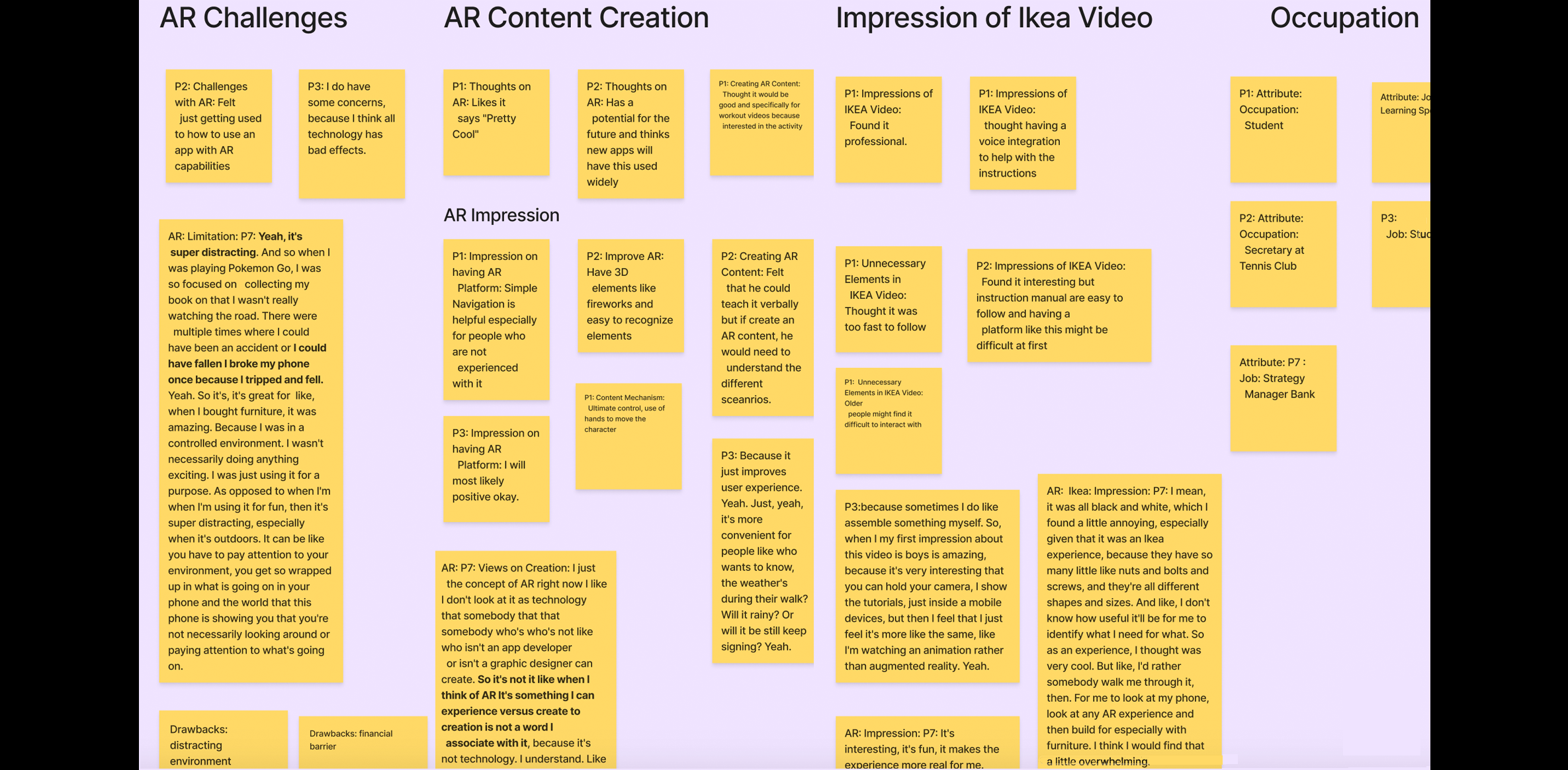
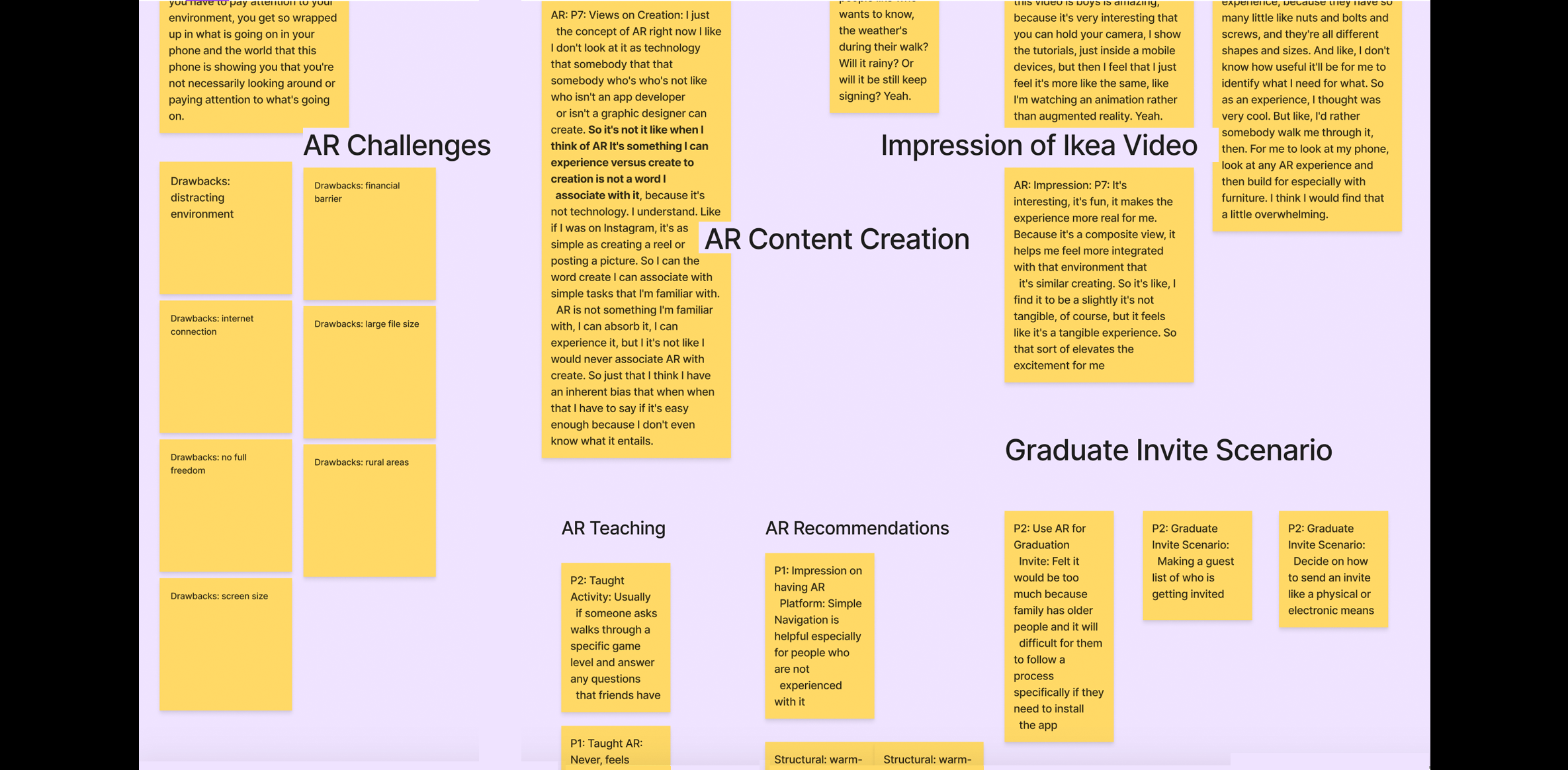
In the “deep focus” section of the interview, we asked participants to walk us through their process of showing someone how to perform an activity. This could be any form of activity, but also be related to their hobby. The deep focus section of our protocol also involved showing the participants videos based on the level of familiarity with creating AR they indicated on the questionnaire. If they indicated 1 or 2, we then shared an external link to a video that showed a demonstrative assembly of IKEA furniture using an AR app called AssembleAR. After they watched the video, we asked the participants about their impressions as on IKEA AR experience and what they feel about creating such content.
If the participants indicated a 5 or 6, we gave them a scenario to imagine creating a graduation invite for their brother and asked them to explain their process and the tools they would use. We then shared a link to a video from an app named iGreet that showed a birthday greeting card. After they watched the video, we asked the participants to share would they change about the invite, what was challenging and what was their overall impression.
- Wrap-up and Demographics
- We ended our interviews by asking a few demographics questions relating to participants’ occupation, gender, and ethnicity.
- Coding the transcripts:
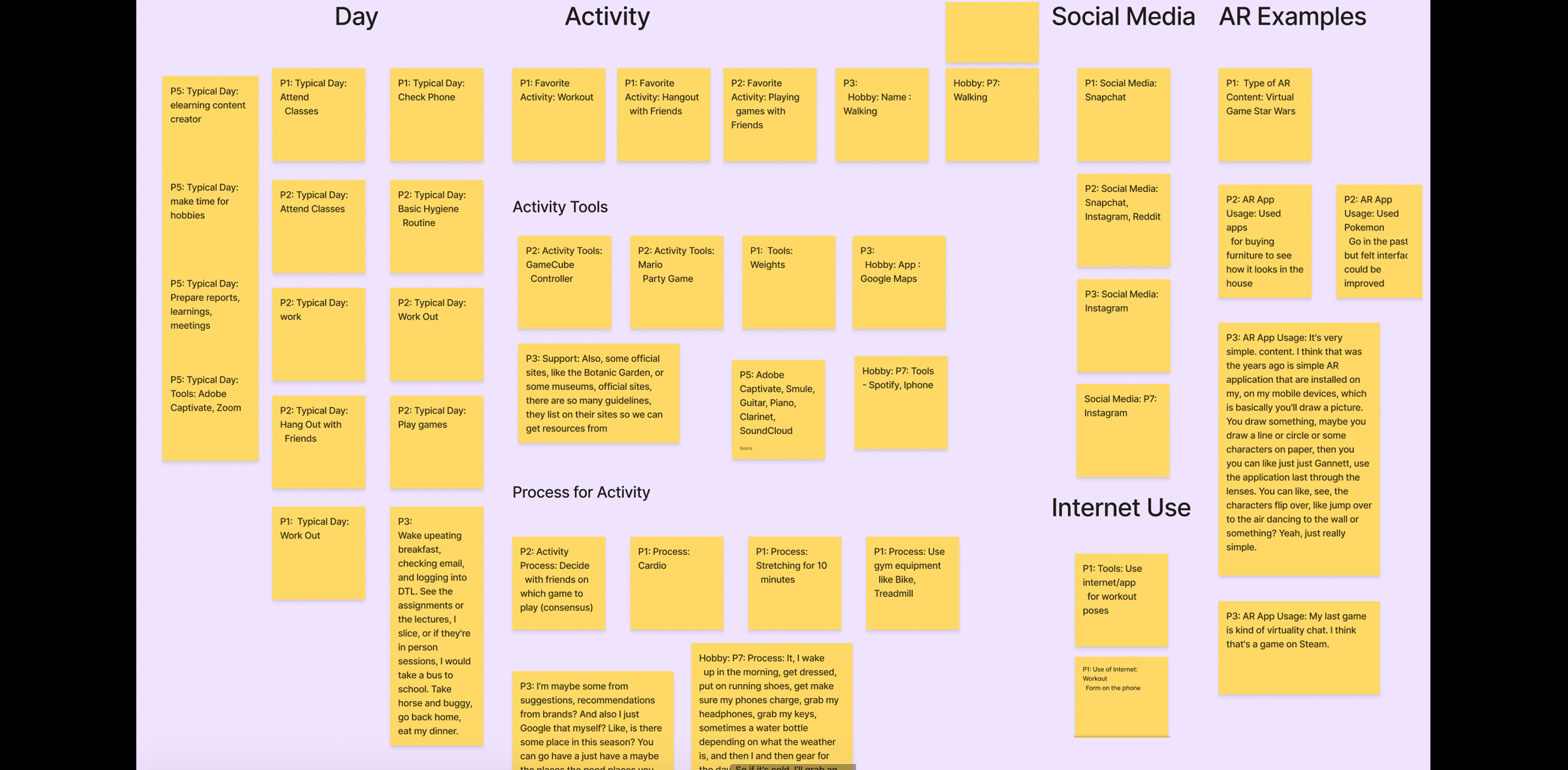
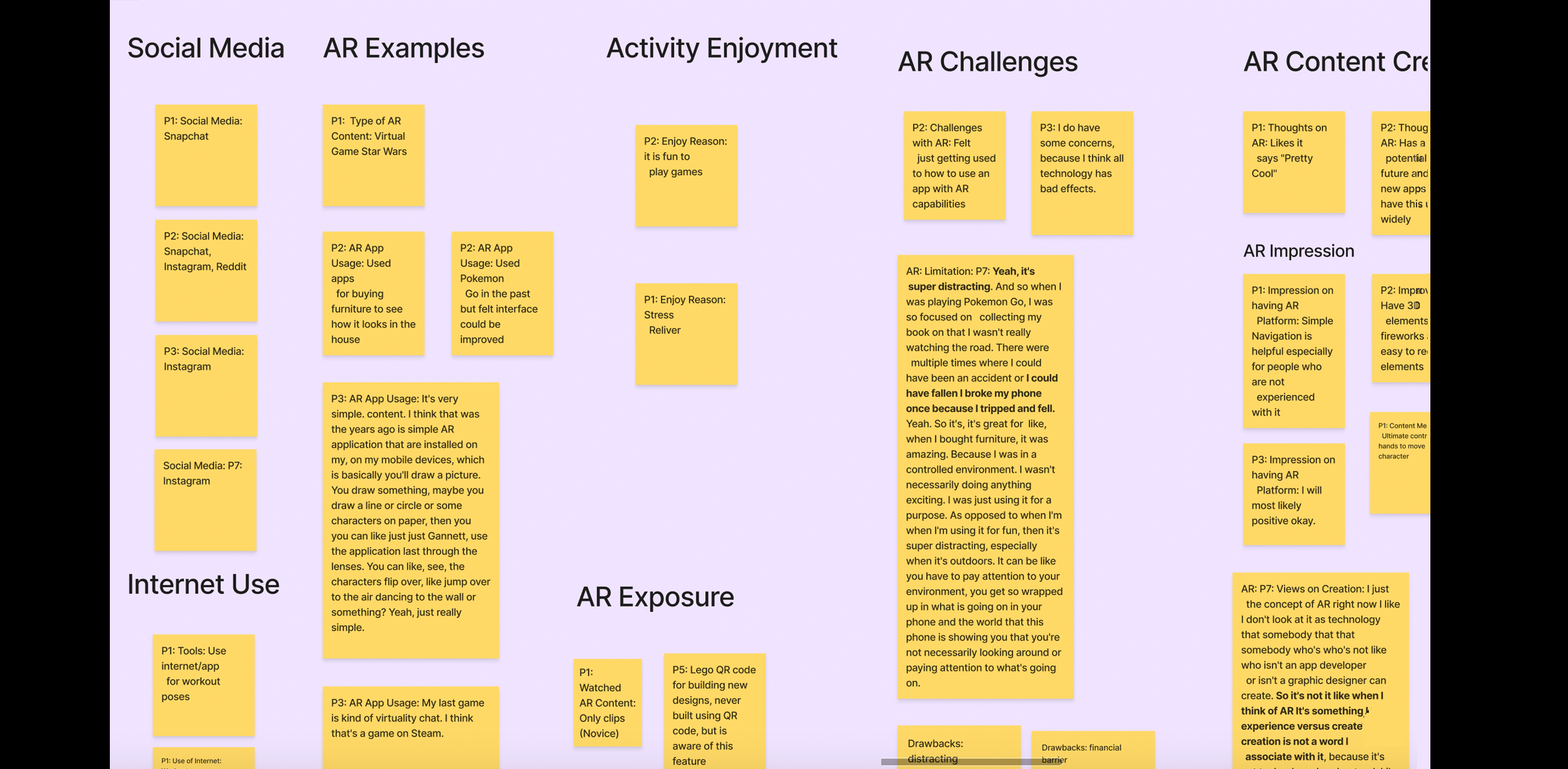
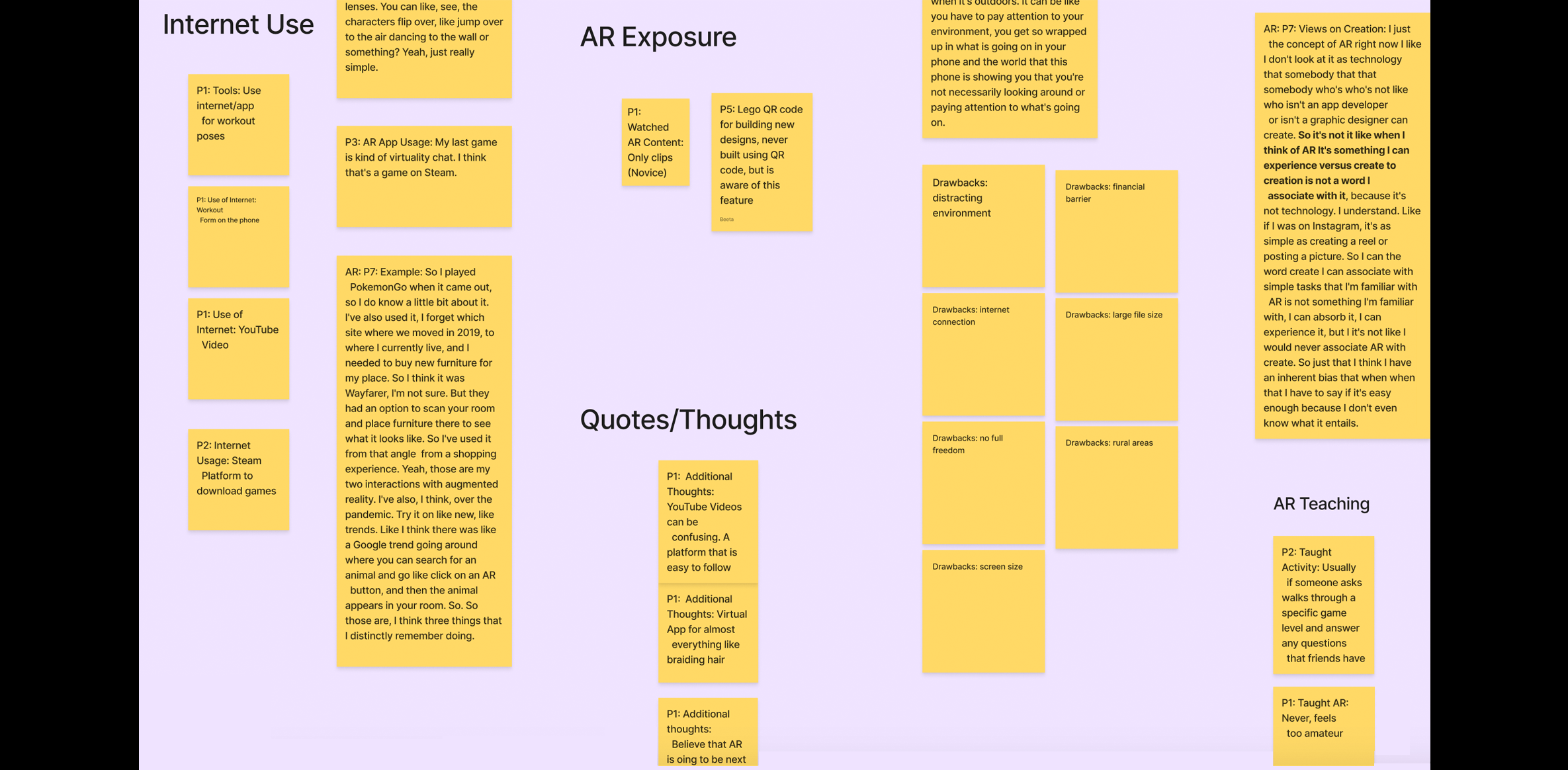
- We recorded the user interviews and transcribed them using Otter.ai. Then, each team member uploaded the transcription to Atlas.ti and open-coded the interviews according to what we felt was relevant. Coding triggers included demographic information, negative words such as “difficult, constraining, confusing” and positive words such as “like, helpful, useful.” We also captured comments and quotes related to their hobbies, daily activities, tools, suggestions for features to include in our platform, and perceptions of what they felt was missing from current AR tools. We also inquired about their motivations for using AR, and how they would use AR to enhance the experience of their hobby.
We exported our Atlas.ti codes to Excel, and then to a “FigJam” board to analyze and organize the main themes from the interviews. This allowed us to collaboratively work on the platform to create an Affinity Diagram. The discussions during that session helped us come to conclusions about our personas and ideas for our card sort categories and cards.
Interview Participants
We recruited nine participants through convenience sampling and the CDM Participant Pool. Note: *Participants were designated as “Novice” users if they stated that they had never made AR content before.
| Participant | AR Knowledge | Age Range | Occupation | Gender | Ethnicity | Hobby |
|---|---|---|---|---|---|---|
| P1 | Novice | 18-24 | Student | Male | African American | Working out |
| P2 | Novice | 18-24 | Secretary at Tennis Club | Male | Caucasian | Playing games with friends |
| P3 | Novice | 18-24 | Student | They | Asian | Walking |
| P4 | Expert | 45-54 | 3D Modeler/Engineer | Male | Caucasian | Beer making |
| P5 | Novice | 35-44 | Learning Specialist | Female | Caucasian/Hispanic | Music |
| P6 | Expert | 18-24 | Student | Female | Biracial | Figure Skating & Social Media Content Creation |
| P7 | Novice | 25-34 | Strategy Manager at a bank | Female | Asian | Walking |
| P8 | Expert | 25-34 | Staff Product Designer; UX Technologist & VR/AR Enthusiast | Male | Caucasian | Photography, social media |
| P9 | Expert | 45-54 | UX/UI Designer | Female | Caucasian | Walking, Pilates, reading books, watching Netflix |
Diversity and Accessibility Considerations
Our team took several steps to include diverse participants based on age,level of experience with augmented reality, English as a second language, learning styles, vision impairments, hearing loss, access to latest technology, and whether they were “digital or non-digital natives”. First, we included definitions of augmented reality and content creation tools in our live interview and prototype evaluation scripts to ensure a common understanding of the domain area. During the live interview phase, we spoke with a participant in her fifties who started her career in photography and came to technology much later. That participant took a 6-week course on AR and expressed challenges with learning the ZapWorks software due to how “buggy” it was and that it required the assistance of an instructor to provide “workarounds” to complete tasks. From that interview, we wanted to ensure that our platform was intuitive and included integrated Help and guidance. We also interviewed an experienced AR enthusiast in his thirties who suggested that allowing the user to “tinker” with existing 3D models and pre-made templates would help the novice user “see what’s possible” and make them feel successful right away. He expressed that his learning style is to “take things apart” to see how they are made and “deconstruct stuff to understand it better.” Based on his feedback, we included several “starter” project templates, pre-made elements, and a gallery of inspiration to make the novice user feel confident and support the learning style of “reverse-engineering.”
Interview Findings
Based on our 9 interviews, we identified 2 primary users: Novice and Expert.
Novice
Five out of 9 participants (P1, P2, P3, P5, and P7) of our live interviews were categorized as “novice” users. All 5 novice users indicated “1- not at all familiar” on the 5-point Likert-scale question about their familiarity making AR content and they also shared some concerns. One of the participants (P2) said, “Getting used to how to use an app with AR capabilities.” Another participant (P5) specified that “some people may only be able to afford the bottom tier, they may not have unlimited data, there may be things that happen beyond our control, like power outages, or, or other things where internet connection suddenly gets severed.
Since we showed novice users the IKEA furniture video, all the participants shared impressions that were both positive and negative. Three out of the 5 novice users (P1, P5 and P7) found the video to be interesting. Two of participants (P2 and P3) found it difficult to connect with it, with one (P2) mentioning that the “instruction manual are easy to follow and having a platform like this might be difficult at first.” Another participant (P3) said, “It’s very interesting that you can hold your camera, I show the tutorials, just inside a mobile device, but then I feel that I just feel it’s more like the same, like I’m watching an animation rather than augmented reality.”
Expert
Four out of 9 participants (P4, P6, P8, and P9) of our live interviews were categorized as “expert” users. All 4 “expert” participants who have used AR platforms in the past suggested some improvements that they would like to see in an AR platform. One of the participants (P4) suggested having tutorials, a “Preview” feature, ability to see the programming side of the platform, and better file management. Another participant (P8) suggested that a AR platform should provide webinars, customer support and examples of what is possible.
Additionally, the expert participants also shared the frustrations and limitations they faced while making AR content on other platforms, which also confirmed some of the drawbacks we found during our competitive analysis. One participant (P4) said that “additional add-on was required, and it was a content specific platform so unable to adapt.” They also mentioned that the software required frequent troubleshooting, has limited instructions, and has an unfriendly user interface.
Insights
Considering the thoughts and impressions shared by the participants, we organized our interview findings into 3 main categories 1) Ease of Use, 2) Simple Onboarding, 3) Functionality.
- Ease of Use:
- All 9 participants highlighted having an easy-to-use AR platform that has easily recognizable UI elements and is simple to navigate to effectively create AR content. Expert users utilize an AR based platform to create content that relates to their hobbies such as painting and photography, while novice users expressed interest in exploring and creating AR content. However, both types of users stated that not having the right features in an AR platform makes it challenging to create effective AR content.
- Simple Onboarding:
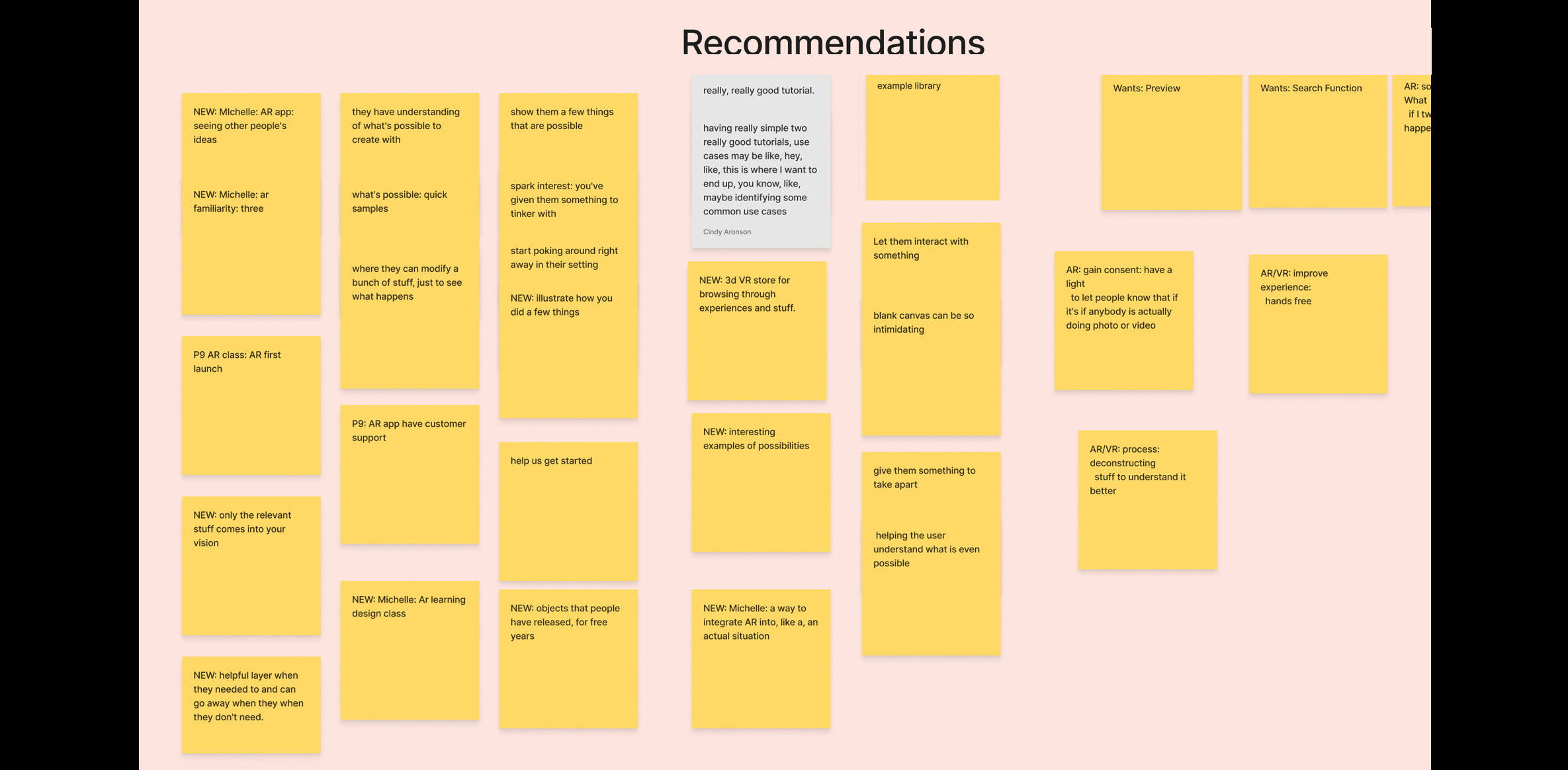
- Seven out of 9 participants said that they would prefer to have an AR platform with simple onboarding and “help” features. One participant said, “With AR you don't want to have like a whole lot of stuff. You want it to be simple.” Four out of 9 participants wanted feedback on where they are in the process when creating AR content. One participant even mentioned that a “blank canvas can be intimidating” and suggested, “helping the user understand what is even possible and help them visualize the steps.”
- Functionality:
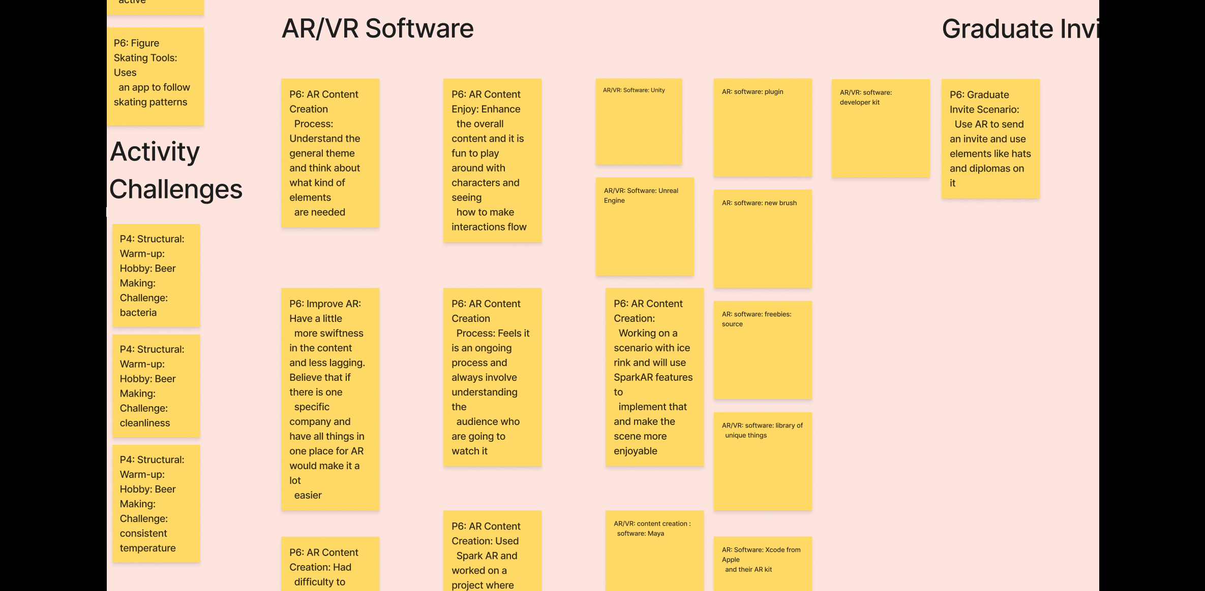
- Six out of 9 participants highlighted that since AR is “the next big thing,” the platform’s performance should be seamless and uninterrupted. Participants who had experience using an AR platform, SparkAR, noted difficulty dragging and dropping objects to the workspace and a lag in the system during the content playback. One participant mentioned that when using SparkAR, an Augmented Reality application, it was “sometimes hard to test it out and move objects especially when dragging and dropping them in the scene.”
Based on these findings, we decided to integrate the following features into our system:
Method 4: User Personas
- Goal (contribution to the project):
- Generate user personas based on the interview responses. This will give us a better understanding of who the “archetype” users could be and empathize with their pain points, motivations, and goals. This will allow us to seek ways to design an enriching and meaningful AR experience within our platform.
- Detailed Method Description
- After conducting and analyzing our 9 user interviews, our team created 2 distinct user personas in Figma: Olivia, an Occasional Educator (Novice User) and Aaron, AR Content Creator (Expert User). Both personas include a brief biography, a quote, the motivations, frustrations, goals, personality traits, and brands they are familiar with.
- Results
- We used qualitative interviews to better understand the pain points of expert users when making AR content and derive inferences about what hesitations novices may have towards making AR content. After the interview, we synthesized our transcripts and notes to highlight major themes. The themes and trends we analyzed from the interview data helped us create two user personas: Olivia and Aaron. We highlighted the goals, motivations, frustrations, and personality that we felt were most relevant and that presented opportunities that our platform could address. These personas served as a guide for designing our lo-fi prototype.
If AR was easy enough to create content for, I would use it to teach others because I believe it's going to be the next "big thing" in YouTube."
- Bio:
- Active on social media and posts about her origami creations.
- Motivations:
- Interested in educating people about the craft of origami.
- Goals:
- Looking for a better way to demonstrate origami technique.
- Frustrations:
- Finds it difficult to create video animations.

Olivia the Occasional Educator
Novice with AR


I like to tinker and experiment with AR to learn how things are built. I'd appreciate a platform where the community has a centralized way to share what they've made, build upon it, and learn what's possible.
- Bio:
- Web developer with a passion for photography and AR.
- Motivations:
- Interested in sharing how to create complex AR creations.
- Goals:
- Wants to build a library of multi-player AR games.
- Frustrations:
- Looking to dive deep into the code and have easy previewing.

Aaron the AR Content Creator
Expert AR Creator


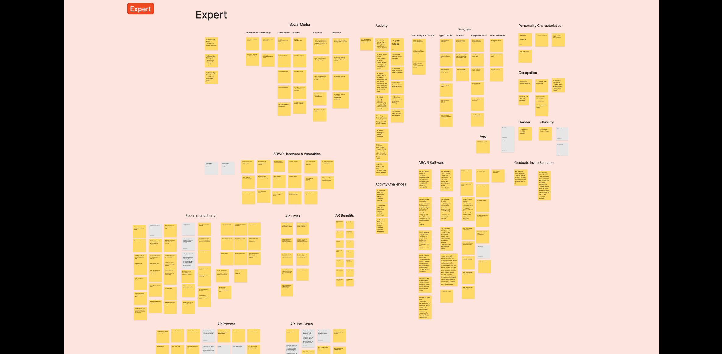
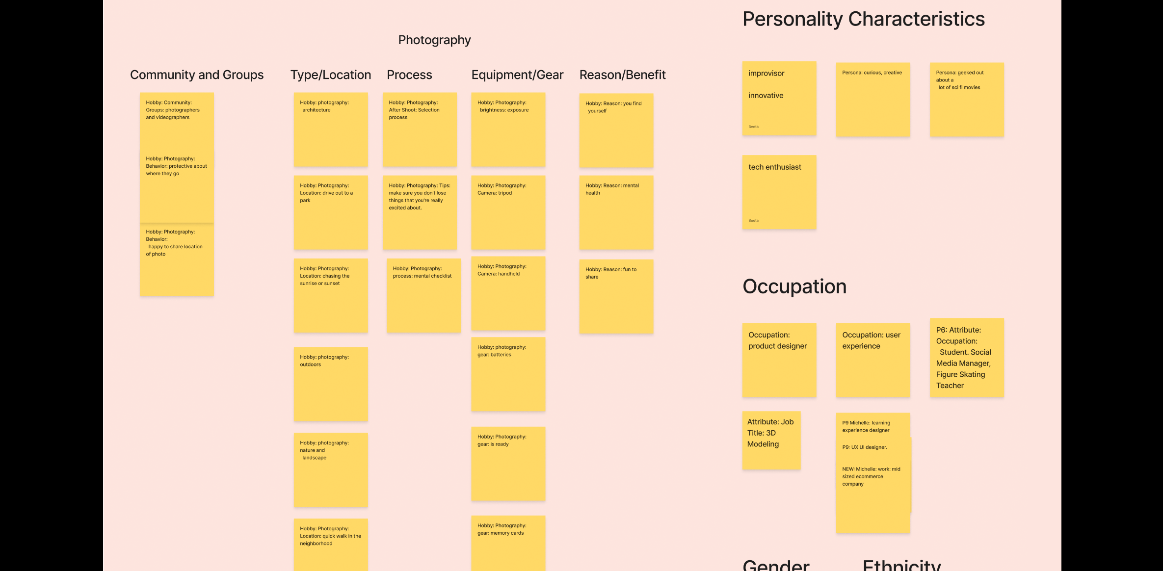
Affinity Diagrams
After coding our interviews, we organized the data into salient themes and categories based on Expert and Novice users.
Expert User Categories:
- Social Media (Community, Platforms, Behavior, Benefits)
- Activities and Hobbies, including challenges
- Demographics (Personality Characteristics, Occupation, Gender, Ethnicity, Age)
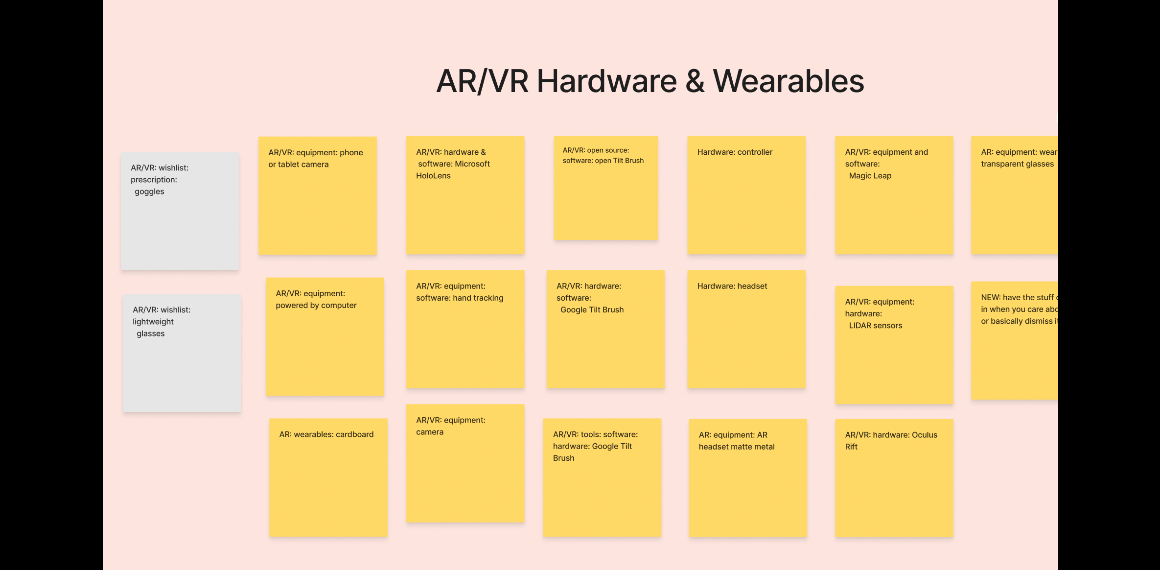
- AR/VR Hardware and Wearables
- AR/VR Software
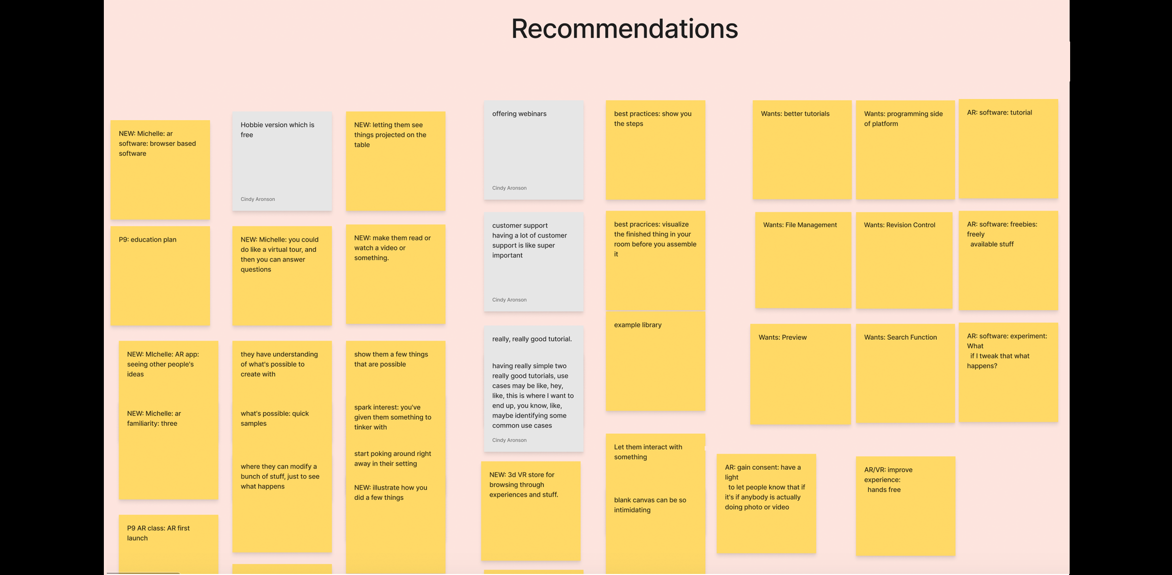
- Recommendations for AR experience
- AR Benefits and Limitations
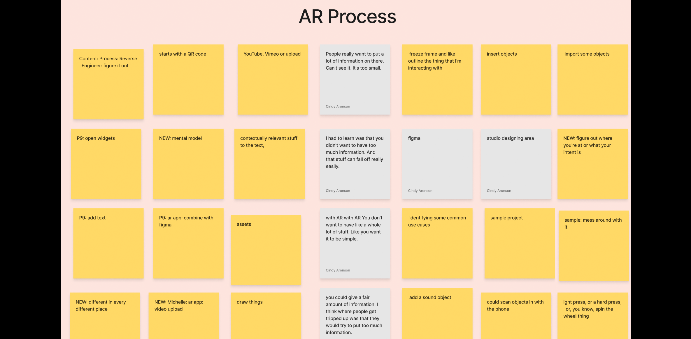
- AR Process
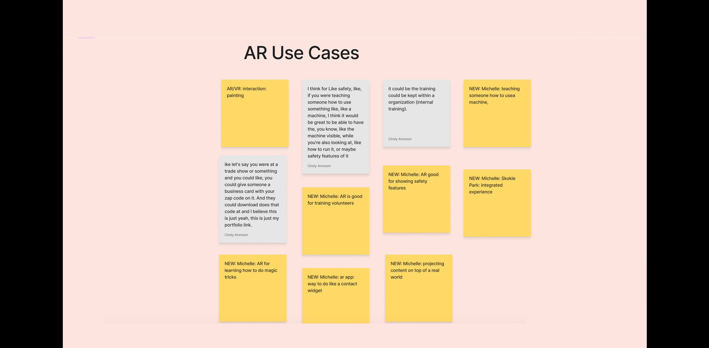
- AR Use Cases
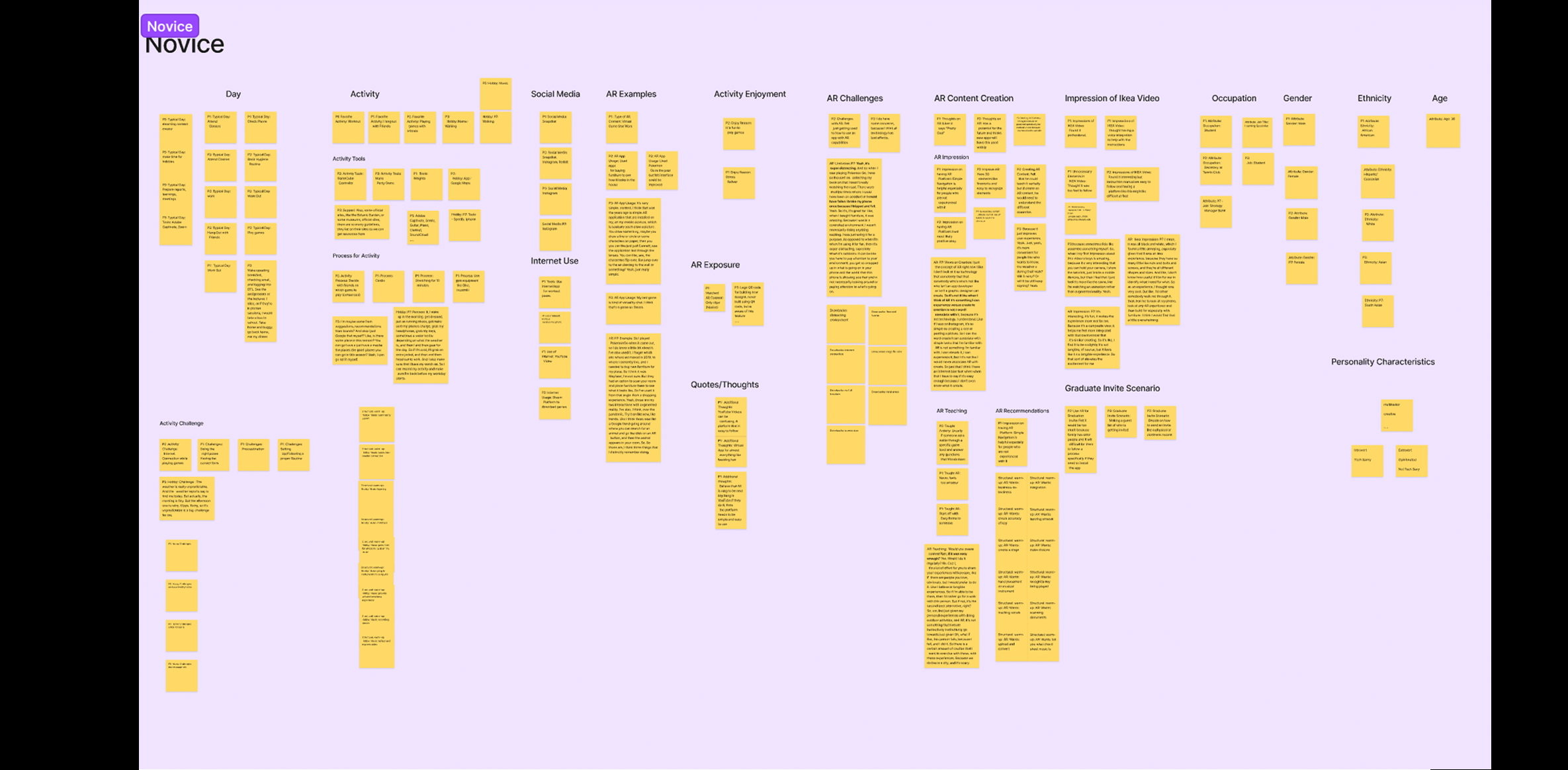
Novice User Categories:
- Typical Day Activities
- Tools and Processes for engaging in Activities
- Social Media and Internet Usage
- AR Examples
- AR Challenges
- Recommendations for AR experience
- AR Content Creation, AR Teaching, and Graduate Invitation Scenario
- Impression of IKEA AR Video
- Demographics (Occupation, Age, Gender, Ethnicity, and Personality Characteristics)
3. Define
Methods for this phase
Method 5: Open Card Sort
- Goal (contribution to the project):
- Conduct an open card sort activity within our team that will help us decide the overall flow of our platform. This will help us determine the best process that our target users will follow and provide us with the opportunities to decide on card names for our hybrid card sorting activity.
- Detailed Method Description
- The open card sort allowed each team member to brainstorm ideas on categories for a card sort. We used data from our interviews and competitive reviews to develop the categories. We then added these cards and categories to another FigJam and met to discuss our rationale for the choices made, and how the proposed structure would help both novice and expert AR users move through the application. We transferred our list to an Excel spreadsheet and had a cumulative total of 112 cards, after removing duplicate instances. We consolidated our list of cards to arrive at a total of 64 items (9 categories and 56 cards).
- Results
- Each team member individually brainstormed navigation options for our platform. A total of 165 navigation options were generated and as a team we put them on the Excel sheet, performed an open card sort, and then discussed which cards and categories are important to include in our hybrid card sort activity. This activity also allowed us to understand the major workflow of our platform and gave us an idea of what features are important to include.
Method 6: Hybrid Card Sort
- Goal (contribution to the project):
- Conduct and analyze a hybrid card sort for our AR-based platform. How participants categorize items will determine the navigation, category names, and information architecture and hierarchy of the prototype.
- Detailed Method Description
- Twelve remote participants from our class completed this activity. Using the insights from our design charrette exercise, we identified the primary categories and the cards that would nest within those categories. Optimal Sort was used to create and analyze digital hybrid card sort.
Participants were asked to share their responses to the following pre-test and post-test questions:
- Indicating on a scale of 1 to 5, their level of familiarity with creating AR experiences
- Sharing any category that they felt we overlooked and should include in our platform.
- Results
- The card sort was attempted by 15 participants, out of which three abandoned and 12 completed it. Seven out of 12 participants were not familiar with creating AR content, 3 out of 12 participants were somewhat familiar with creating AR content, and 2 out of 12 participants were moderately familiar with creating AR content.
- Assets
- Camera
- Edit
- File
- Help
- Insert
- Tools/Objects
- View
- Unsure
- I don’t know what that is
Participants were asked to categorize 56 cards under eight categories.
Participants also created two additional categories, where they placed 4 of the 56 cards. Because the occurrence of cards in addition to other categories was low, we did not consider these categories as a part of our results:
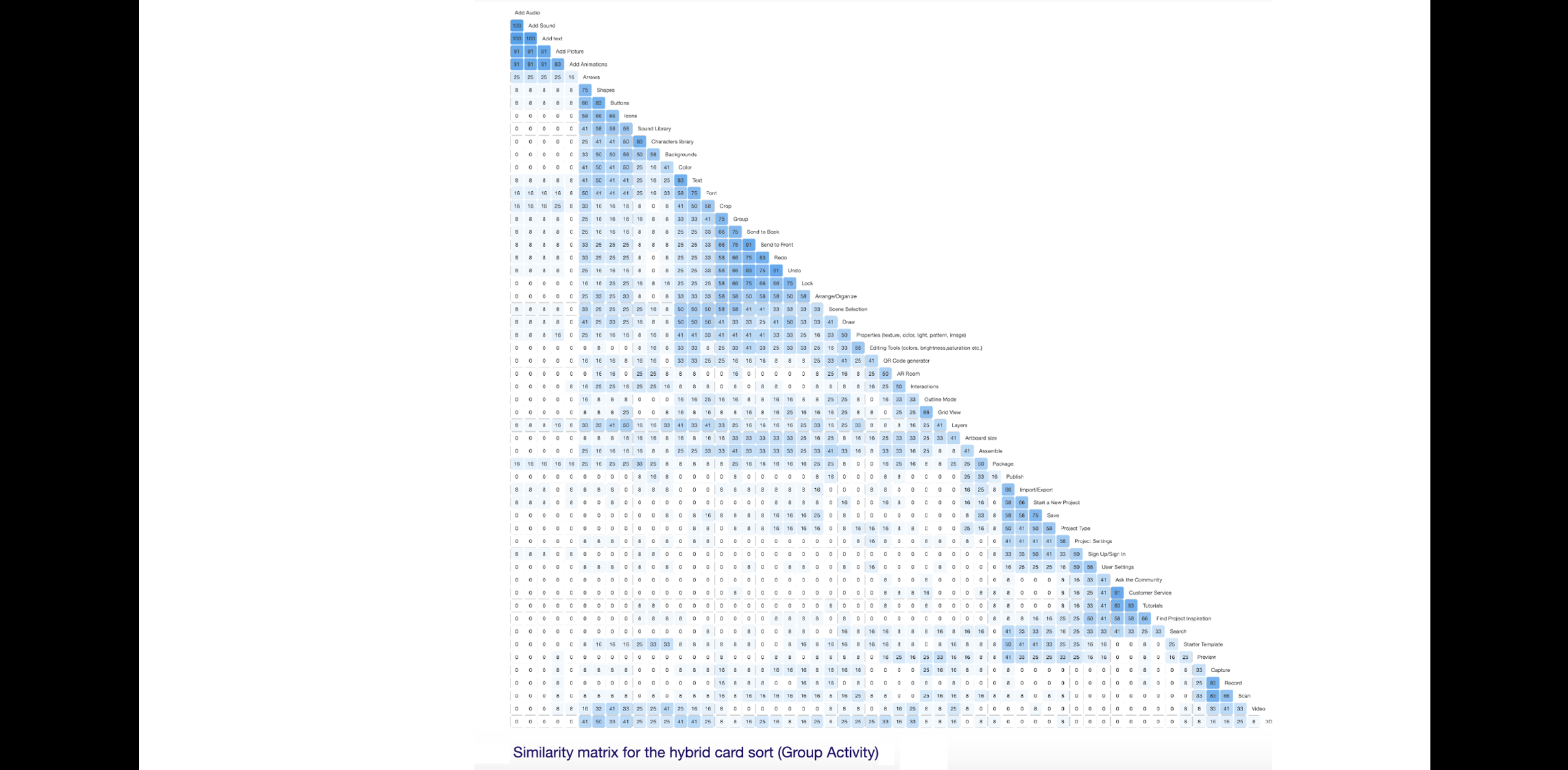
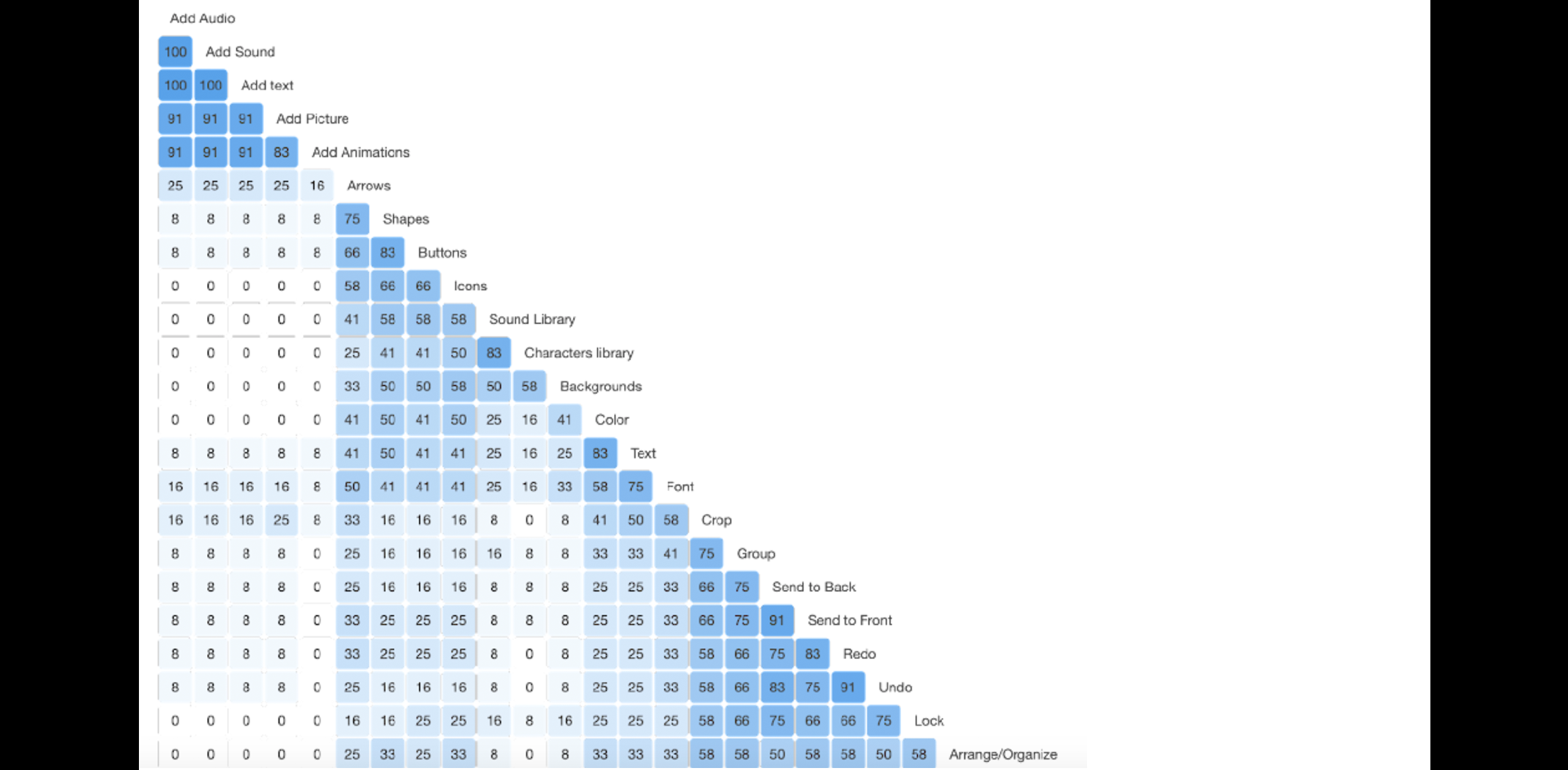
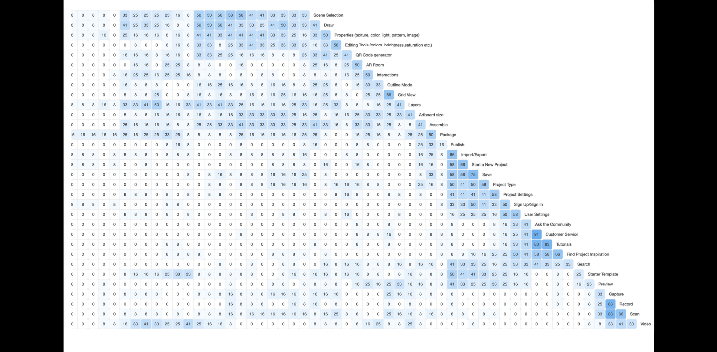
The highest percentage of agreement achieved among cards was 100%, and the lowest was 8%.
Card Sort Results with Highest Agreement Percentages
The table below lists the cards with the highest percentage of agreement from highest to lowest and associated categories participants placed cards into. The cards above matched what our team intended. However, we determined that we should exclude “Add” from cards “Add Text, Add Animations, Add Sounds, Add Audio” as we felt it might be confusing and having it under “Insert” would itself be self-explanatory.
| Cards | Categories | Percentage of Agreement |
|---|---|---|
| Ask the Community | Help | 100% |
| Customer Service | Help | 92% |
| Record | Camera | 92% |
| Save | File | 92% |
| Add Animations | Insert | 92% |
| Tutorials | Help | 83% |
| Start a New Project | File | 83% |
| Send to Back | Edit | 83% |
| Capture | Camera | 83% |
| Add Text | Insert | 83% |
| Add Sound | Insert | 83% |
| Add Audio | Insert | 83% |
| Grid View | View | 83% |
| Add Picture | Insert | 75% |
| Characters library | Assets | 75% |
| Draw | Tools/objects | 67% |
| QR Code generator | Tools/objects | 67% |
| Scan | Camera | 67% |
| Sound Library | Assets | 67% |
| Undo | Edit | 67% |
| Publish | File | 67% |
| Project Type | File | 67% |
| Import/Export | File | 67% |
Card Sort Results with Lowest Agreement Percentages
The table below lists the cards with the lowest percentage of agreement; they are organized from lowest to highest, along with the associated categories participants placed cards into.
| Cards | Categories | Percentage of Agreement |
|---|---|---|
| Backgrounds | Tools/Objects | 8% |
| Sound Library | Insert | 8% |
| Color | View | 16% |
| Project Type | Edit | 16% |
| Publish | Assets | 16% |
| Project Settings | Edit | 16% |
| Group | Tools/Objects | 25% |
| Font | Edit | 25% |
| Artboard size | Edit | 25% |
| Layers | View | 33% |
| Scene Selection | Tools/Object | 33% |
| Assemble | Tools/Object | 33% |
| Starter Template | Assets | 33% |
| Interactions | View | 33% |
| Signup/Sign in | Help | 33% |
| Arrows | Tools/objects | 41% |
| Shapes | Tools/objects | 41% |
| Package | Assets | 41% |
| Buttons | Tools/Object | 41% |
| Preview | View | 41% |
| Video | Camera | 41% |
| Arrange/Organize | Tools/Objects | 41% |
| User Setting | Help | 41% |
| Search | Help | 41% |
| Preview | View | 41% |
Card Sort Results with Highest to Lowest Agreement Percentages
The overall percentage of agreement among cards and categories was low. The highest agreement rate reached among categories was 42%, and the lowest percentage was 19%. The table below lists the categories by the percentage of agreement from highest to lowest.
| Categories | Percentage of Agreement | Number of Cards |
|---|---|---|
| Help | 42% | 12 |
| Insert | 32% | 18 |
| File | 31% | 24 |
| Tools/Objects | 30% | 38 |
| Edit | 26% | 35 |
| Assets | 26% | 30 |
| Camera | 26% | 16 |
| View | 19% | 26 |
We determined that the primary reason the agreement among categories was low was that the participants placed so many different cards in each category. The main reasons we identified were:
- Some participants were confused between the categories "Tools/Objects" and "Insert" and they needed more context on what each of them meant.
- Not all our participants were quite familiar with the AR platform, so some card labels were unfamiliar.
The card sort results indicated that we need to revisit some cards and category names and make them more straightforward for our Lo-Fi prototypes. Therefore, based on all the data we collected from this card sort, we made the following changes to our cards and categories to start our Lo-Fi prototypes:
- We eliminated the “Insert” and “Tools/Objects” categories because we felt they both achieved the same tasks of adding objects or text, or other elements.
- We split the “Assets” category into sub-categories:
- Elements which included icons, background, buttons, 3D objects, Text, Pictures, Shapes, and Arrows
- Video Library that includes pre-loaded videos
- Sound Library that includes pre-loaded audio
- Tools which include a Pen tool, Brush Tool and Draw Tool
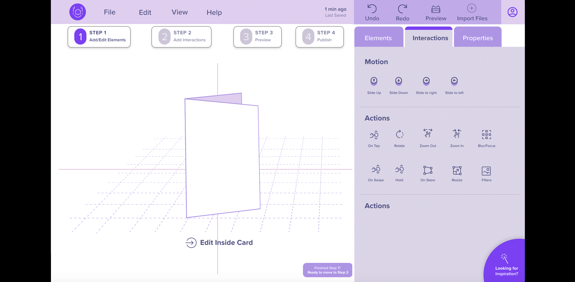
- We also included an additional category, “interactions,” that will list all the animations and gestures.
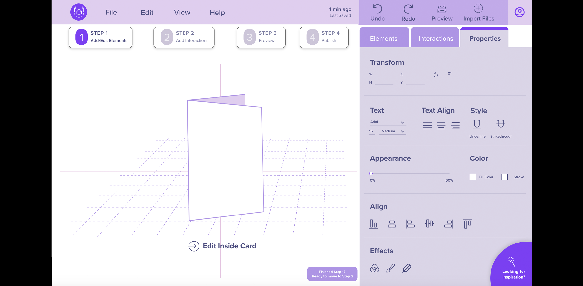
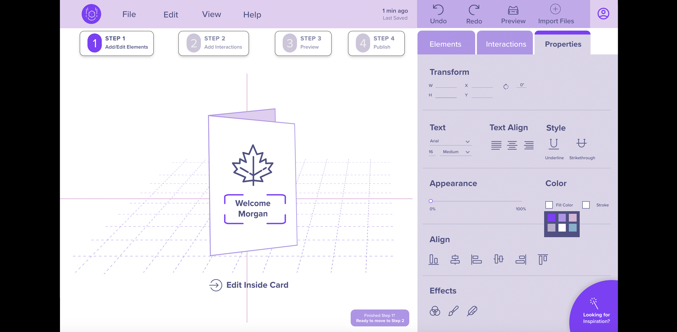
- Additionally, we decided to have a separate “Properties” category that will contain the options to modify properties of any element on the workspace.
Similarity Matrix for the Hybrid Card Sort (Group Activity)
4. Ideate
Methods for this phase
Method 7: Design Charrette (Sketching)
- Goal (contribution to the project):
- Conduct a design charrette to collaborate and quickly explore and generate ideas for the layout, navigation, organization, and structure for the major screens.
- Detailed Method Description
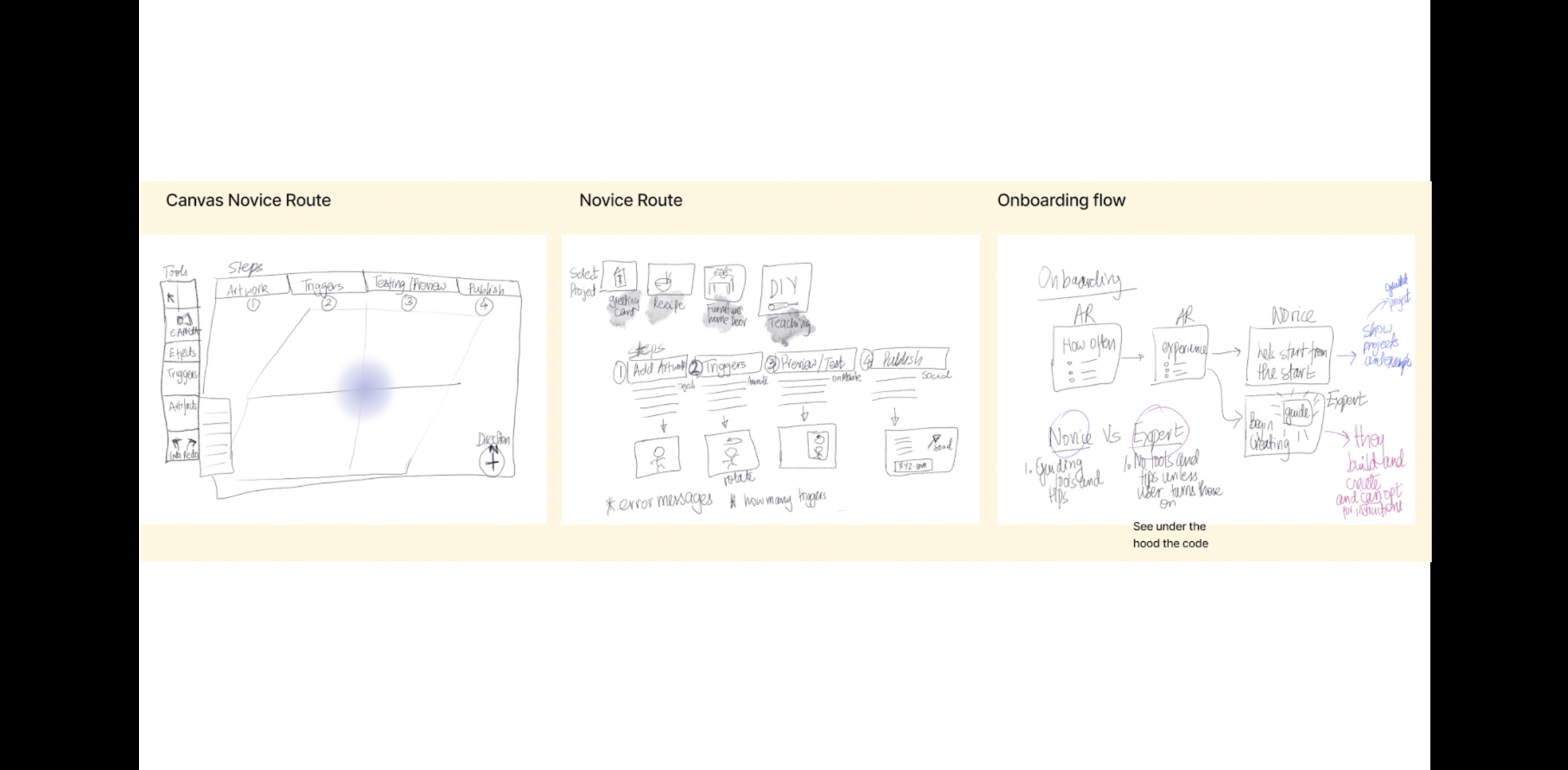
- After analyzing the card sort results, our team began sketching out the basic lo-fi prototypes. The team decided to use Figma for its collaboration capabilities that allowed everyone to work simultaneously on the prototype. Prior to designing the screens, each team member explored similar AR applications using online creative platforms such as Dribbble and Behance. We then individually sketched ideas using paper and pencil and Procreate (Tablet App). We discussed which screens and features were essential and listed what we needed to evaluate in our usability test session. The design charrette allowed each team member to brainstorm ideas by sketching design concepts separately then coming back to share with the team. We discussed the pros and cons of each approach.
- Results
- We combined the best ideas from the sketches to inform the Lo-Fi prototype design.
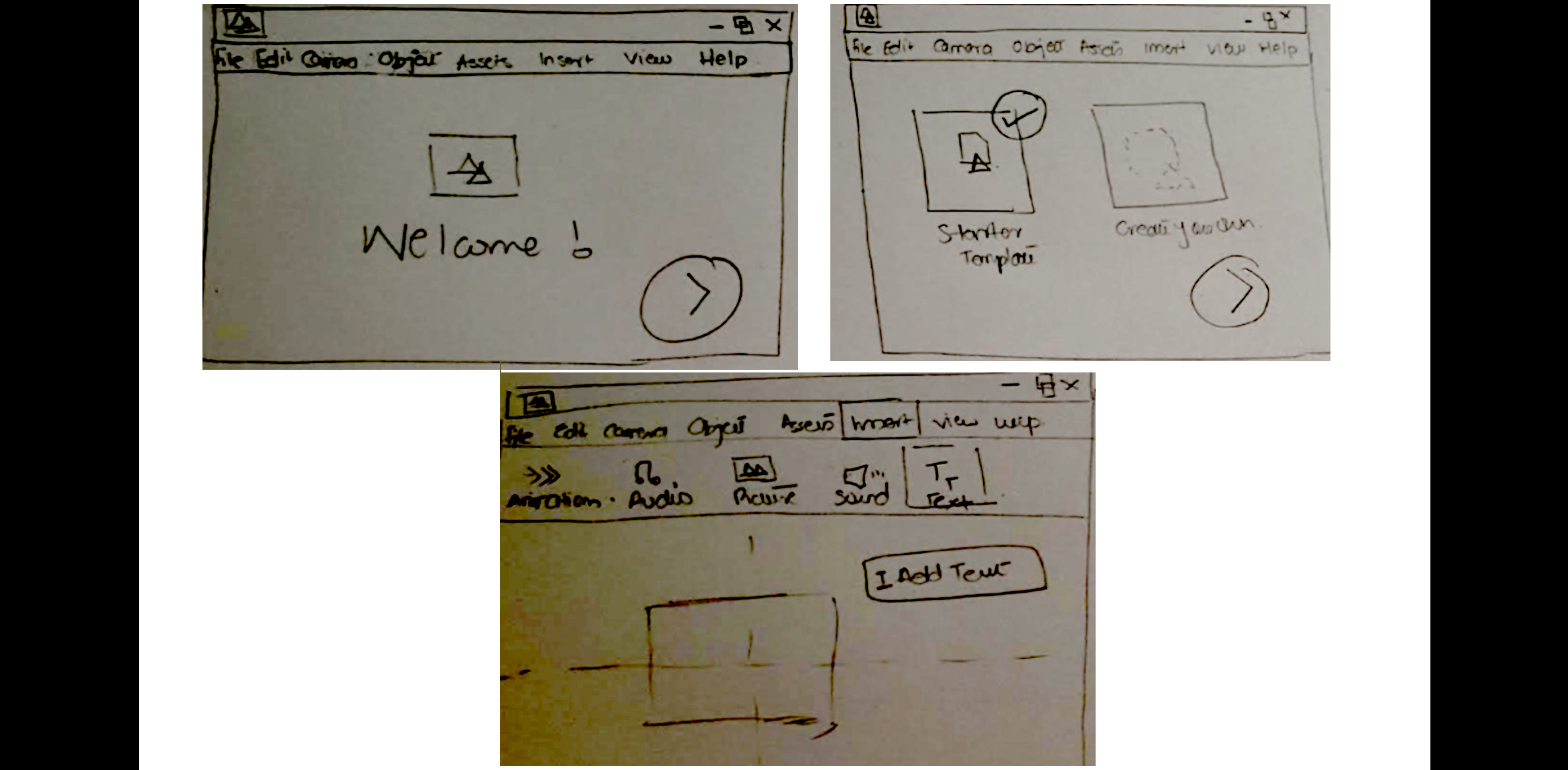
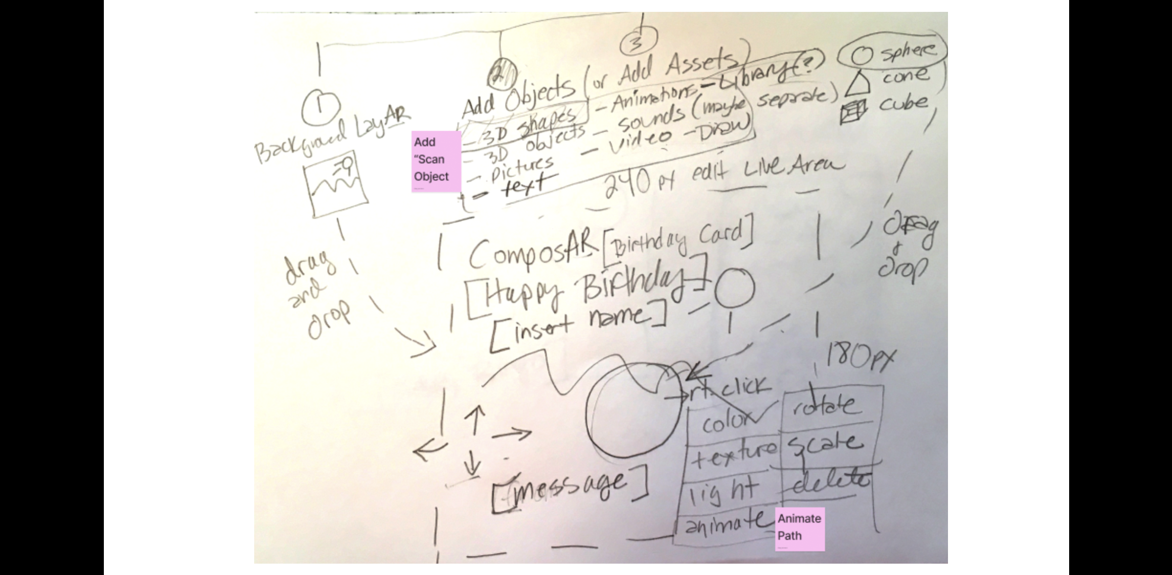
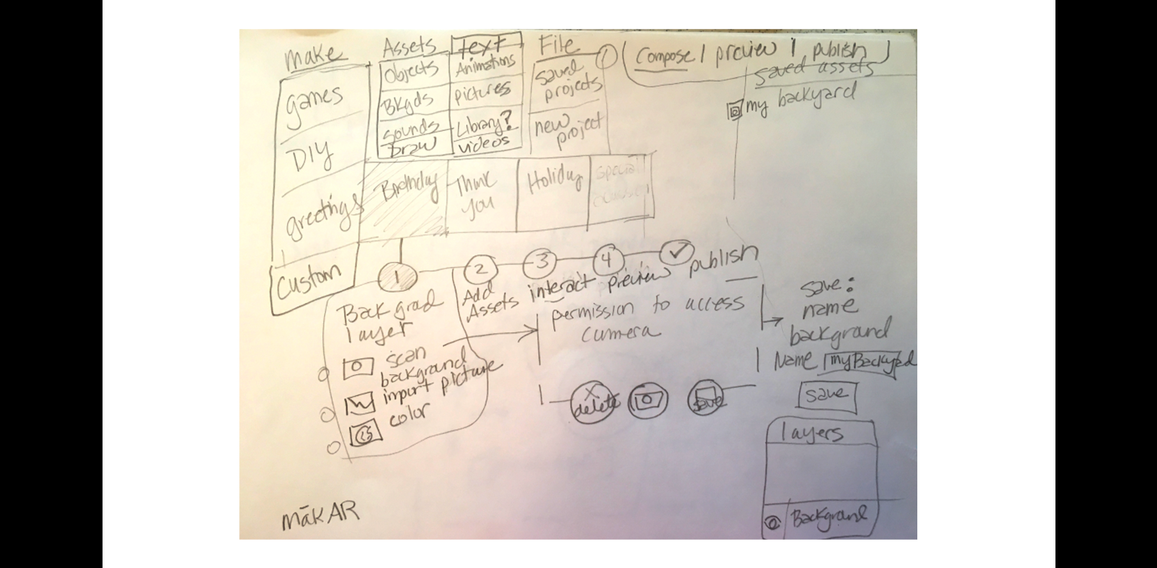
Sketches and Initial Wireframes
Each team member individually sketched layout ideas for our platform then explored translating them to wireframes.
5. Prototype
Methods for this phase
Method 8: Lo-Fi Prototyping
- Goal (contribution to the project):
- Create a low-fidelity digital prototype to showcase the concept, functionality, and prioritized design implications for our AR web-based platform.
- Detailed Method Description
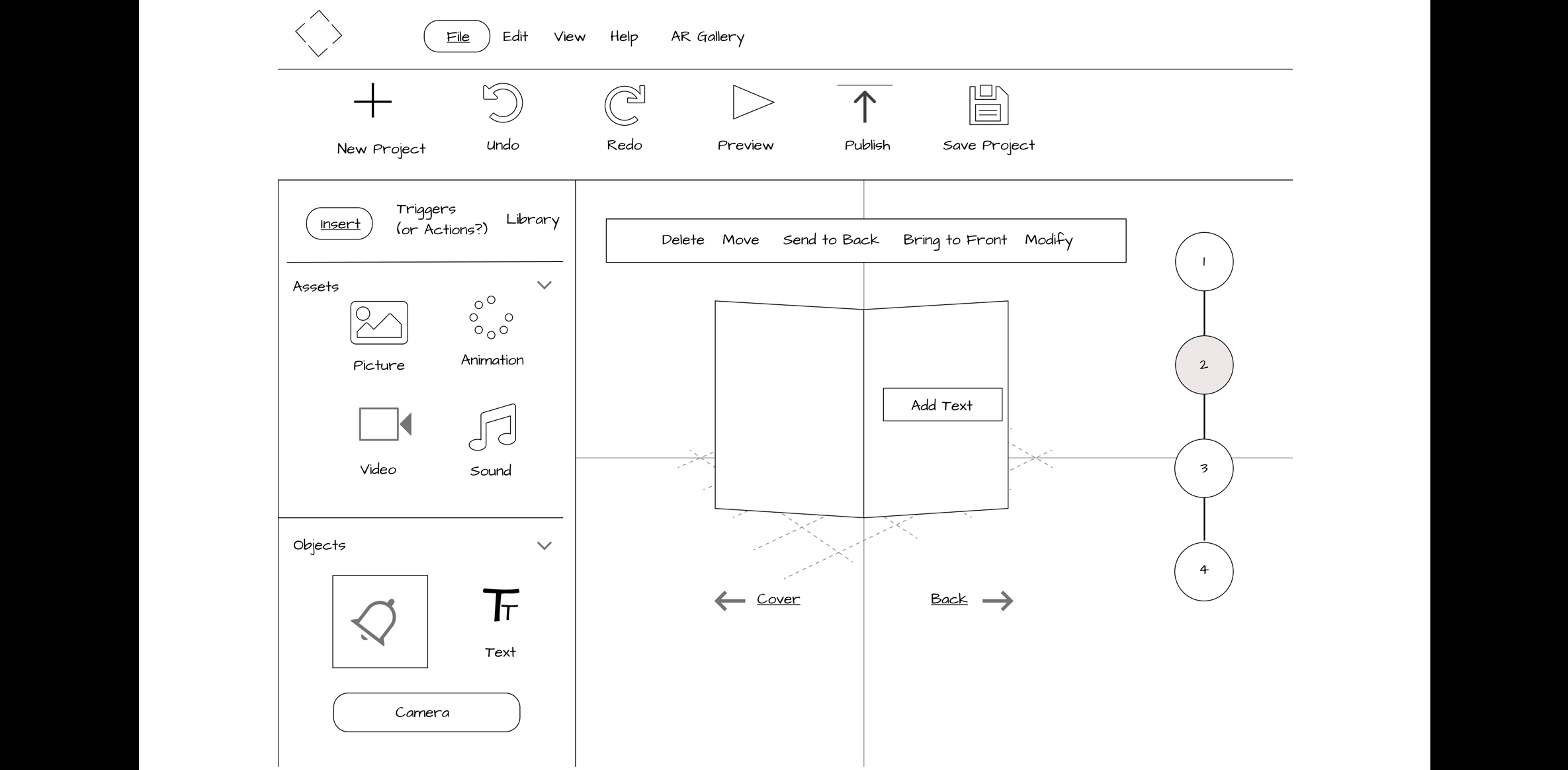
- We translated each sketch into a separate Figma wireframe. We further refined our concept by iterating based on team feedback. We consolidated the best ideas from each team member's design into one prototype and made it clickable in Figma for our usability testing.
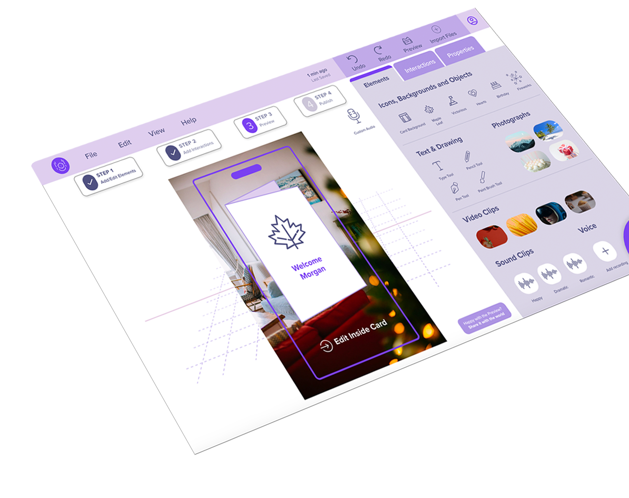
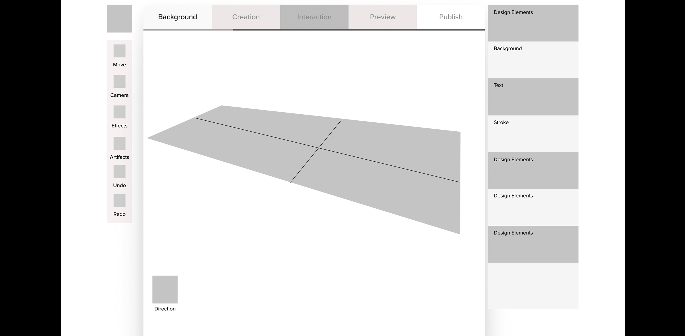
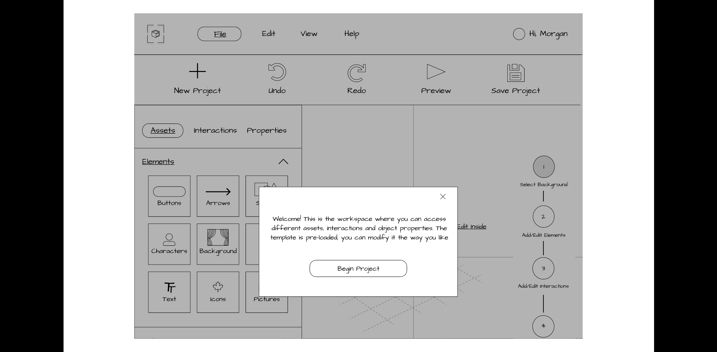
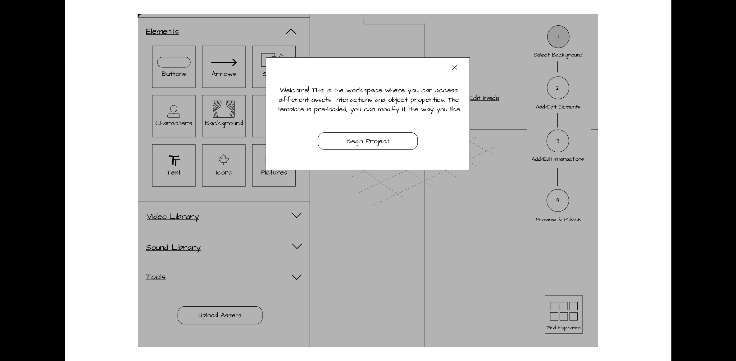
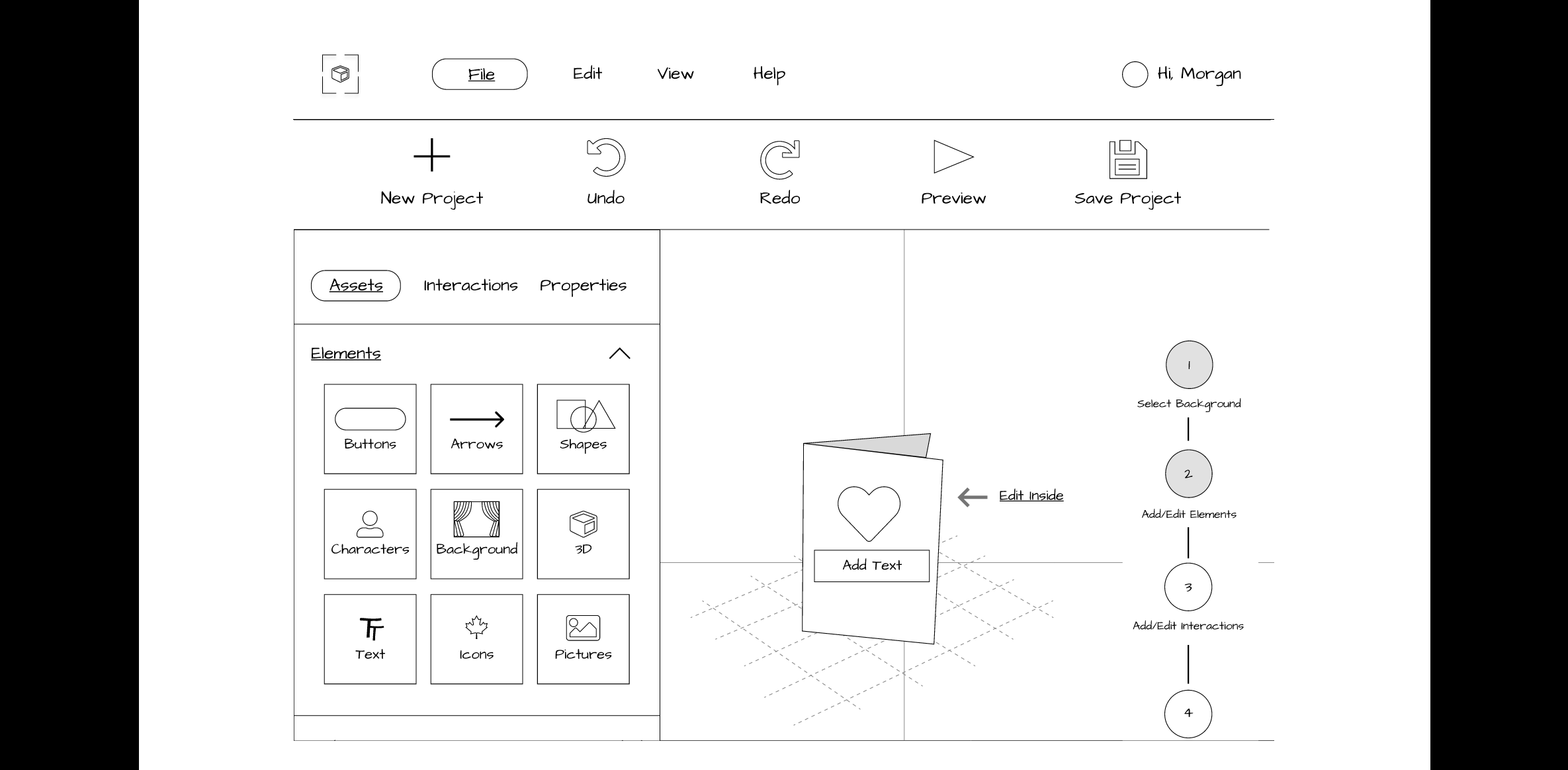
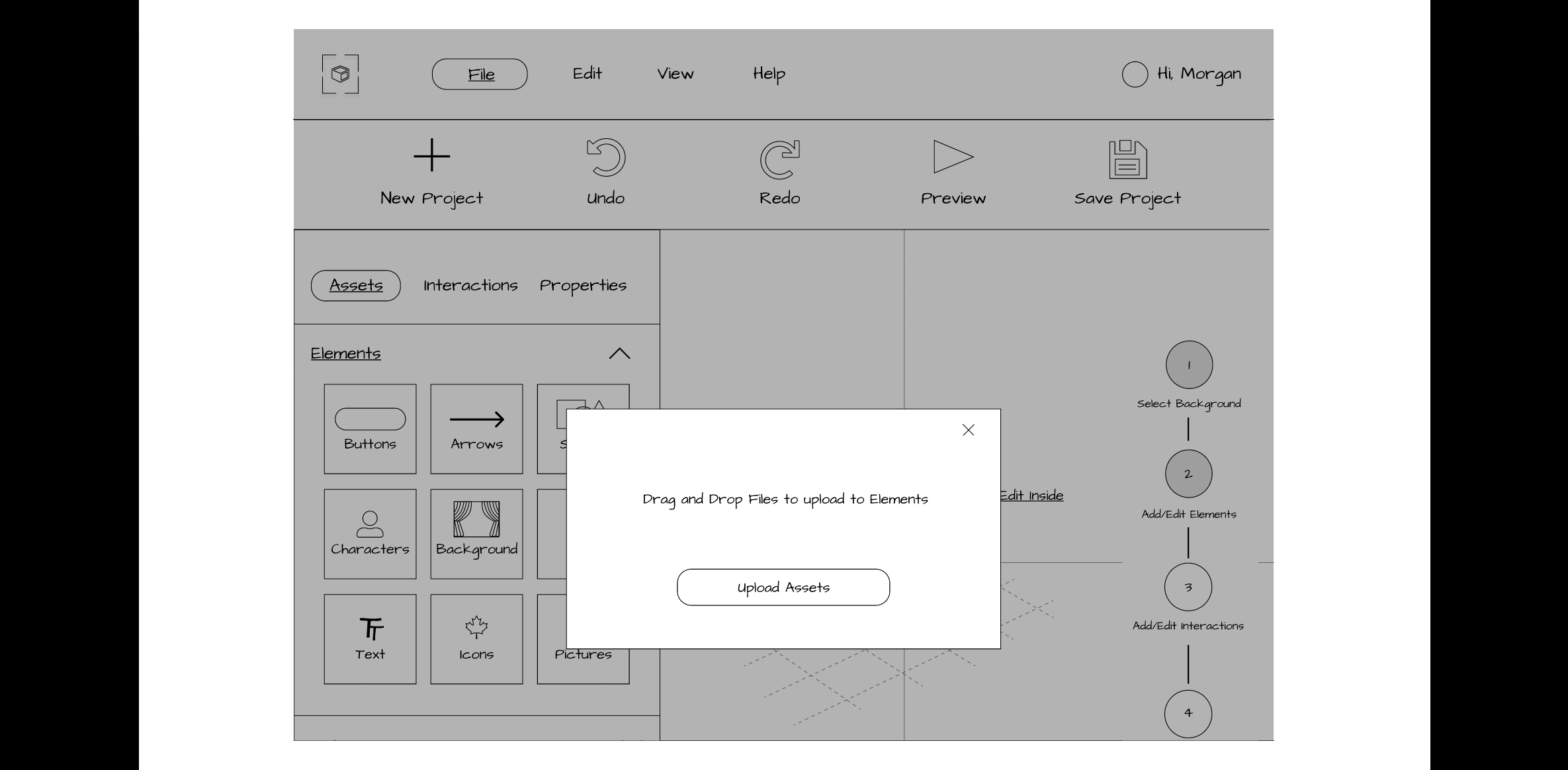
- Style: Our prototypes were created using a grey color scheme with a font that mimicked handwriting but was easy to read. We used universal icons, a basic logo and a simple, clean layout that was not too overwhelming for first-time users.
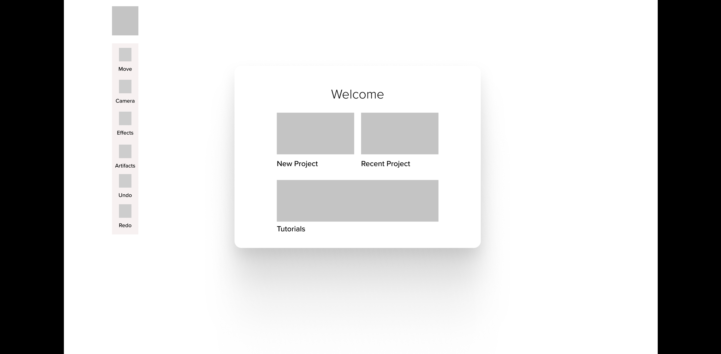
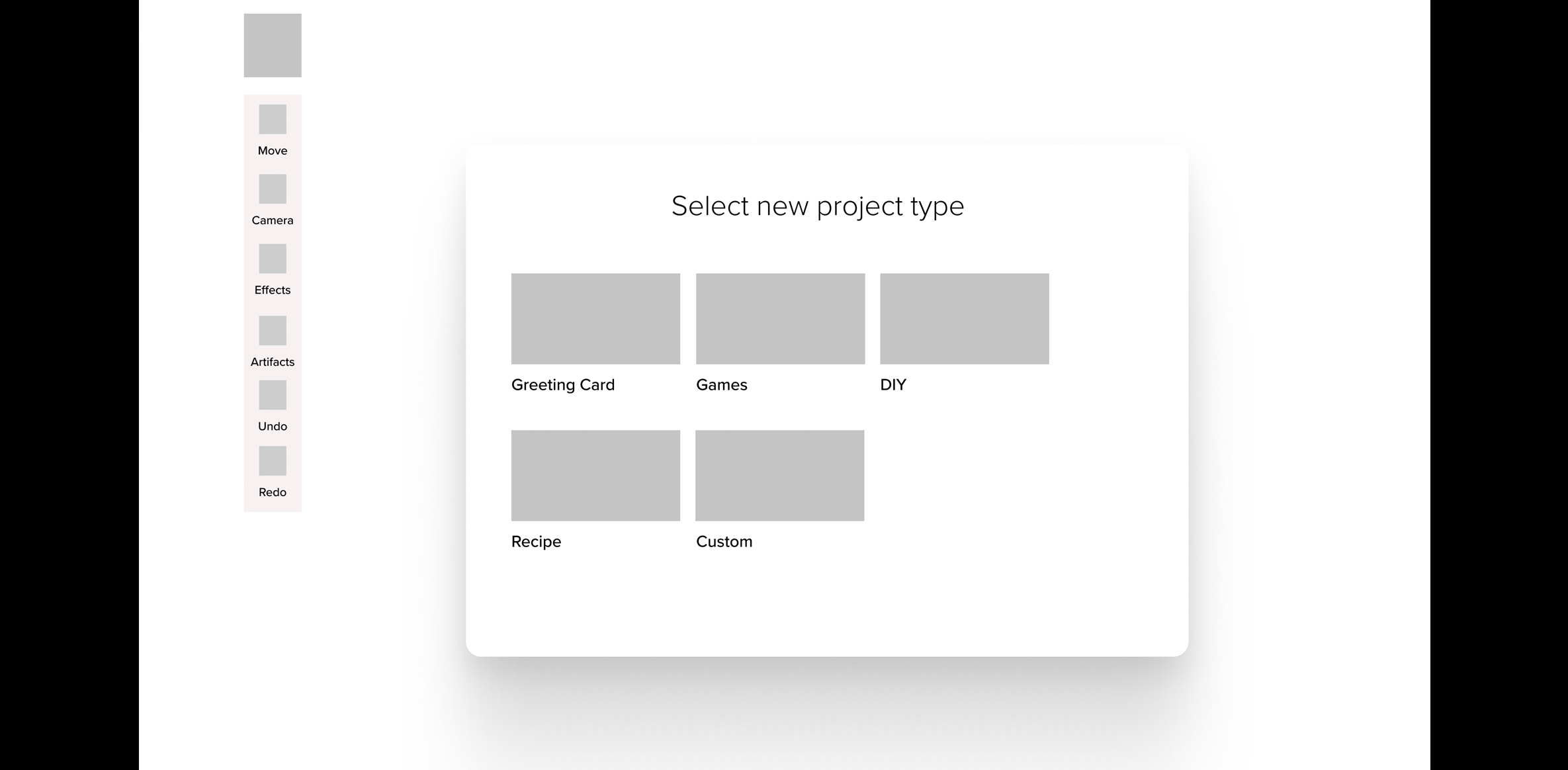
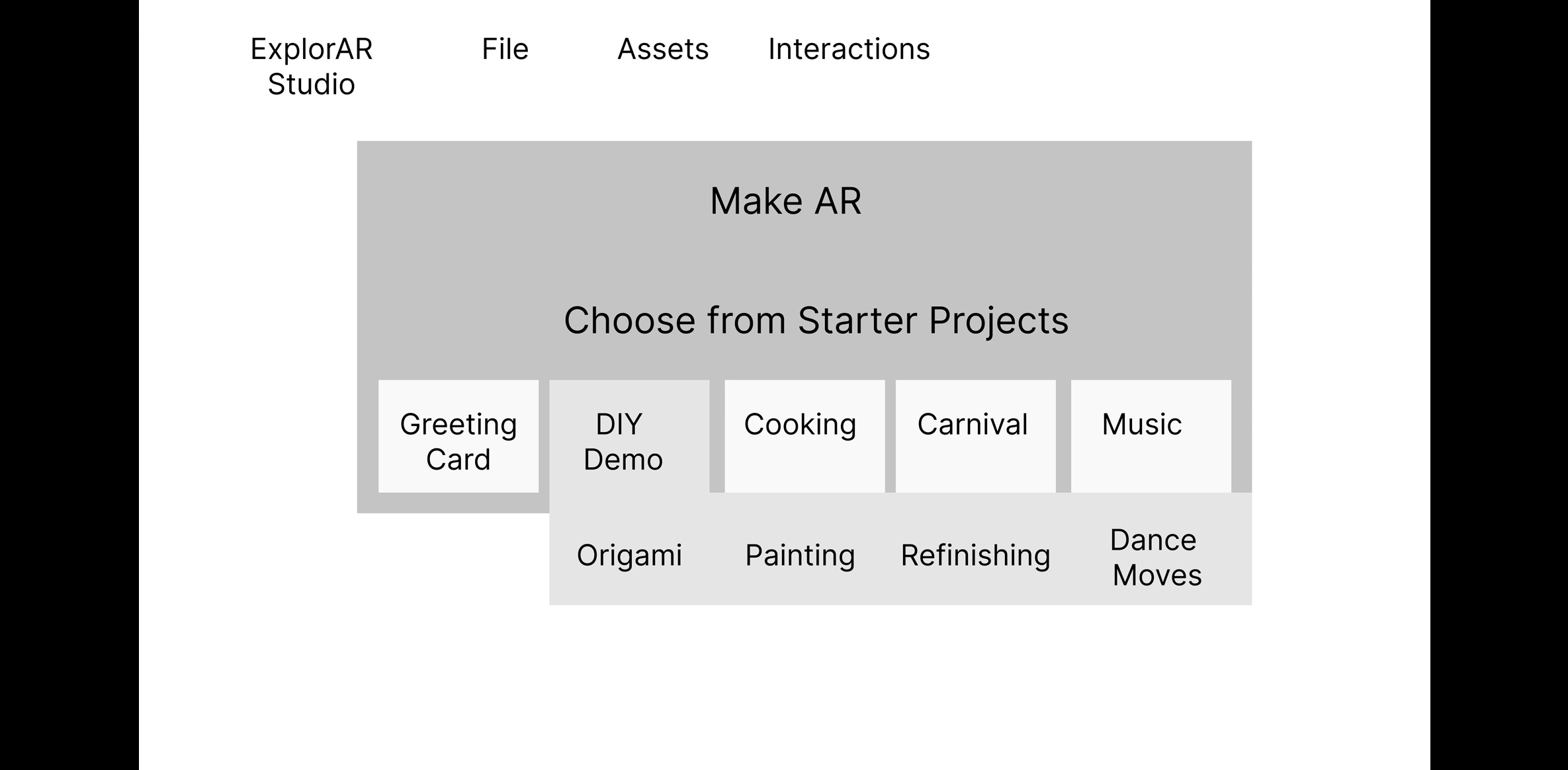
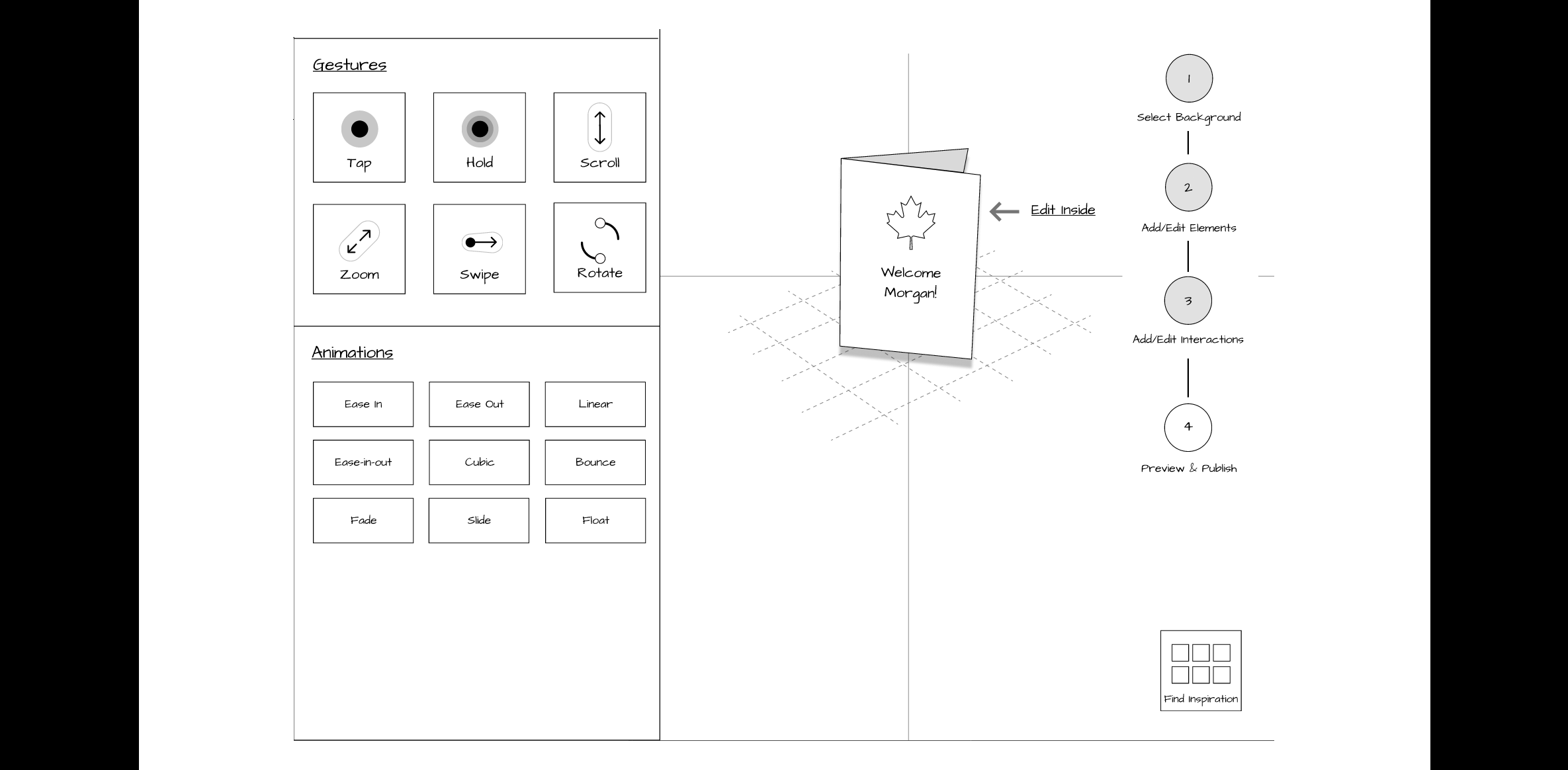
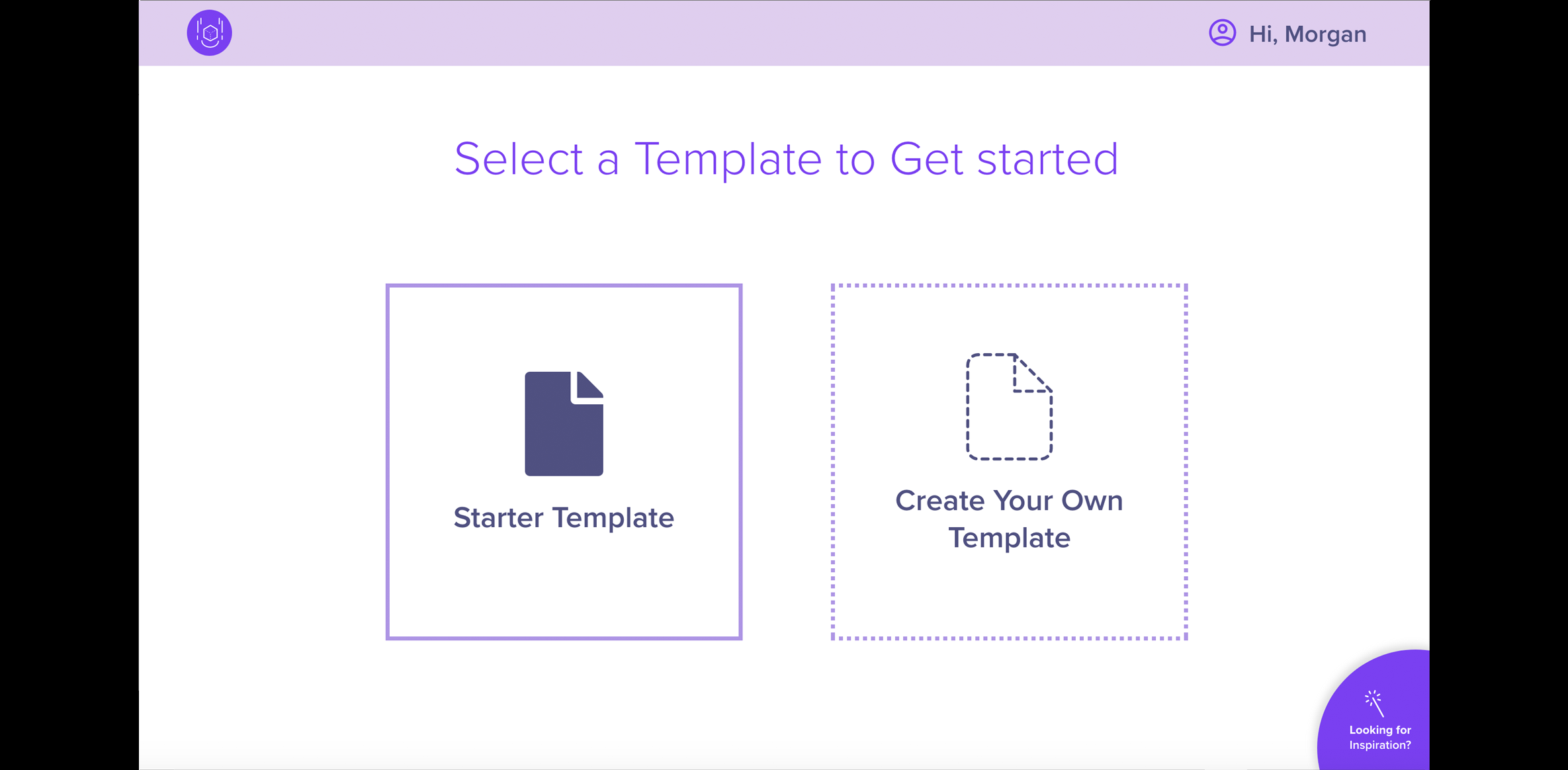
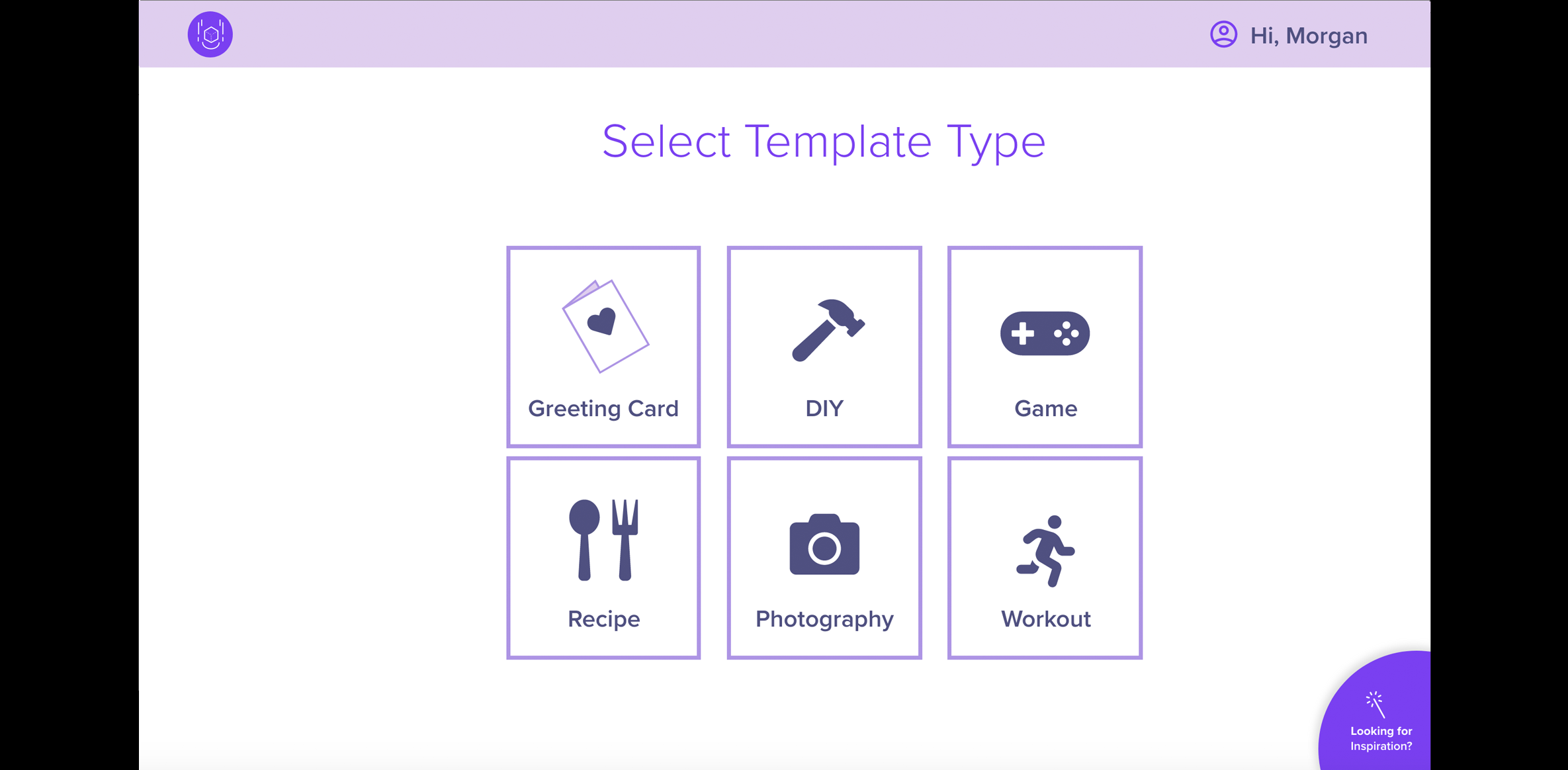
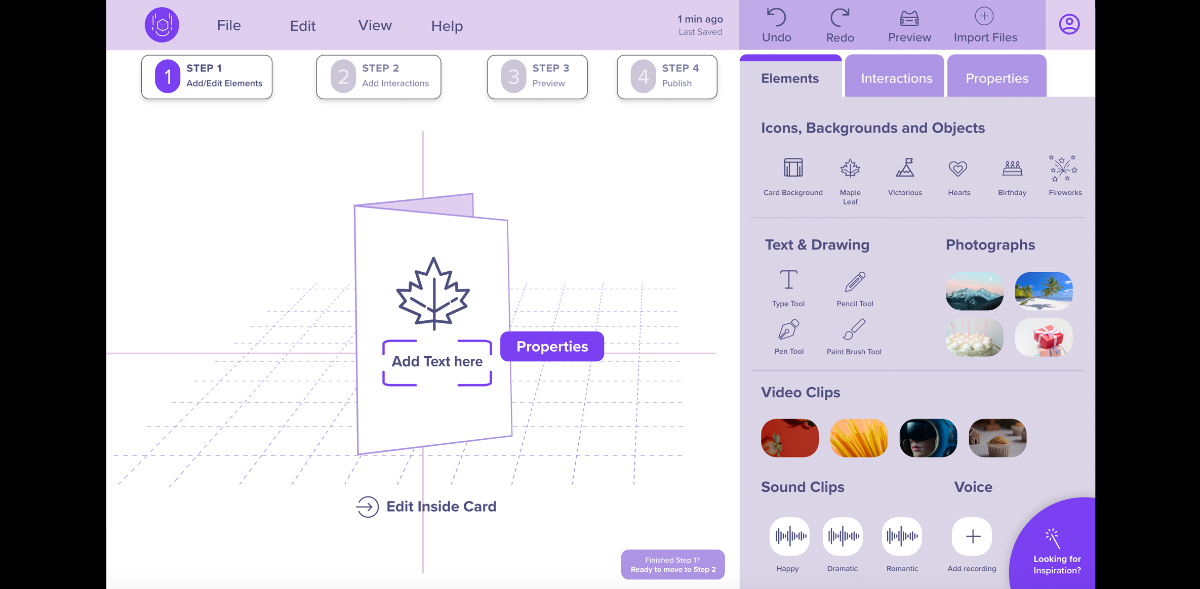
- Features: On our lo-fi prototype, we focused on the following key features:
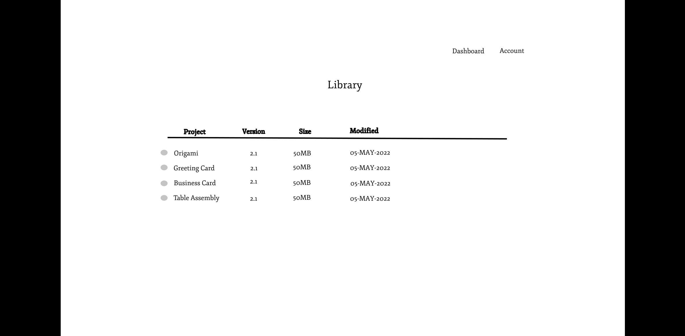
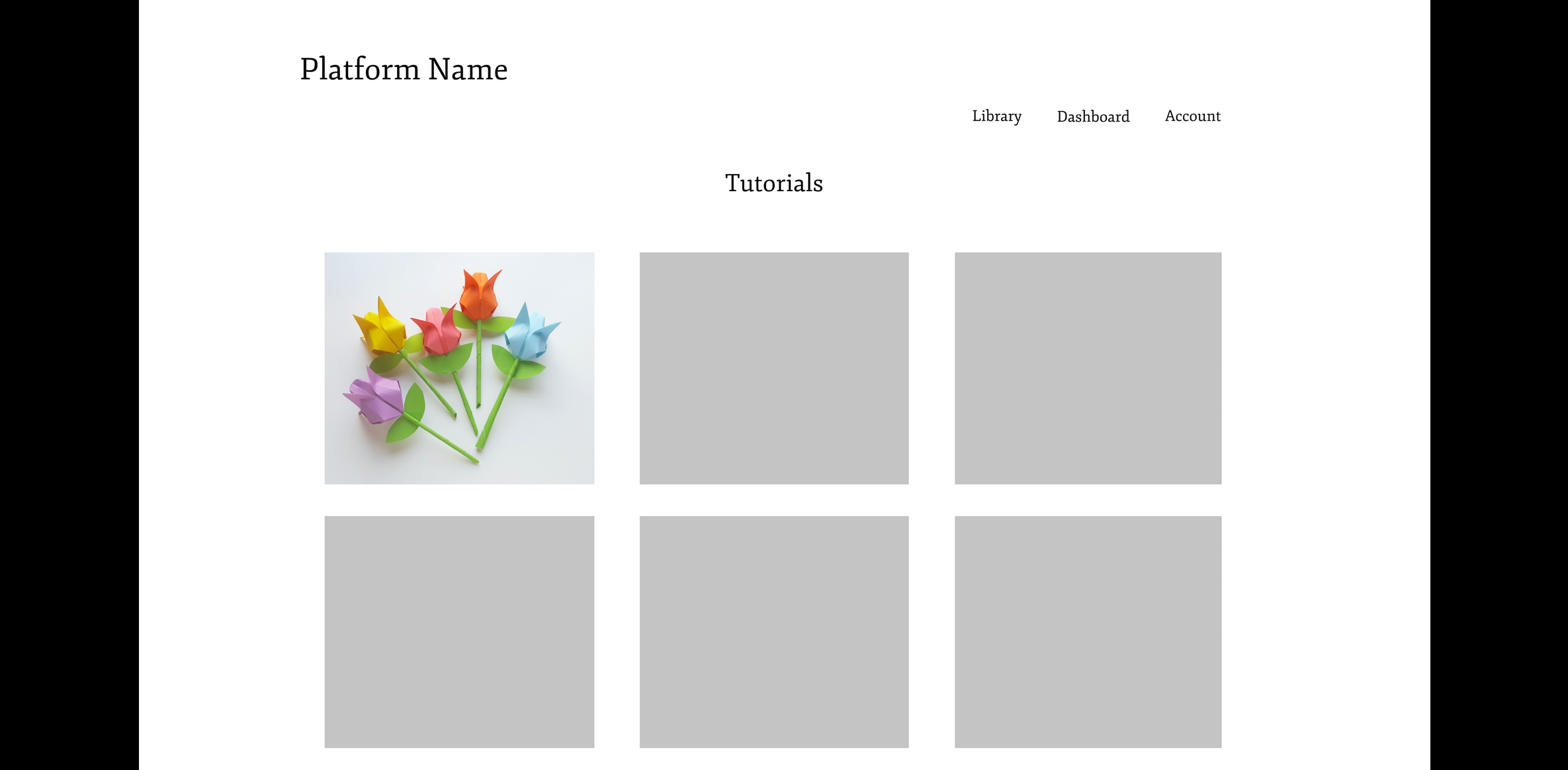
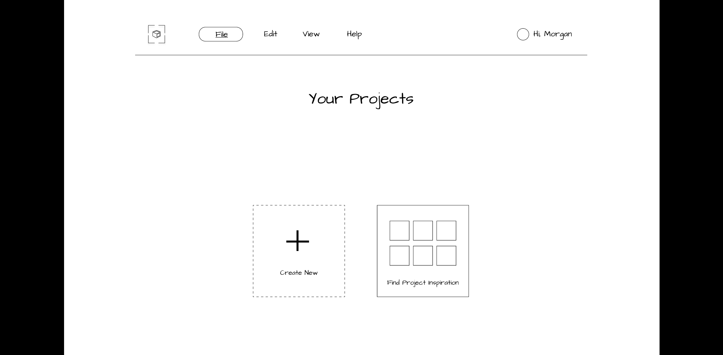
- Project Dashboard
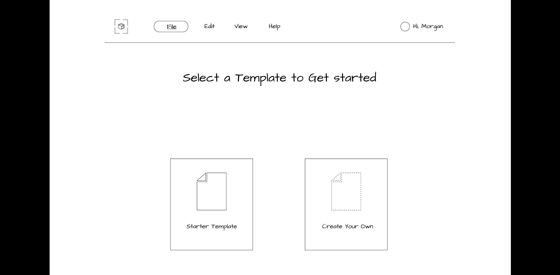
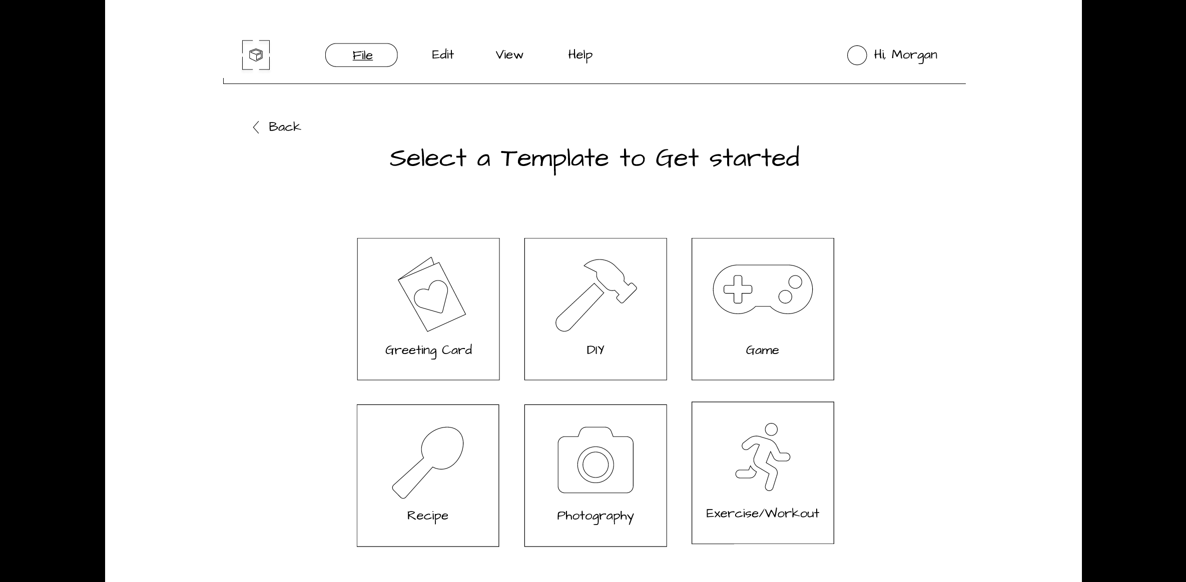
- Template Options
- Project Workspace
- Assets (Adding Elements, and Text)
- Interactions Tab
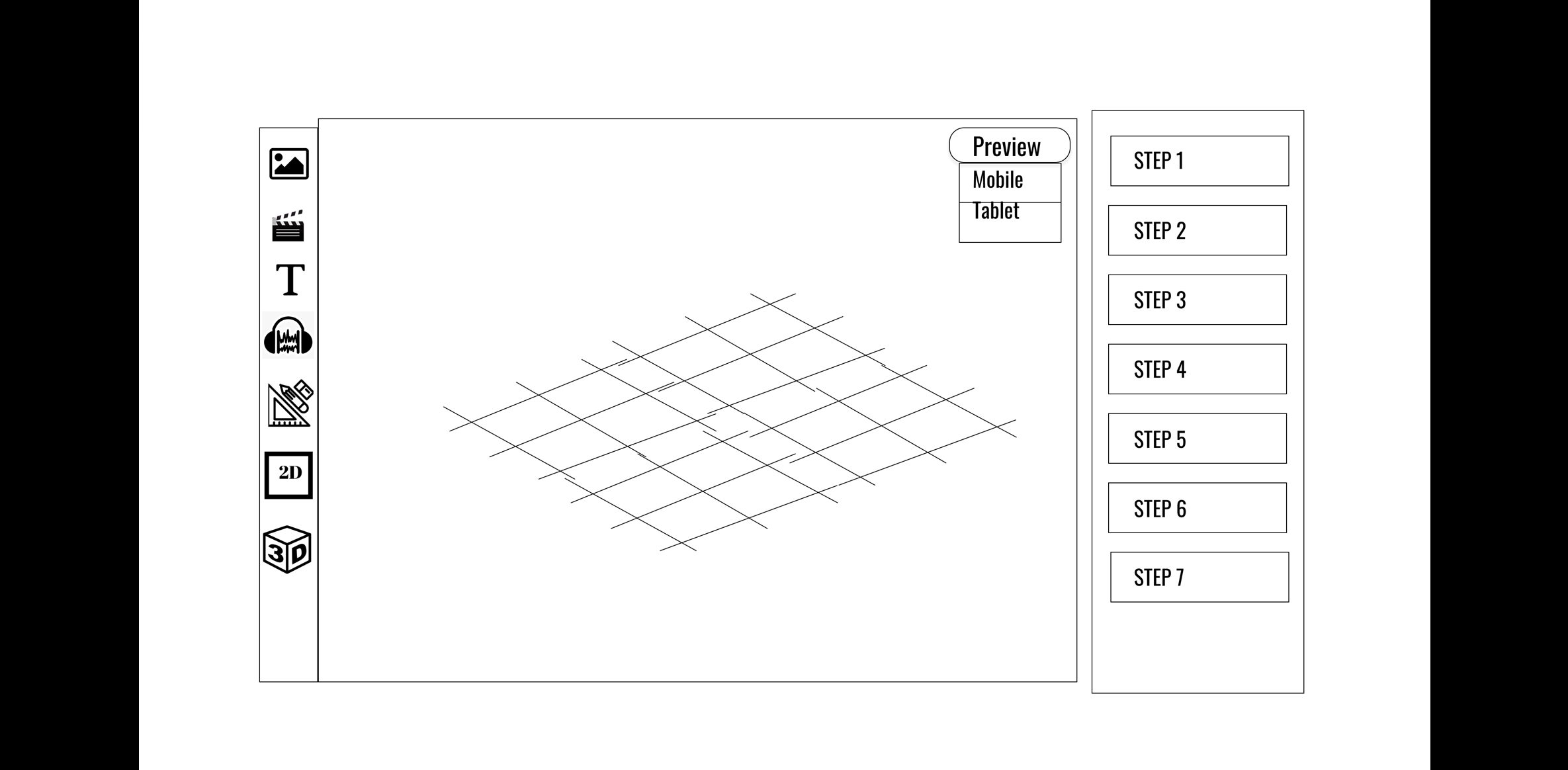
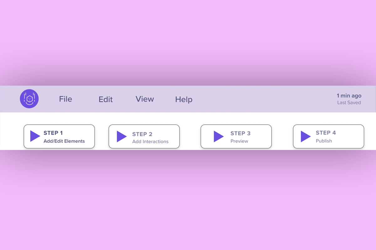
- Preview Mode
- Information Architecture: We used the results from our hybrid card sort to organize the menu names and structure for our platform. Overall, our team created 36 prototype screens and made them clickable for our usability test sessions. We generated a shareable Figma link for our participants.
Lo-Fi Wireframe Prototype
We created a lo-fi clickable prototype for usability testing, targeting the Laptop as the main authoring device with a smartphone for sharing and previewing the AR experience.
Method 9: Mid-Fi Prototyping
- Goal (contribution to the project):
- Design mid-fi prototypes and incorporate feedback from lo-fi evaluation to have an improved and intuitive platform.
- Detailed Method Description
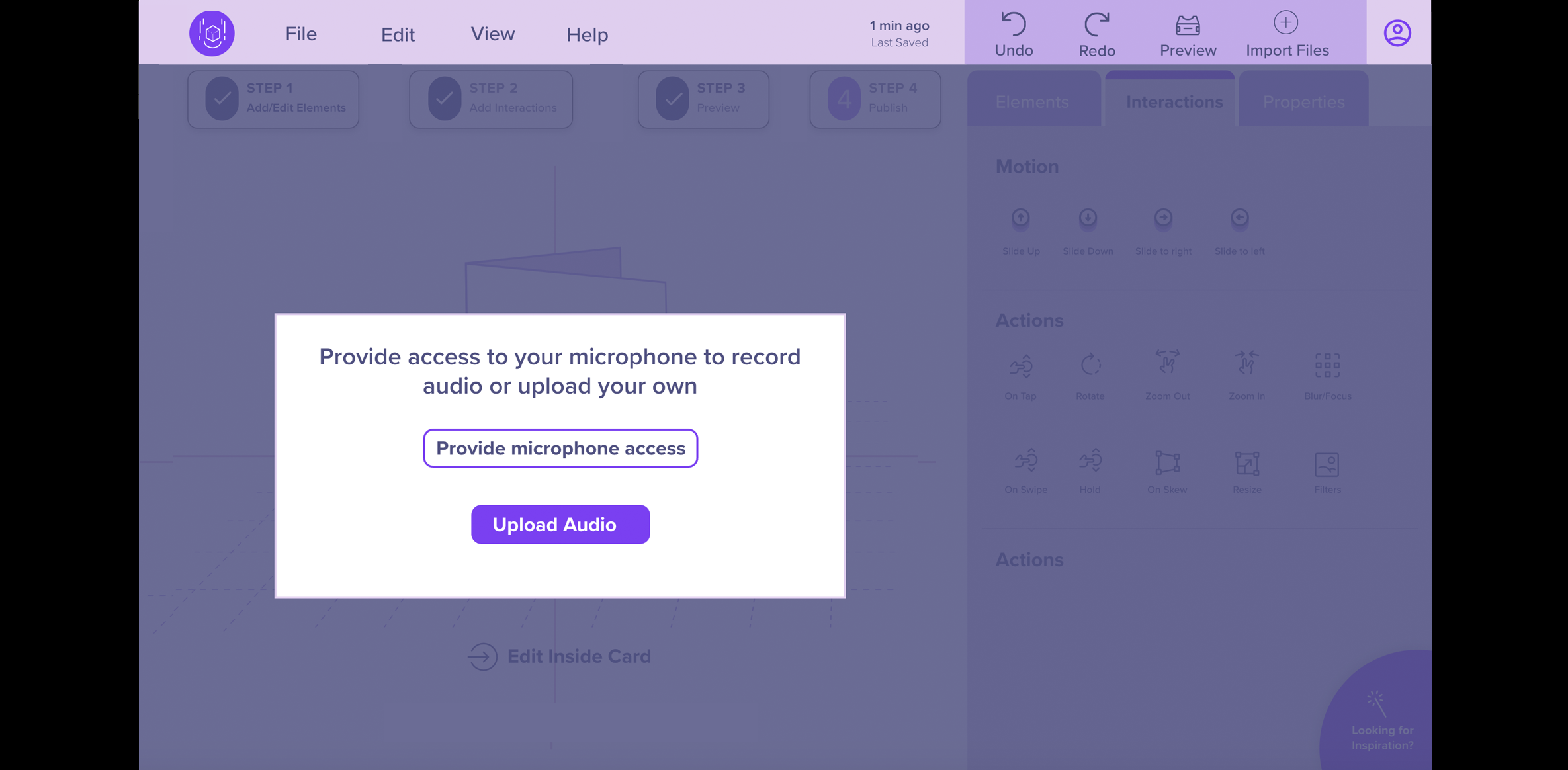
- Applying the findings and results from our lo-fi usability test sessions, we designed our mid-fi prototype. Instead of using Figma, as we had done previously for our lo-fi prototype, our team decided to use Adobe XD for its easy voice integration. Adobe XD has a built-in text-to-speech playback feature that allowed us to easily add text which produced system generated speech. At first, we tried using Figma for our voice-guided prototype but had to install a plugin called “Anima” which was confusing, cumbersome, and time-consuming to use because it required embedding code for an mp3 file to play the verbal guidance.
For our mid-fi prototype comparison evaluation, we needed to produce a total of 106 screens (53 screens for Prototype A – Without Voice and 53 screens for Prototype B – With Voice Enabled).
- Process:
- We created an Adobe XD file, revised our logo, and added color to the design. The screens were then made clickable using the “Prototype” feature of Adobe XD. We quality tested the two prototypes to ensure all features functioned properly before usability testing.
- Design Changes:
- We updated the layout, visual style and organization of content and navigation on our platform to better meet the needs of the user. Since we had two prototypes, the significant design changes took place on Prototype A which did not have verbal guidance. Prototype B, which included the verbal guidance feature, was a copy of Prototype A, and we only made a design change by adding the “Steps” feature at the top.
- Color Contrast: For our mid-fi prototype we used a monochromatic color palette with an accent color. We ensured that the colors had a high contrast, and the text was easy to read. We tested our color palette using a software called Stark, a contrast-checking plugin for Adobe XD
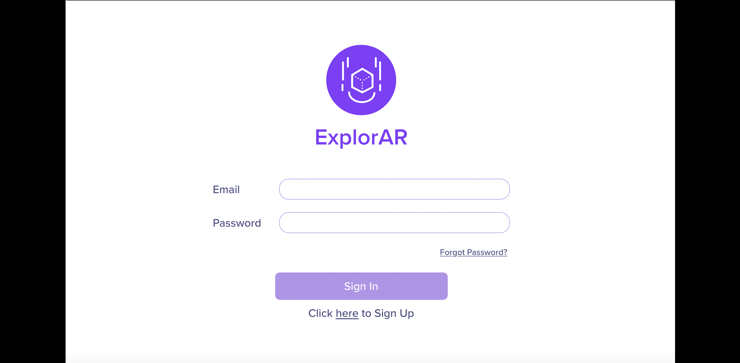
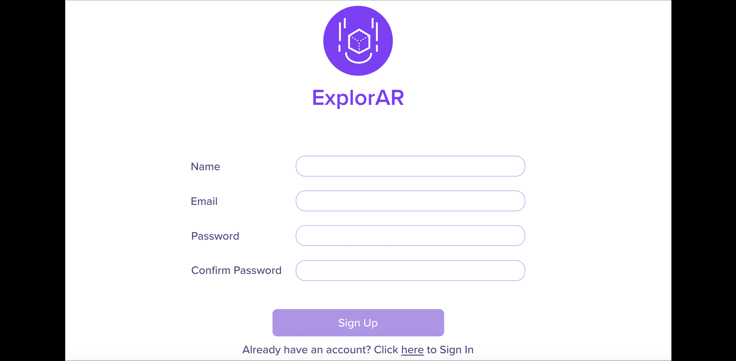
- Logo: We decided to name our platform “ExplorAR” and designed a logo that was based on the branding and colors used in our overall platform.
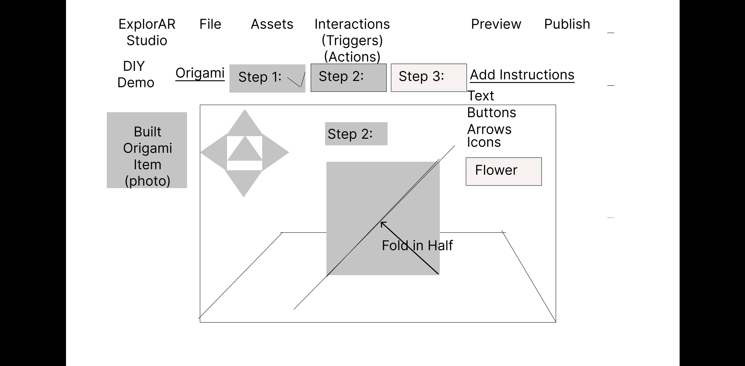
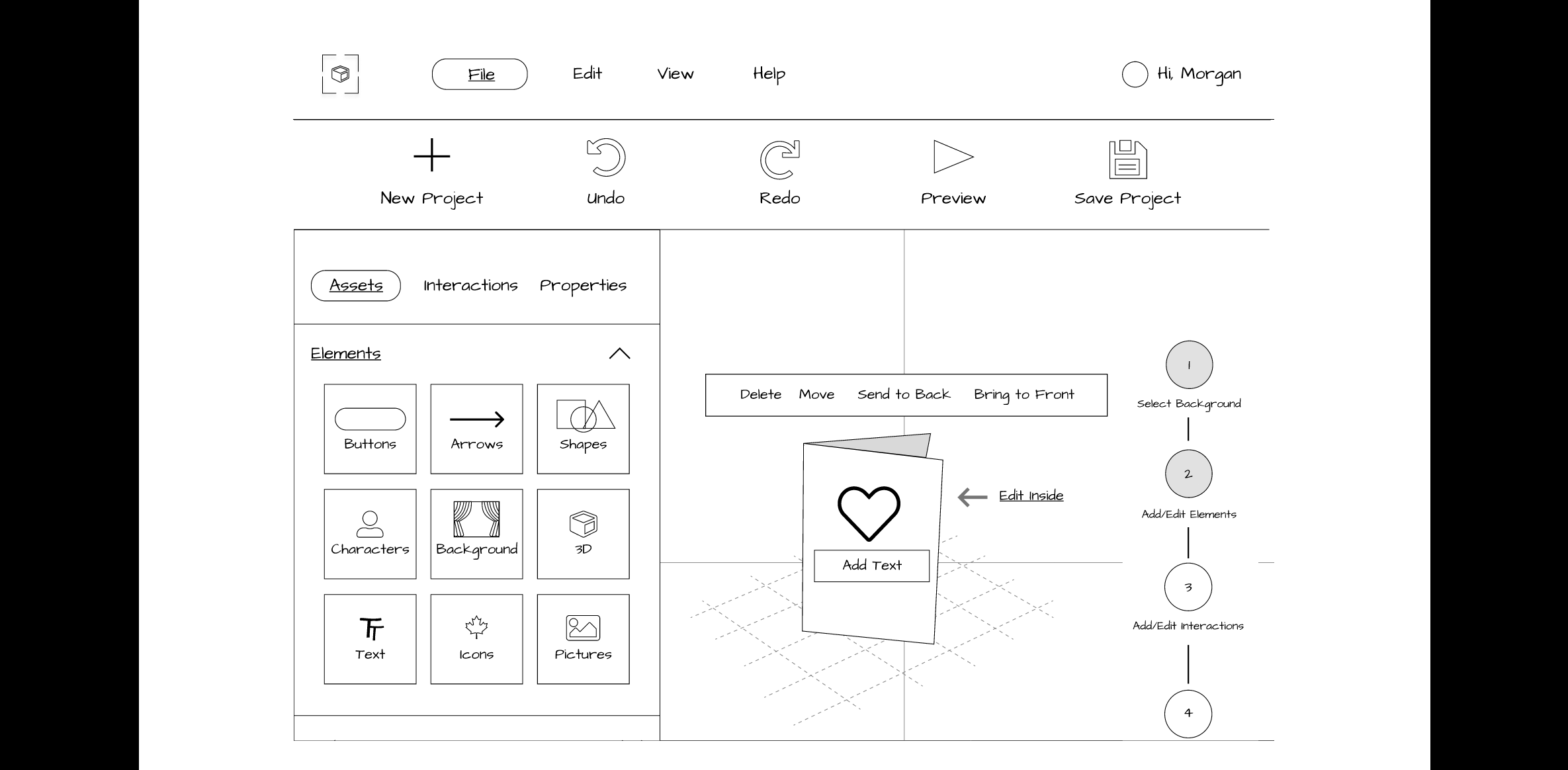
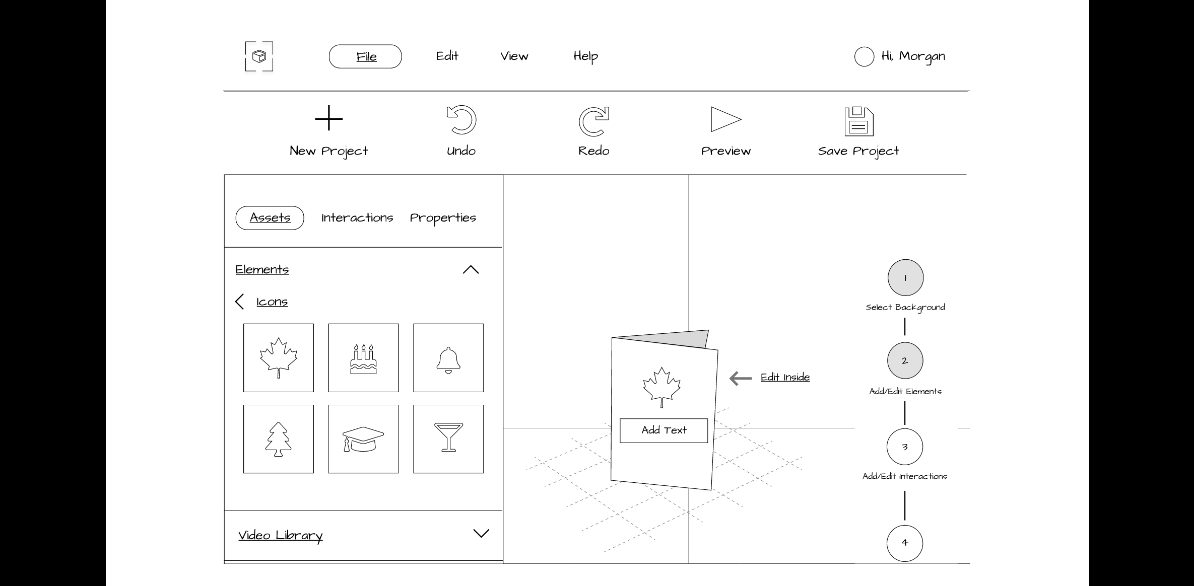
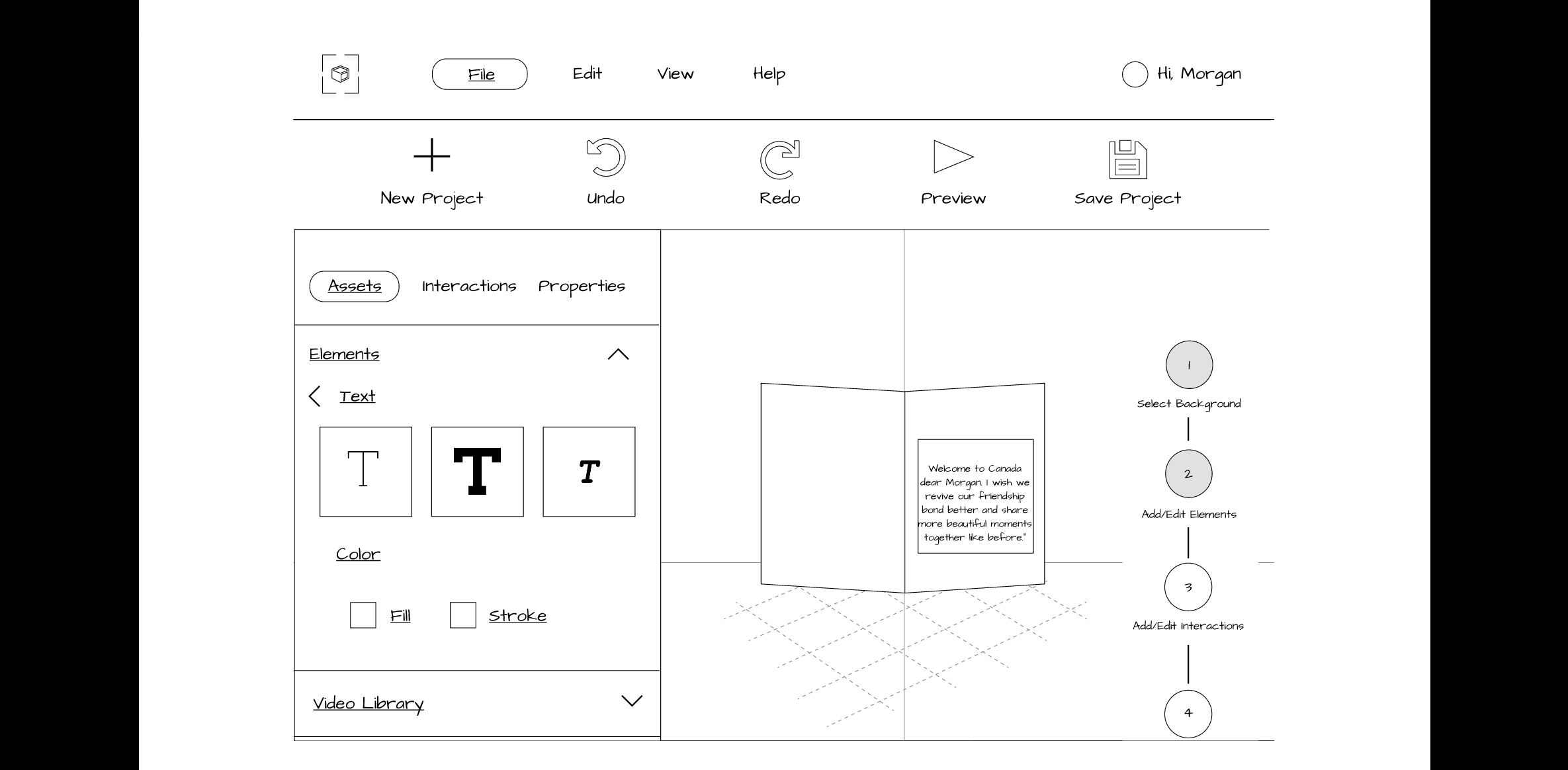
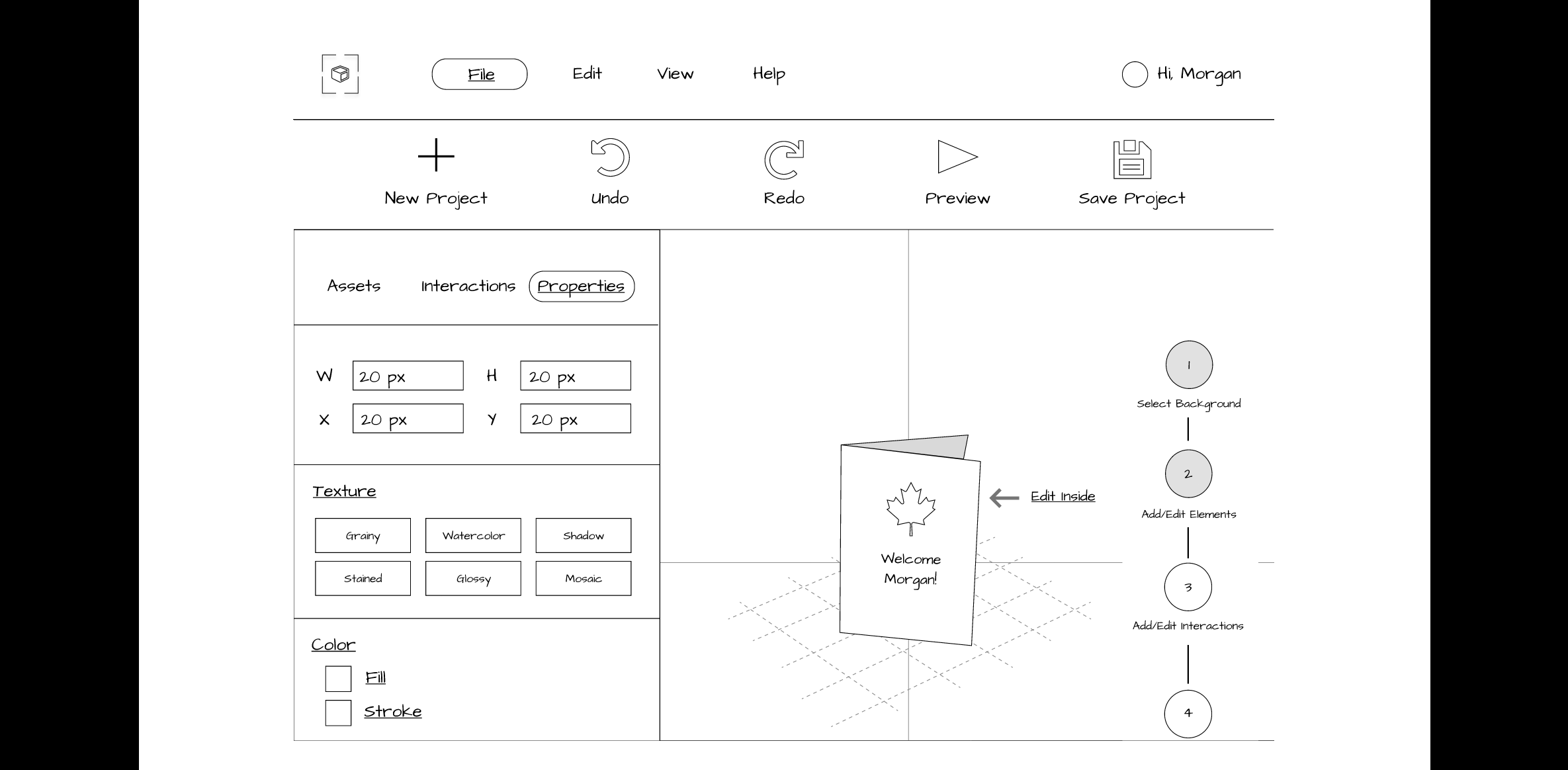
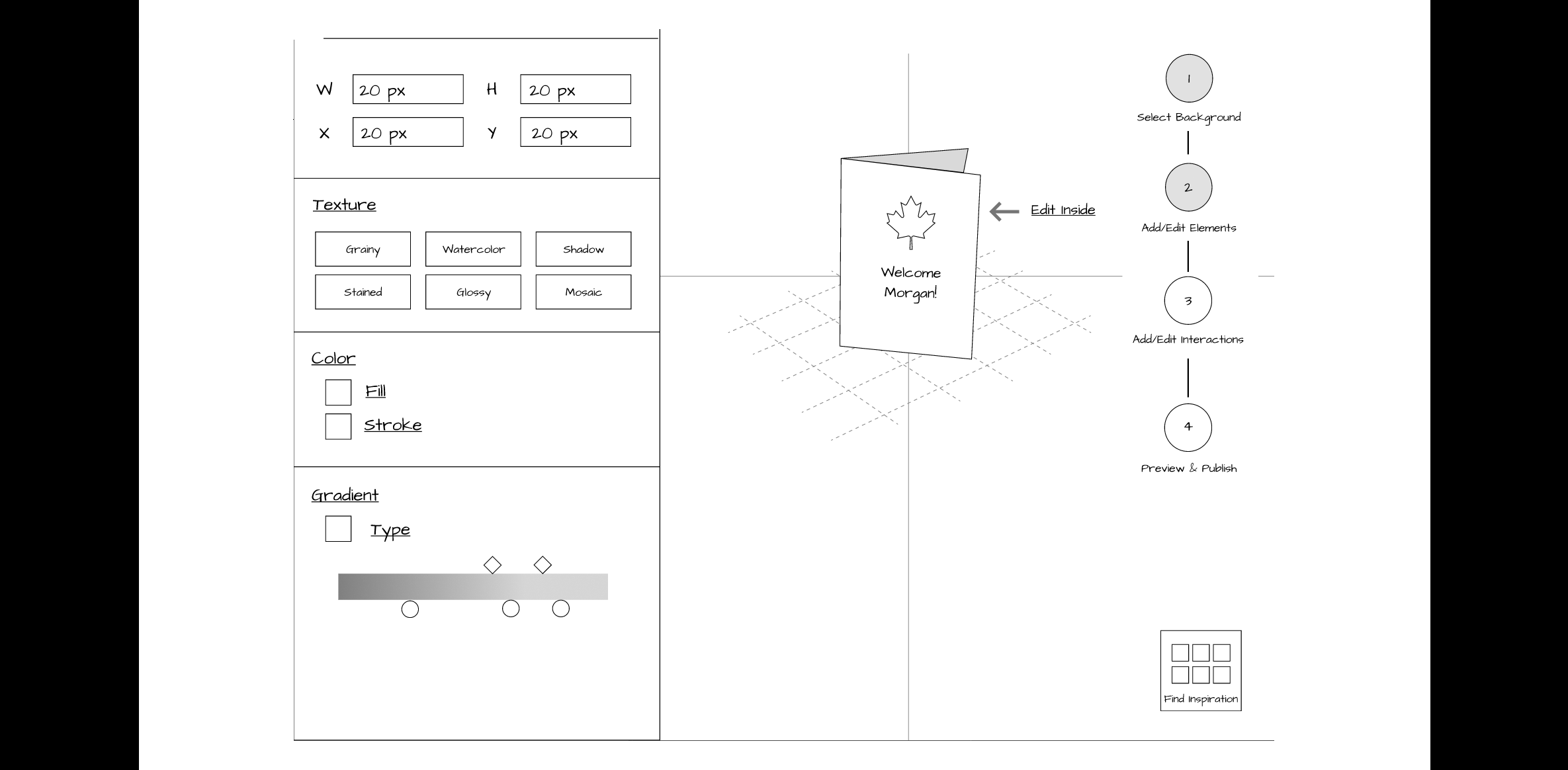
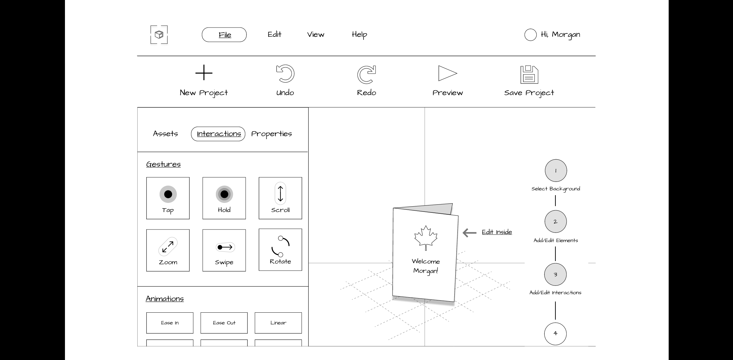
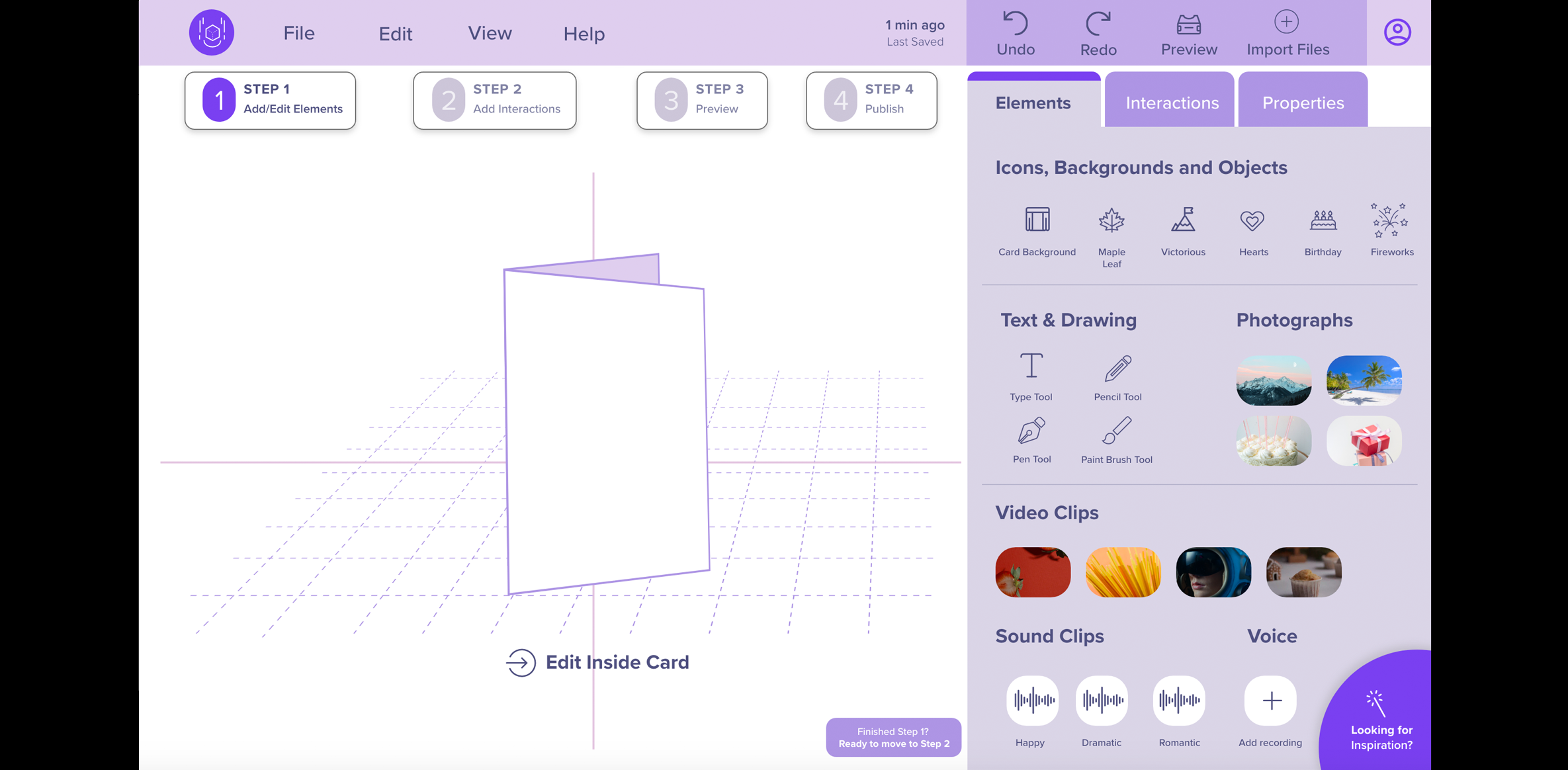
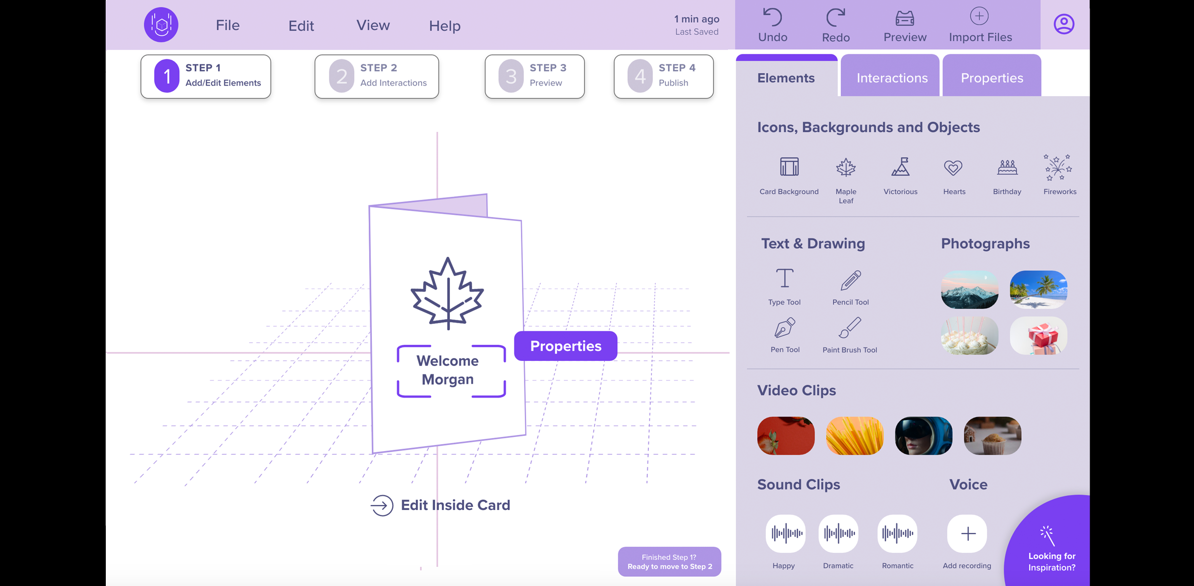
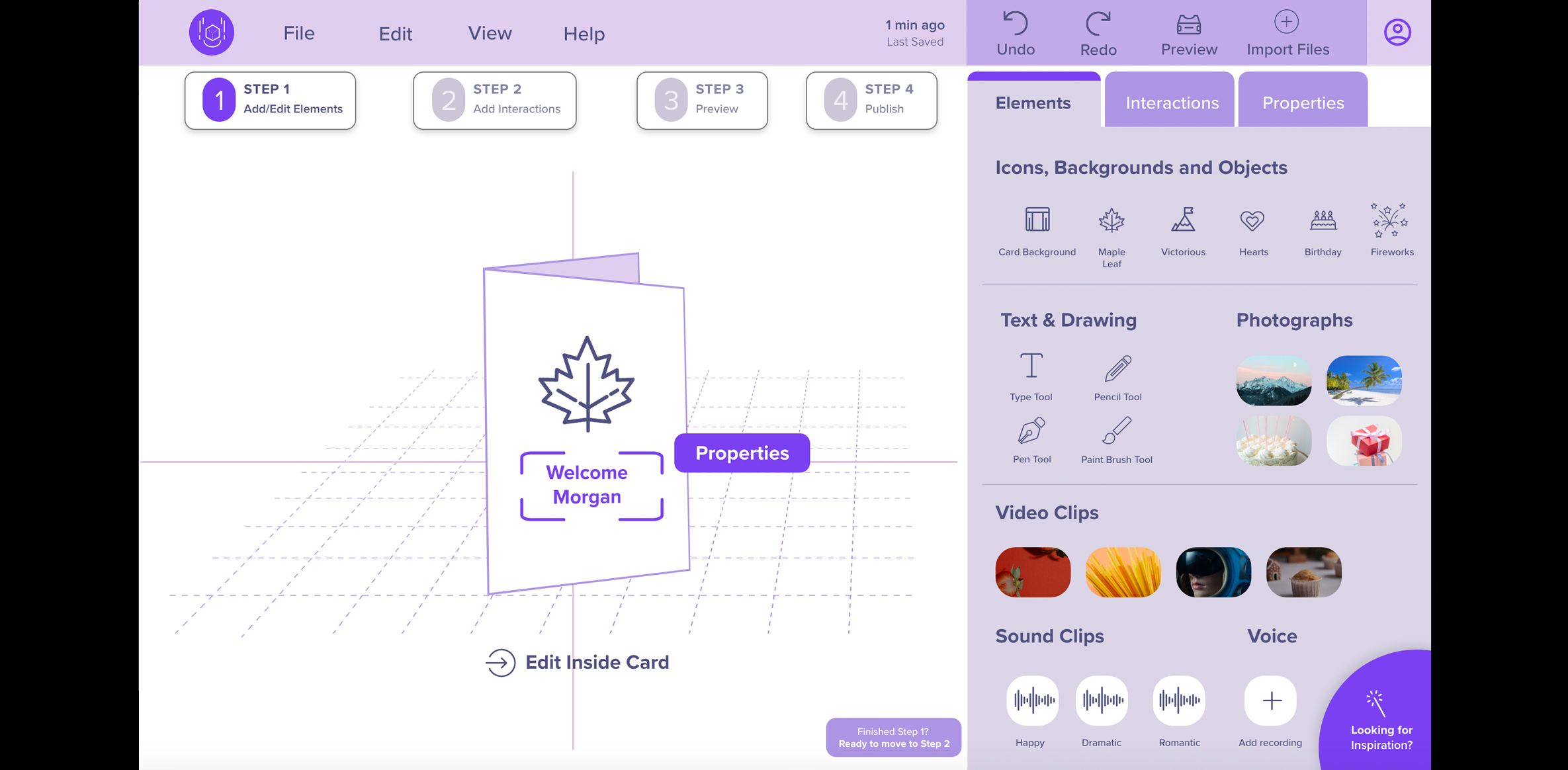
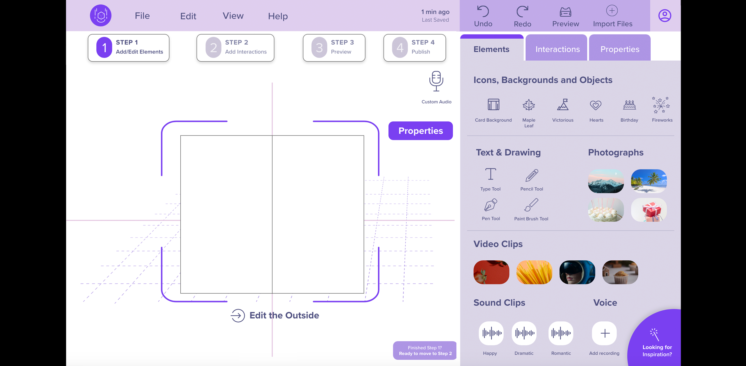
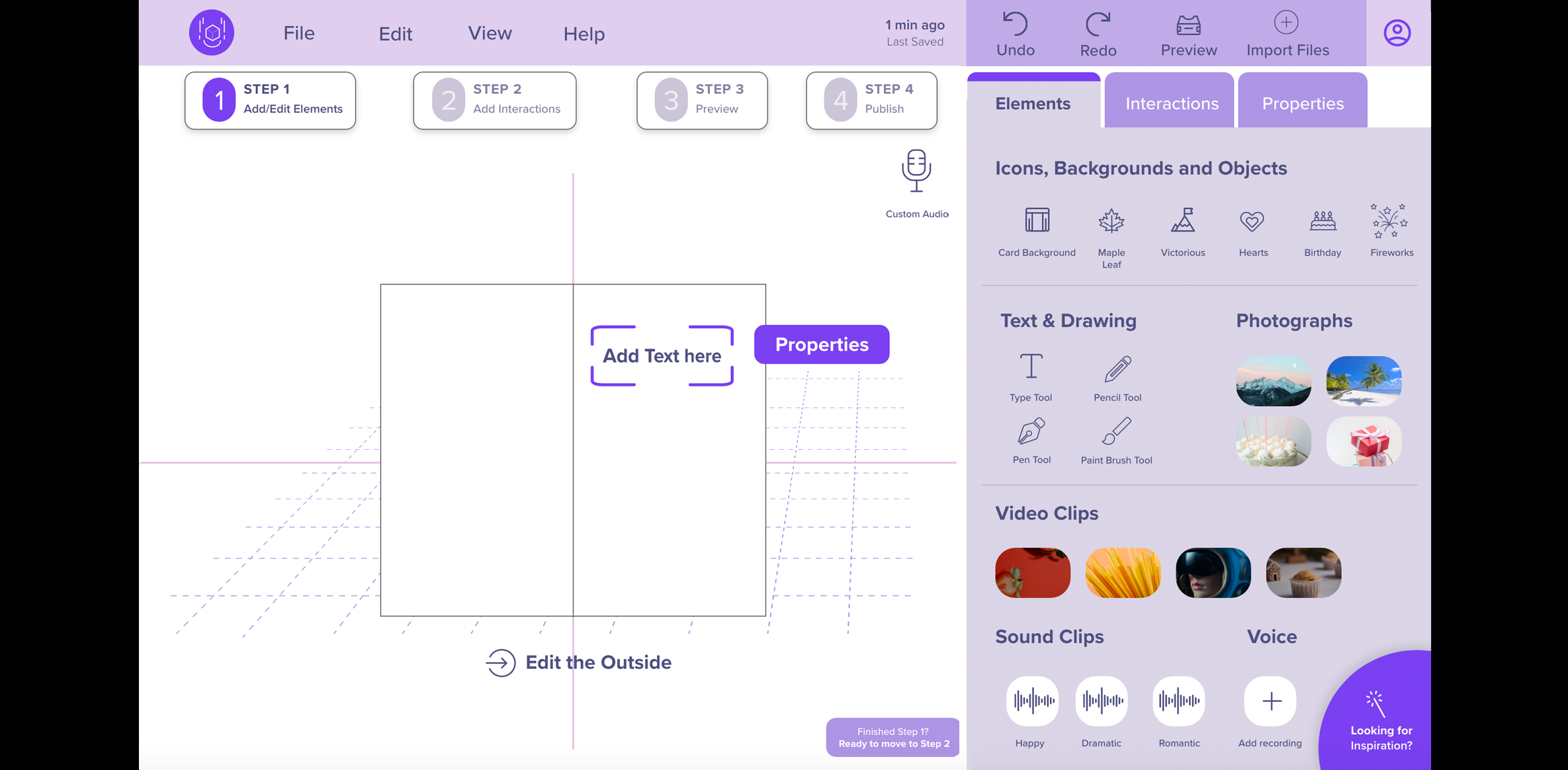
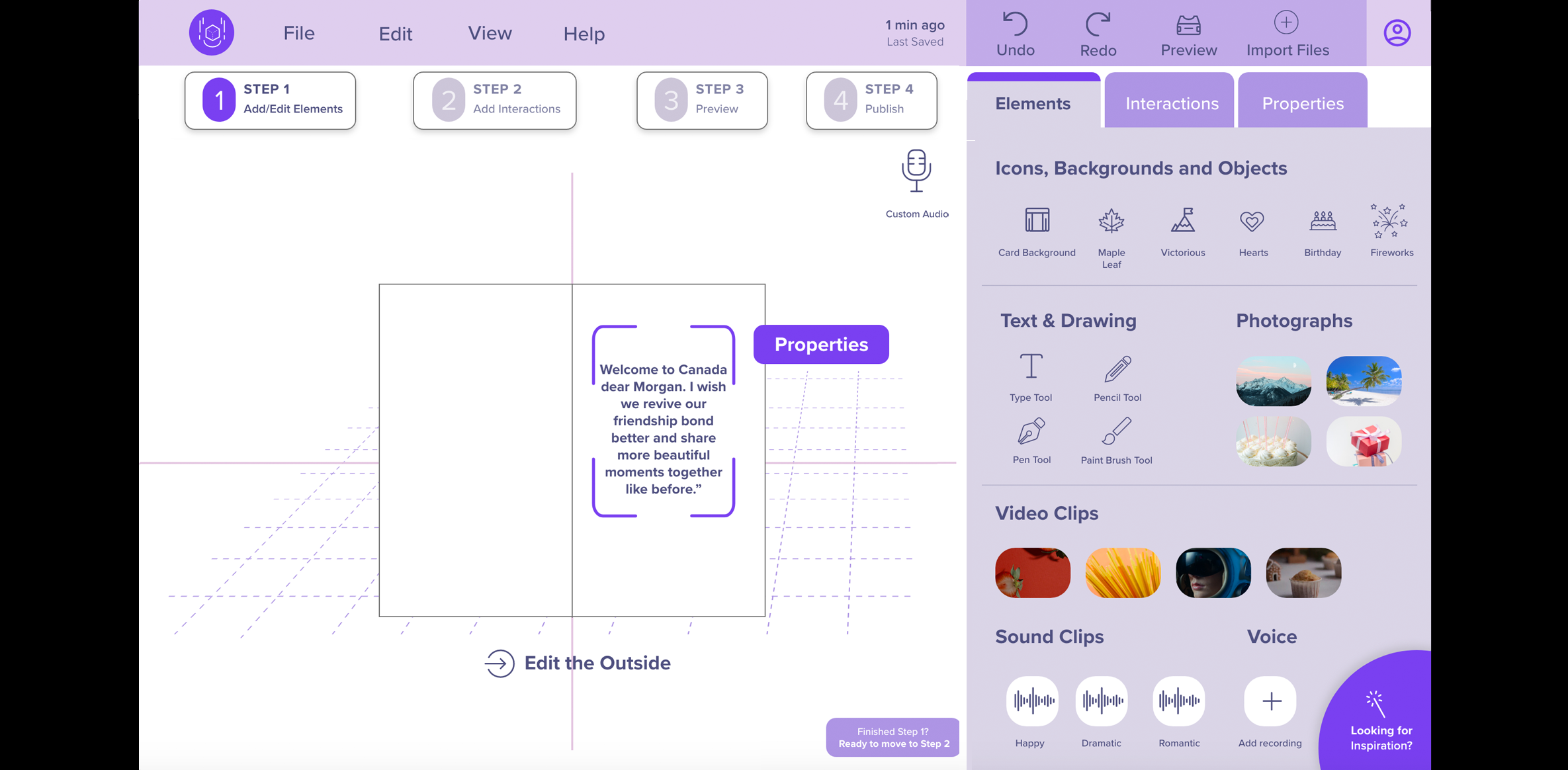
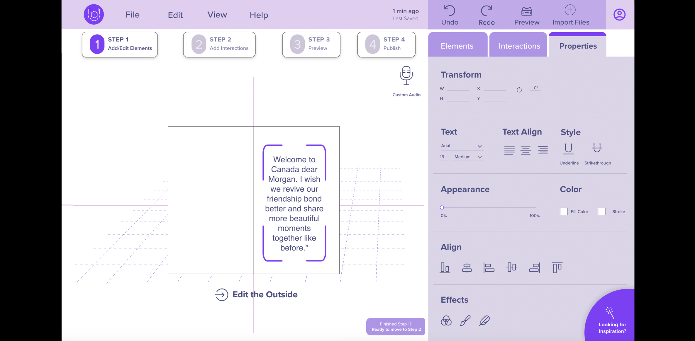
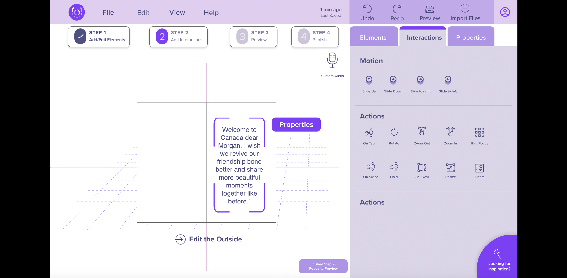
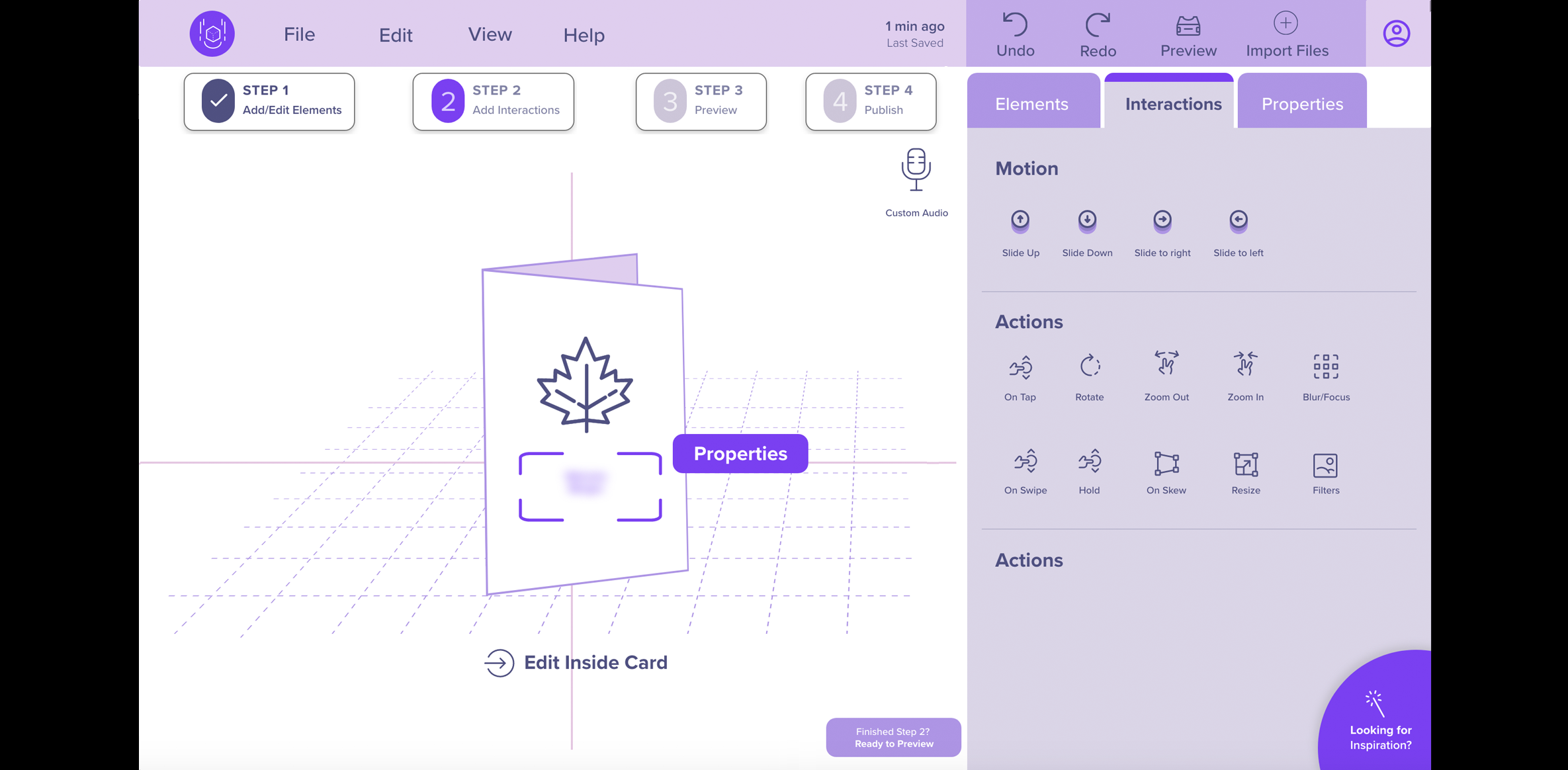
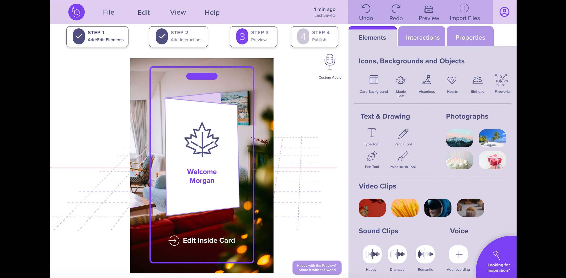
- Elements: Since some users had difficulty differentiating between the terms “Assets” and “Tools” on our lo-fi prototype, we changed the “Assets” label to “Elements.” It contains icons, backgrounds, objects, text and drawing tools, photographs, video, and sound clips.
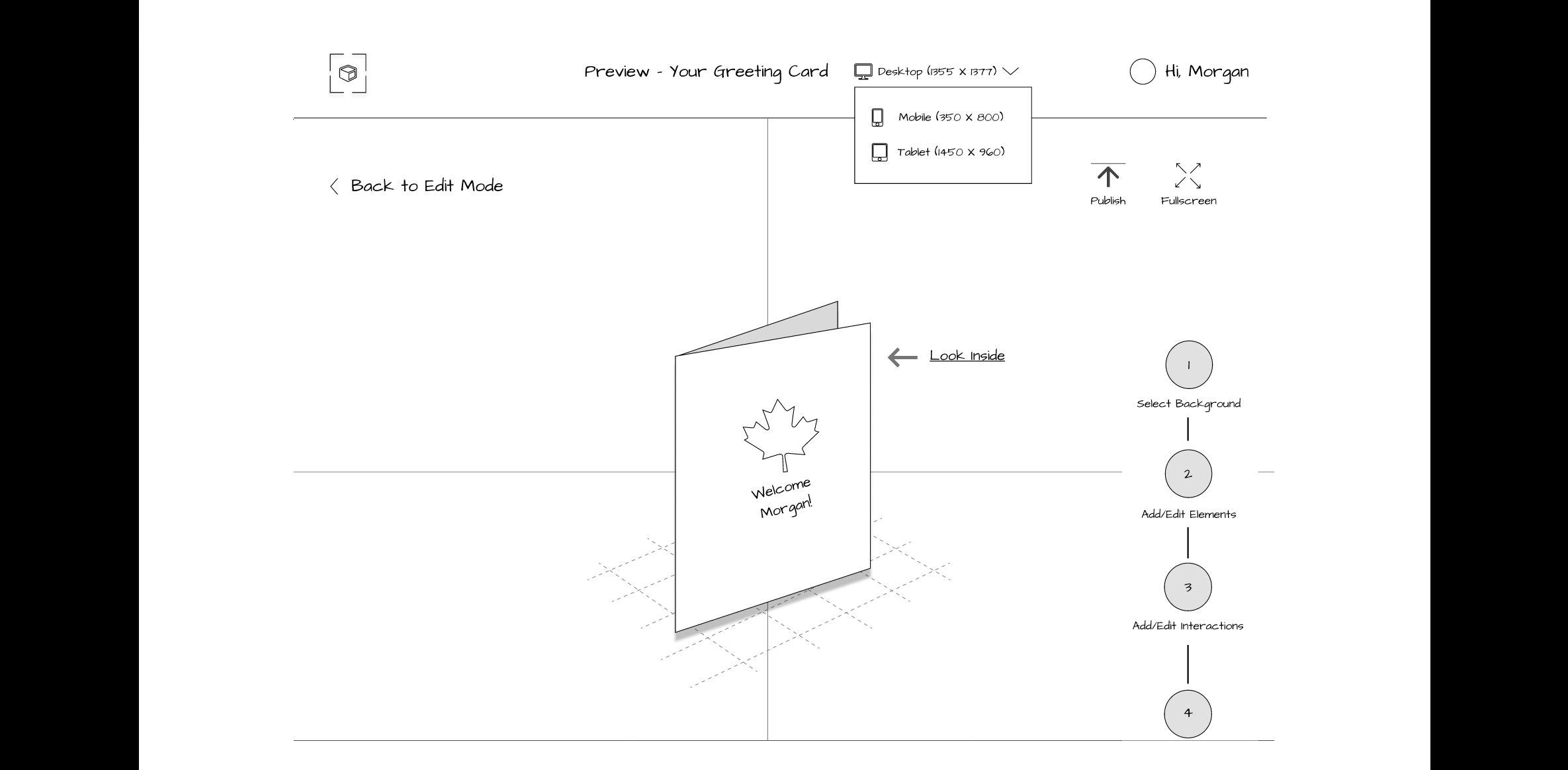
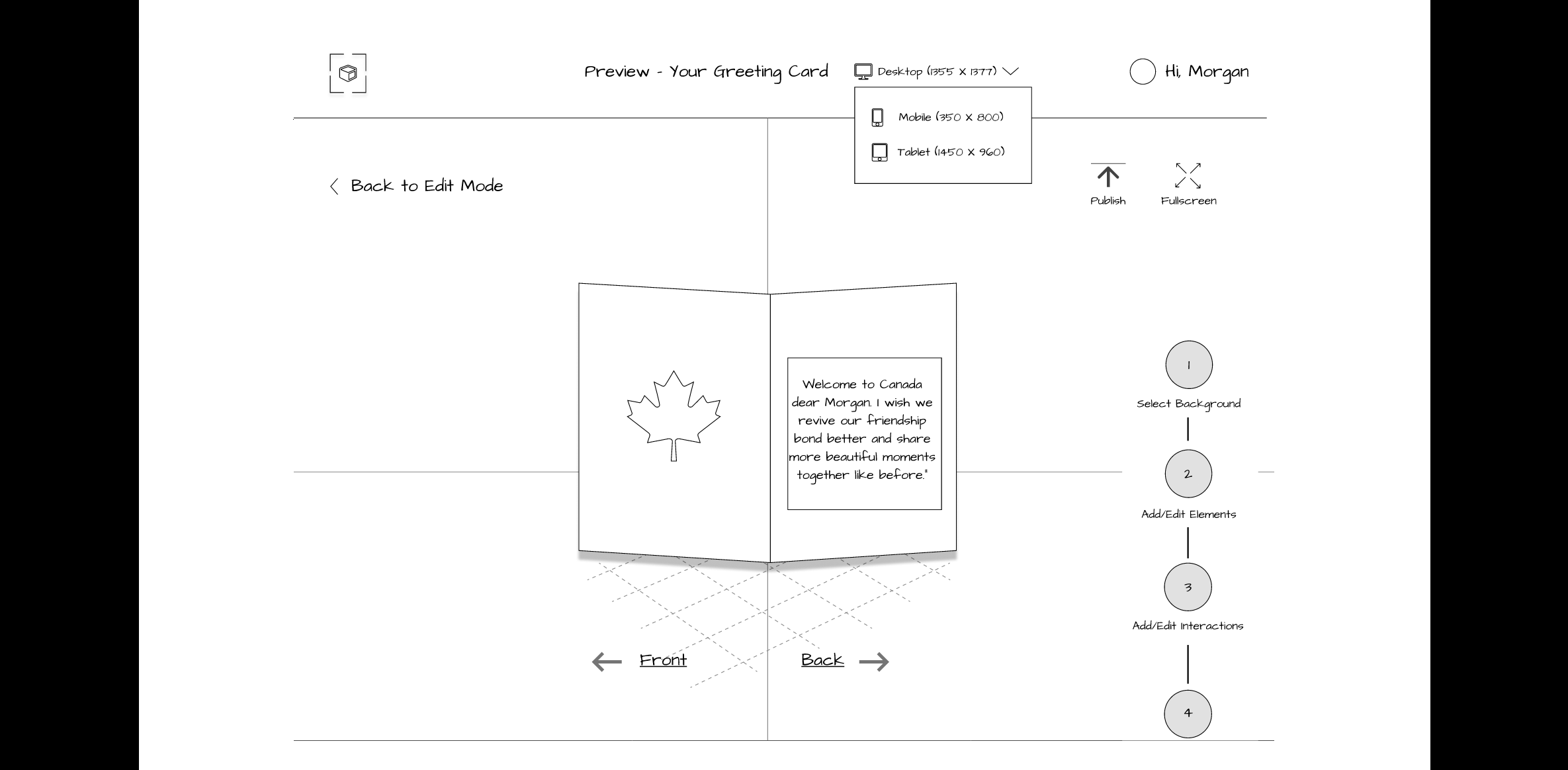
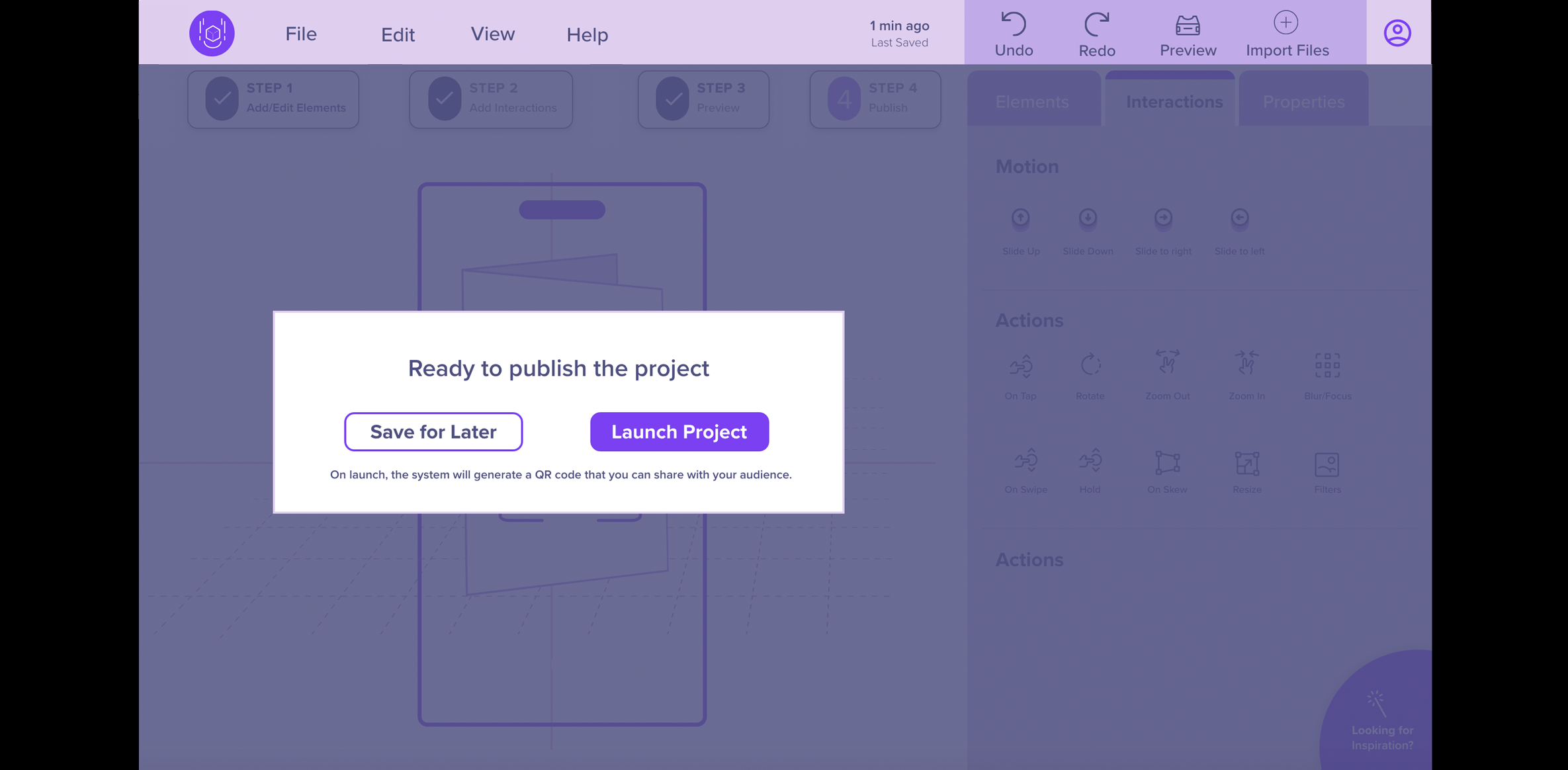
- Split Preview and Publish as Two Different Steps: Participants from our lo-fi usability testing were confused with having “Preview and Publish” as a combined step, and recommended splitting it up into two separate steps. Therefore, in our mid-fi prototype, we split them into two separate buttons. A QR code and link is generated to be shared with others once the participant clicks the “Publish” button.
- Prototype B changes: Our second prototype had all the same changes as our first mid-fi prototype. The only change we made was having a “Play” button in the “Step” feature at the top that indicated clicking on it will play a voice that will guide the user on what step they are on.
Mid-Fi Prototype
We created two mid-fi clickable prototypes for A/B Comparison and usability testing, targeting the Laptop as the main authoring device with a smartphone for sharing and previewing the AR experience. Please note: not all functionality is wired or clickable. To see all the screens, view the carousel below.
View Adobe XD Mid-Fi Prototype Version A (without sound)
View Adobe XD Mid-Fi Prototype Version B With Sound (Note: Volume is loud, adjust as needed).
6. Test
Methods for this phase
Method 10: Lo-Fi Prototype Evaluation
- Goal (contribution to the project):
- Conduct a lo-fi formative evaluation to identify potential usability problems our users may encounter when trying to complete tasks. This evaluation feedback will allow us to modify the prototype early in the design process, test ideas, and collect feedback on revised designs more efficiently.
- Revisions or adjustments:
- We initially planned to have 5 participants and only tested 4 participants.
- Explain changes:
- The reason we tested 4 participants instead of 5 was because of the extra effort required to design a quality initial prototype.
- Detailed Method Description
- We recruited 2 participants through the CDM participant pool and 2 from personal connections for our lo-fi prototype remote moderated usability testing. The only in-person session was conducted on our 89-year-old participant who required assistance accessing the prototype. All other sessions were conducted through Zoom and were video recorded after receiving the participant’s verbal consent. Before conducting the test sessions, our team created a usability test protocol that included a brief introduction, a participant's statement of verbal consent, background questions, warm-up questions, definitions of augmented reality and content creation, a scenario, four tasks that participants were asked to complete, and demographic and wrap-up questions.
During the sessions, we encouraged the participants to think out loud while performing the tasks. If the participant asked for help, we provided directions but did not give them a direct path to complete the task. We evaluated how well participants could navigate and perform basic tasks such as starting a project, selecting, and editing elements, previewing, and publishing a greeting card. We specifically chose a greeting card because of its universal qualities as most people have either received or sent greeting cards. We deemed evaluating a DIY task as too complex for this phase of our project.
Each task had a post-task question, where we asked the participants to rate their confidence level of completing the task using a 5-point Likert scale (1 = Not at all confident and 5 = Extremely confident). Each task was measured as Pass/Fail and we also noted the time it took for each participant to complete the task.
Lo-fi Interview Questions and Test Plan
Lo-Fi Prototype Goals
| Task | Name | Goal |
|---|---|---|
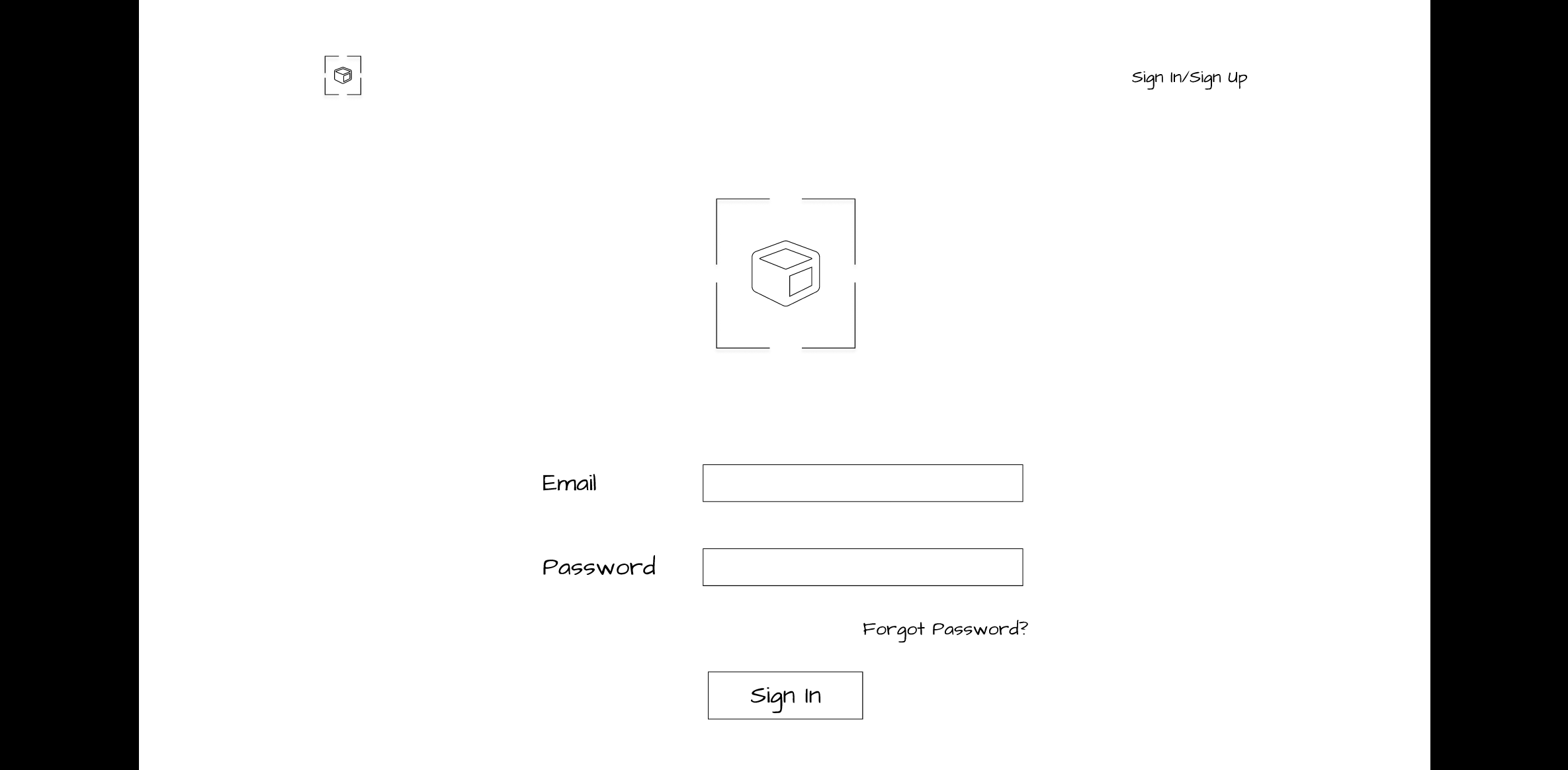
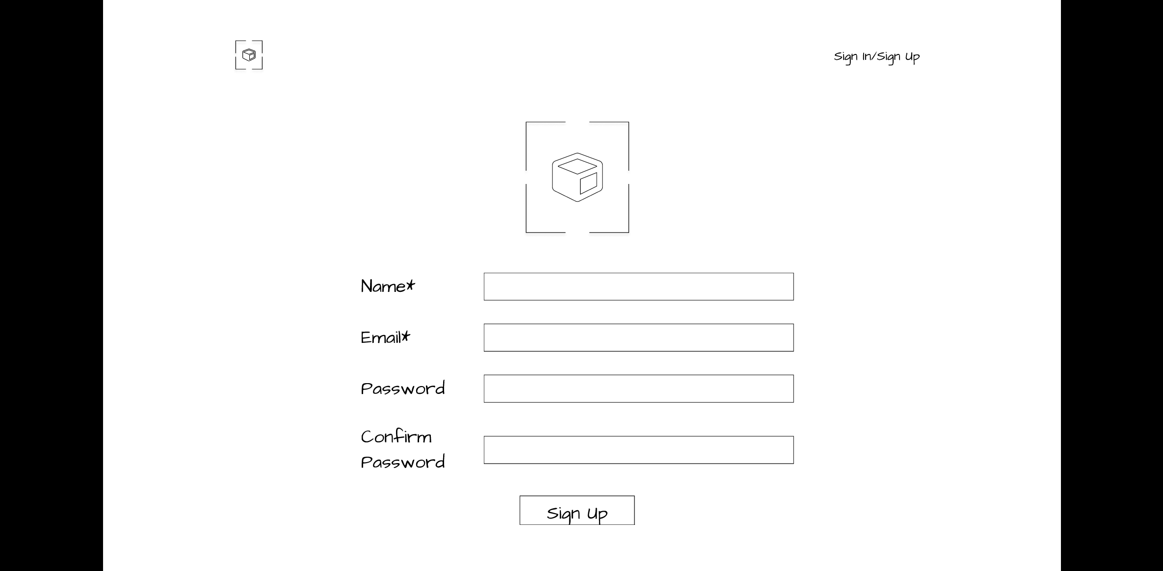
| 1 | Create an Account | Determine if our login page is easy to understand |
| 2 | Start a new project using a greeting card template | Determine if the new project creation process is easy and if our prototype has meaningful buttons, icons, naming conventions, and architecture |
| 3 | Make modifications to the template | Determine if the step-by-step approach makes sense and if the layout of our prototype is easy to use |
| 4 | Review the Preview Mode | Determine if there is a clear distinction between “preview” and “publish” in our prototype |
Lo-Fi Usability Test Participants
We made note of how familiar participants were with augmented reality using a 5-point Likert scale.
| Participant | AR Awareness* | AR Creation | AR Familiarity** | Occupation | Age Range | Ethnicity |
|---|---|---|---|---|---|---|
| P1 | 2 | No | 2 | Housewife & Artist | 65-90 | Caucasian |
| P2 | 1 | No | 1 | Student | 25-34 | Asian |
| P3 | 5 | Yes | 5 | Student | 25-34 | Asian |
| P4 | 1 | No | 1 | Gemologist | 34-44 | Asian |
*On a scale of 1 to 5, how aware participants were of Augmented Reality (AR) experiences (1 is not at all aware, 5 is extremely aware). **On a scale of 1 to 5, when 1 is not at all familiar and 5 is extremely familiar, what was the participant's level of familiarity with creating AR experiences.
After completing the lo-fi usability testing, our team compiled the results and added the participant demographic information, insights, notes, time on task, confidence rating and other important information on a Microsoft Form. The team then discussed the findings and made a list of what changes are needed for our mid-fi prototype.
Diversity and Accessbility Considerations
During one of the lo-fi prototype evaluations, we moderated an in-person interview with an 89-year-old artist with monocular vision due to suffering an eye stroke in one eye. The moderator controlled the keyboard, while the participant pointed where to navigate on the screen. This participant has peripheral vision in one of her eyes and has other age-related natural declines in memory and hearing. She indicated that a verbal guidance audio feature would help her know which steps to follow when completing a task. As an artist, she also expressed a desire for hand-drawing tools such as brushes, pens and pencils. Both features were included in our mid-fidelity prototype. Because she uses an iPad, Chromebook, and flip-phone we felt that having a desktop-sized platform would offer the greatest flexibility for authoring, as older participants may experience fatigue if using a gesture-based application, or one requiring a smartphone.
Results
Four remote usability test sessions were conducted, where the participants performed four tasks.
Task Completion Rate
To evaluate the effectiveness of the prototype features, we rated each completed task as “pass” or “1” and each failed task as “fail” or “0.” We then calculated the percentage of success.
| Task | Name | Completed |
|---|---|---|
| 1 | Create an Account | 3/4 |
| 2 | Start a new project using a greeting card template | 4/4 |
| 3 | Make modifications to the template | 1/4 |
| 4 | Review the Preview Mode | 4/4 |
Average Task Completion Time and Confidence Ratings
The table below summarizes the average completion time for each task and the confidence rating.
| Task | Name | Average Time on Task | Confidence Rating |
|---|---|---|---|
| 1 | Create an Account | 02:09 minutes | 2/4 rated task as 5 - extremely confident |
| 2 | Start a new project using a greeting card template | 00:47 seconds | 3/4 rated task as 5 - extremely confident |
| 3 | Make modifications to the template | 06:40 minutes | 2/4 rated task as 2 - somewhat confident |
| 4 | Review the Preview Mode | 03:20 minutes | 3/4 rated task as 4 - slightly confident |
Summary of Participant Feedback for Lo-Fi Prototype
Our participants expressed both positive and challenging experiences while using the platform.
We categorized feedback based on the following 8 dimensions:
Method 11: Mid-Fi Prototype Evaluation
- Goal (contribution to the project):
- Evaluate the mid-fi prototype’s effectiveness and identify the satisfaction level of participants with the features by utilizing moderated user testing.
- Detailed Method Description
- Our team recruited four participants from our connections for mid-fi usability testing. All four sessions were conducted through Zoom and were video recorded after receiving the participant's verbal consent. Before performing the test, our team created several artifacts. We created a usability test protocol that included a brief introduction, a participant's statement of verbal consent, background questions, warm-up questions, definitions of augmented reality and content creation, a scenario, five short tasks for the first mid-fi prototype and three questions to measure impressions of the second mid-fi prototype. Also, the protocol had demographic and wrap-up questions at the end.
We encouraged participants to think aloud while completing tasks. If the participant asked for help, we provided directions but did not give them a direct path to follow to complete tasks.
Usability sessions began with background questions where we asked participants to choose their awareness and familiarity levels with AR content on a 5-point Likert scale. If they responded with a “1” or “2” on the scale, we played them a short video from “iGreet,” which is an app for making AR greeting cards.
Mid-Fi Prototype A (Without Verbal Guidance)
We utilized the greeting card scenario from our lo-fi usability testing. The tasks for our mid-fi Prototype A were the same, except we broke them into subtasks to make it manageable for the participants to explore our platform. Each task had a post-task question, where we asked the participants to rate their confidence level in completing the task using a 5-point Likert scale (1 = Not at all confident and 5 = Extremely confident). Each task was measured as Pass/Fail, and we also noted the time it took for each participant to complete the task.
Mid-fi Interview Questions and Test Plan
Mid-Fi Prototype Goals
| Task | Name | Goal |
|---|---|---|
| 1 | Create a greeting card project | Determine if a new project creation process is easy. |
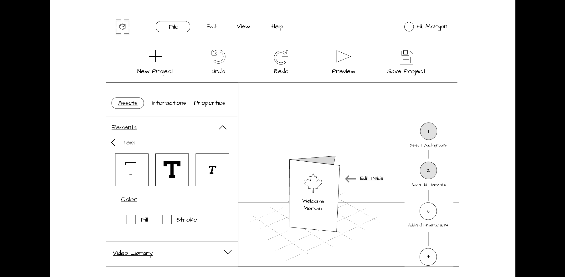
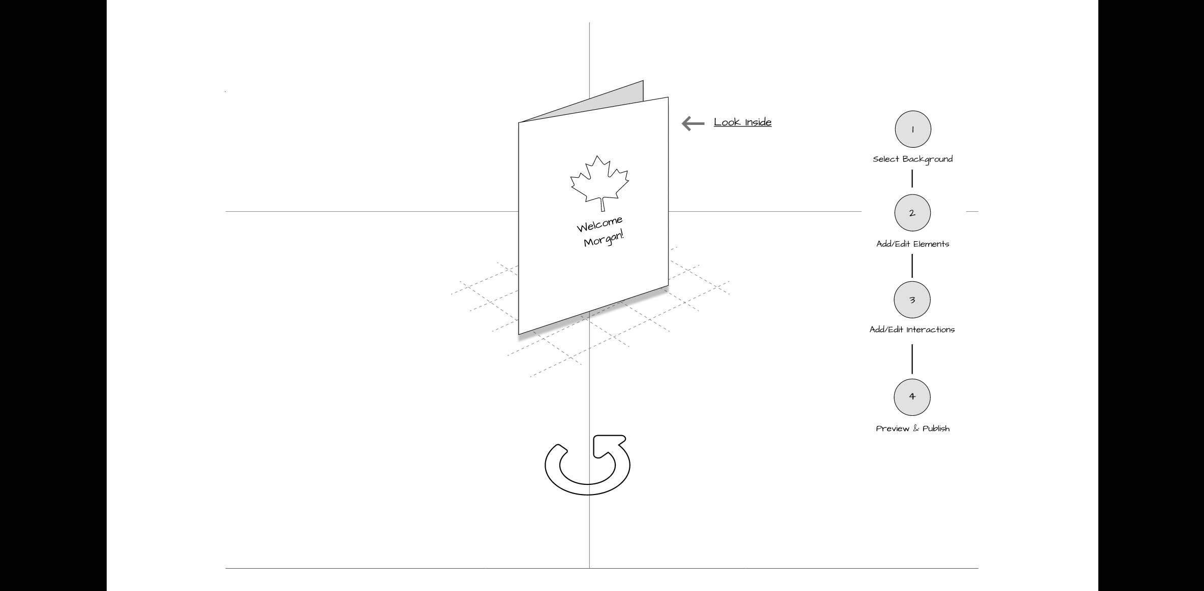
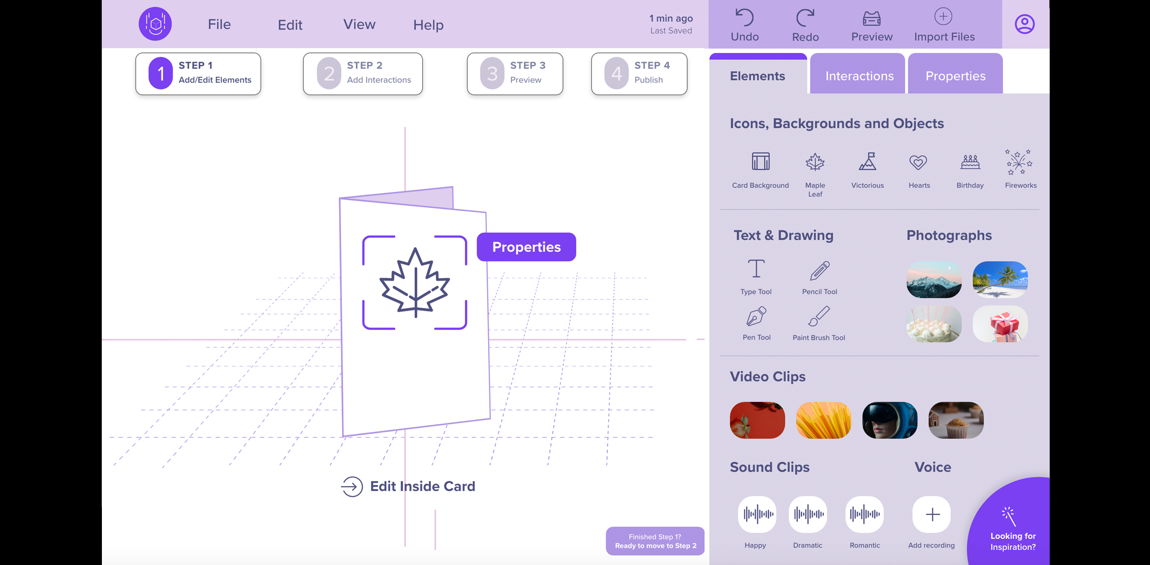
| 2 | Add a “Maple Leaf” and text on the card | Determine if our prototype has meaningful buttons, icons, naming conventions, and architecture. |
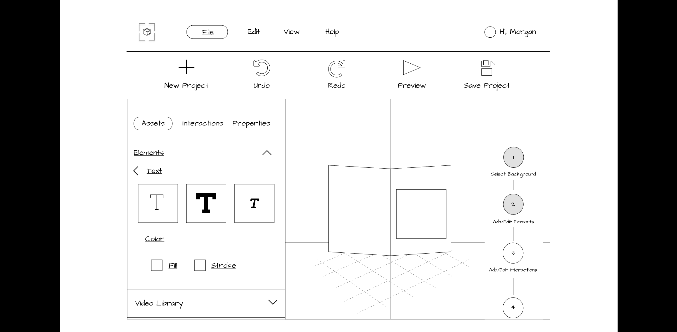
| 3 | Add content inside of the card | Determine if it is easy to edit inside the greeting card. |
| 4 | Add "slide to right” Interaction to the card | Determine if the interactions tab is appropriate and if the participants can visualize the animations that were added to the card. |
| 5 | Preview and publish project | Determine if there is a clear distinction between “Preview” and “Publish” step in our prototype. |
Mid-Fi Prototype B (With Verbal Guidance)
Playing the verbal feature of Prototype B required an Adobe XD account. To eliminate placing the burden of account verification on our participants, we the facilitators shared our screen and followed completed the login process. We asked participants to explain what they saw on Prototype B’s blank greeting card template screen.
If participants did not mention the “steps” feature at the top of the screen, we directed their attention to it, and asked what they expected it to do.
Verbal Guidance Feature
We asked the following questions to understand if participants found the verbal guidance feature useful or not.
- What do you think about having verbal guidance in the prototype?
- Do you think it will be useful for you when using the platform?
- Looking at this interface, do you think it is clear enough that you can move back and forth between the steps?
At the end of our usability test session, we asked each participant to share feedback about which prototype they found easier to use. We also asked our participants to take a short survey at the end that consisted of Product Reaction cards. This survey was inspired by the toolkit that was developed by Microsoft to understand the “illusive, intangible aspect of desirability resulting from a user's experience with a product.” (Barnum, 2011).
After completing the mid-fi usability testing, our team compiled the results and added the participant demographic information, insights, notes, time on task, confidence ratings and other important on a Microsoft Form. The team then discussed the findings to identify opportunities for future improvements.
Mid-Fi Prototype Usability Test Participants
We made note of how familiar participants were with augmented reality using a 5-point Likert scale.
| Participant | AR Awareness* | AR Creation | AR Familiarity** | Occupation | Age Range | Ethnicity |
|---|---|---|---|---|---|---|
| P1 | 4 | Yes | 4 | UX Designer | 25-34 | Asian |
| P2 | 2 | No | 2 | UX Designer | 35-44 | Caucasian |
| P3 | 3 | No | 2 | UX Designer | 25-34 | Asian |
| P4 | 3 | No | 1 | Animator | 35-44 | Asian |
*On a scale of 1 to 5, how aware they were of Augmented Reality (AR) experiences (1 is not at all aware, 5 is extremely aware) **On a scale of 1 to 5, when 1 is not at all familiar and 5 is extremely familiar, what was the participant's level of familiarity with creating AR experiences.
Diversity and Accessibility Considerations
Our mid-fidelity prototyping evaluations included 4 participants who spoke English as a second language. Two appreciated the verbal guidance because they found it helpful in knowing where they were in the creation process and commented that it would help the infrequent user get re-acclimated to the platform. One suggested that an onboarding feature upon launching would help the new user get familiar with the platform’s features and functionality. Based on our users’ need for clear, concise language, we targeted a sixth grade reading level for our content and used simple terminology for labels and typographic elements.
Results for Mid-Fi Prototype
Task Completion Rate
We asked the participants to complete five short tasks for our first mid-fi prototype. To evaluate the effectiveness of our prototype features, we rated each completed task as “pass” or “1” and each failed task as “fail” or “0.” We then calculated the percentage of success.
| Task | Name | Completed |
|---|---|---|
| 1 | Create a Greeting Card Project | 4/4 |
| 2 | Add a “Maple Leaf” and Text on the Card | 4/4 |
| 3 | Add Content inside of the Card | 4/4 |
| 4 | Add "Slide to Right” Interaction to the Card | 4/4 |
| 5 | Preview and Publish Project | 3/4 |
Average Time on Task, Ease of Task, and Satisfaction Ratings
We also noted the time the participants took to complete each task and their rating on a scale of 1 to 5 on how easy or difficult the task was and their satisfaction level for each. The table below summarizes the average completion time for each task, ease of task rating and satisfaction ratings.
| Task | Name | Average Time on Task (m:s) | Ease of Task Rating | Satisfaction of Task Rating |
|---|---|---|---|---|
| 1 | Create a Greeting Card Project | 02:25 minutes | 4/4 rated task as 5 - Very Easy | 4/4 rated task as 5 - Satisfied |
| 2 | Add a “Maple Leaf” and Text on the Card | 00:52 seconds | 3/4 rated task as 4 - Somewhat Easy | 2/4 rated task as 5 - Satisfied |
| 3 | Add Content Inside of the Card | 00:21 seconds | 4/4 rated task as 5 - Very Easy | 3/4 rated task as 5 - Satisfied |
| 4 | Add "Slide to Right” Interaction to the Card | 00:40 seconds | 2/4 rated task as 4 - Somewhat Easy | 2/4 rated task as 5 - Satisfied |
| 5 | Preview and Publish Project | 01:23 minutes | 4/4 rated task as 5 - Very Easy | 2/4 rated task as 5 - Satisfied |
Summary of Participant Feedback for the Mid-Fi Prototypes
Our participants expressed both positive and challenging experiences while using the platform. The following is a comparison of both Prototype A and B, in which user preference was equally split.
We categorized feedback comparing Prototype A and Prototype B based on the following dimensions:
Product Reaction Survey
As a part of our post-test debriefing, we also asked our participants to take a Product Reaction Survey, which included 35 different adjectives and allowed the participants to select any 5 to describe our platform the best. Our analysis highlighted that 3 out of 4 participants (P1, P2, and P3) found that our platform was easy to use, clean and innovative. Two out of 4 chosen participants (P3 and P4) found that our platform was friendly, consistent, and creative. Using this product reaction survey allowed us to learn our participants’ initial impressions of our platform..
Microsoft Product Cards
Participants were asked to pick five cards that best describe their experience with the product.
| Comfortable | Creative | Stressful | Ineffective | Friendly |
| Useful | Difficult | Advanced | Consistent | Inconsistent |
| Predictable | Exciting | Unpredictable | Effective | Exceptional |
| Efficient | Innovative | Inviting | Essential | Desirable |
| Unconventional | Annoying | Helpful | Busy | Confusing |
| Personal | Clean | Organized | Engaging | Overwhelming | Rigid | Flexible | Easy-to-use | Familiar | Inspiring |
Discussion
Overall, we feel that we successfully achieved the goals of our project. We fulfilled our goal of providing an easy-to-use platform called ExplorAR, to help novice and expert users create and share AR-based experiences. Performing a card sort activity helped us in determining the information architecture for ExplorAR. Further, we believe verbal guidance can be helpful for our platform, which confirms our findings from the literature review on AR. Our prototype’s usability testing sessions revealed both the negative and positive effects of having verbal guidance in an AR platform. Our results showed that the tools provided are likely to be prioritized over verbal guidance for an expert user. Our mid-fi prototypes usability test results indicated that our step-by-step feature requires improvements because most participants did not comment on it until we pointed it out to them.
Limitations of Research
There were several limitations to our work on ExplorAR. Our interviews were exclusively conducted remotely on Zoom, and we sometimes faced lag time during the session which caused us to ask the participants to repeat themselves. The relatively short ten-week timeline of this project was another limitation, which forced us to prioritize our efforts. Finally, all mid-fi usability testing participants were personal connections, and we had a couple of UX designers who did the testing, so this limited us in knowing what users from other occupations think about our platform. While we would have preferred to utilize participants that we did not know, given our participant criteria and time limitations, using acquaintances was our only viable option. Our connection to participants could have positively biased some of their responses, as we noted above in relation to our goals.
Future Work
For future work, we would like to interview more participants from different fields to further understand the user's needs and goals. We would also like to interview YouTube or TikTok content creators, to know what is lacking in their field and what can be improved. Additionally, we would like to implement the feedback from our mid-fi usability testing into a high-fi prototype. Because many of our participants interacted with items on the platform that were not actively clickable, we believe our design would benefit from a hi-fi prototype to allow for in-depth exploration. Some of our participants had never used an AR platform, so performing a task on top of learning about an AR platform might have confused our participants. Our future work would have a different set of usability tasks for the novice and a different set for the expert users and this will allow us to be more focused and determine the goals and needs of each type of users.
Conclusion
Our project aimed to develop a "no-code" platform for all types of users (expert and novice) to get inspired by an easy-to-use process for creating and sharing AR content. We leveraged several different methods such as live user interviews, hybrid card sort, and lo-fi and mid-fi prototype evaluations, to help us understand the users' needs, goals, and pain points. Our research revealed that our platform should focus on four main categories: 1) Clear and simple system with easily recognizable elements; 2) Intuitive onboarding; 3) Robust and uninterrupted performance; and 4) Engaging starter templates to foster creativity and support different learning styles.
We incorporated features such as easy navigation to enable users to find and utilize the primary components to create content. Our platform employed design conventions such as a step-by-step progress bar, verbal guidance, and a set of templates to empower users to create content of their choice. We focused our usability testing goals on understanding how our users complete critical tasks related to the designed features. Our lo-fi usability study indicates that we received positive feedback on our prototype. The task failures were minimal and were easily resolved by simplifying the language and the placements of correct icons.
Our second round of usability testing produced excellent results, with an overall 95% success rate for our tasks. Based on our work so far, we believe our platform would be successful in the market as it was well-received by most participants. Further iterations and testing of our platform would help us implement a more refined user experience for our targeted users.